


KOREAN AIR: New visual brand and values announced
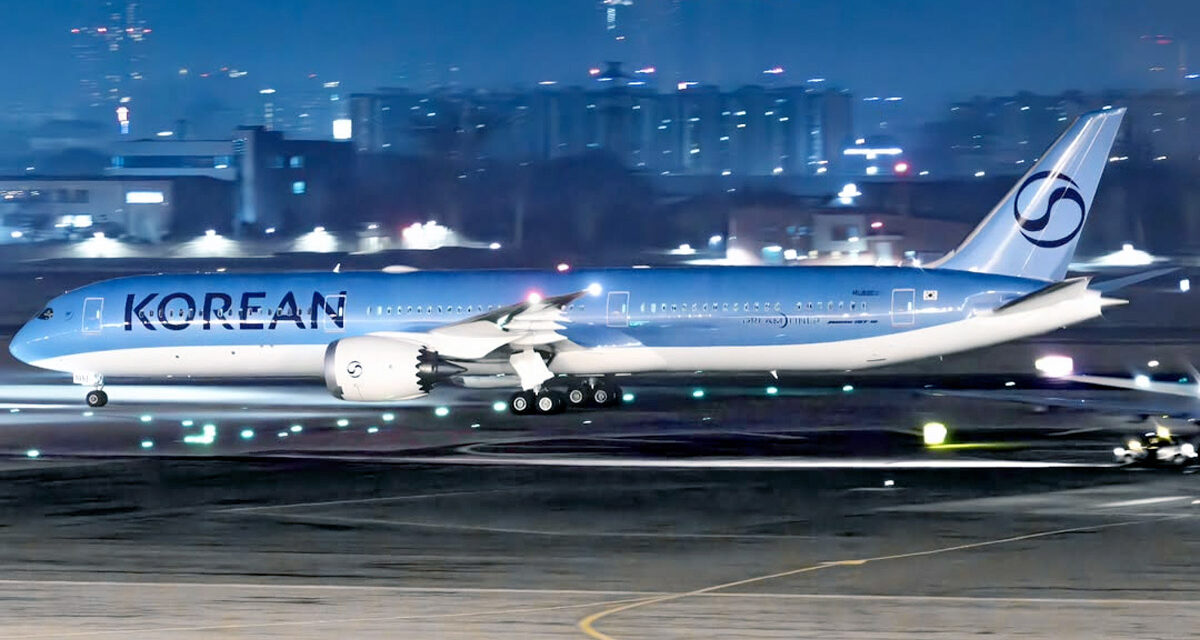
A new 787-10 has been spotted with what is apparently Korean Air’s new livery. Recently, the merging of Korean Airways with Asiana was formally approved, so the corporate branding team requires a new logo, livery, and brand statement.
Content of this Post:
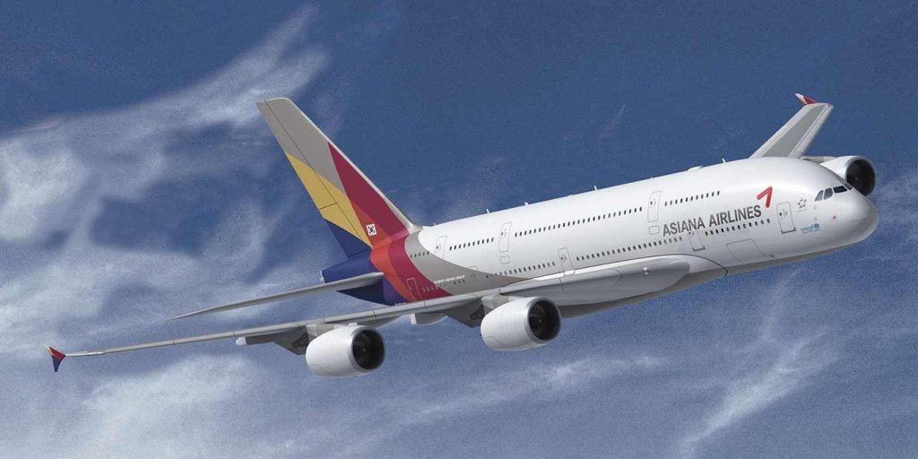
Korean Air – dowdy looks v Asiana contemporary identity
The Korean Air brand is a little dowdy now. It looks old fashioned, and its colour palette is dated. It is well overdue to a refresh if not a complete redesign.
Asiana, on the other hand, has a much more contemporary look. Although it has been around for a while, it could do with a refresh.
Instead, the new combined company, Korean Air, has decided to undergo a major rebranding of its visual identity, livery, and brand values.
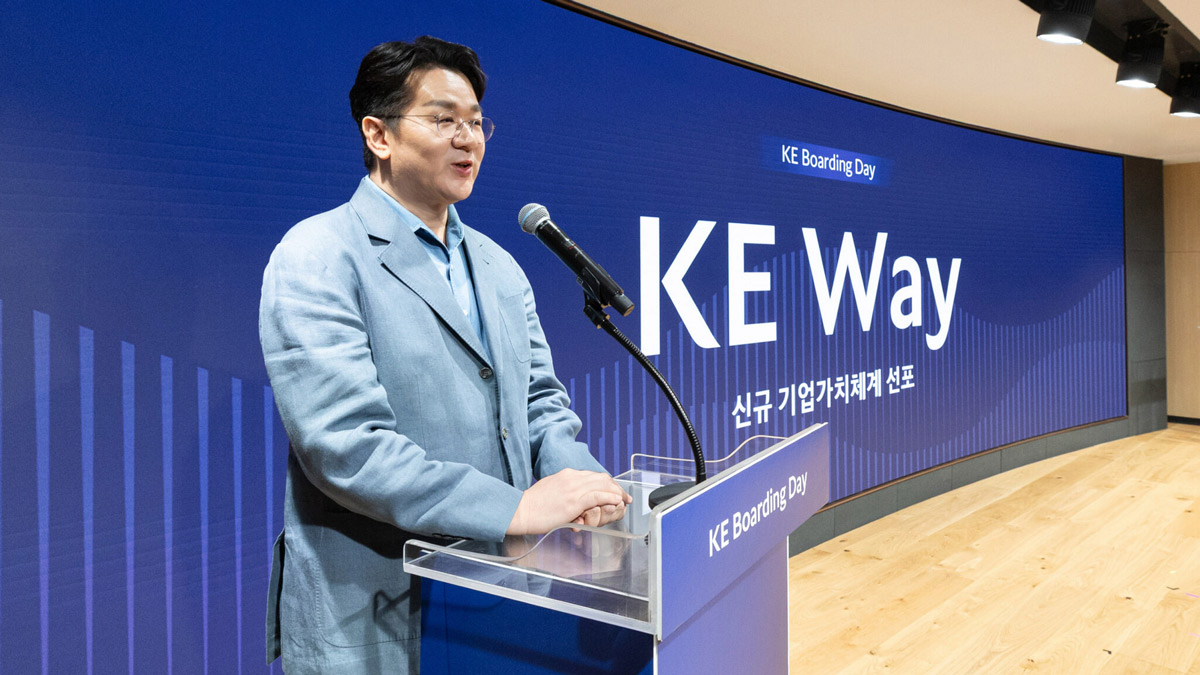
KE Way
The new corporate value system is titled the ‘KE Way’, which involves ‘the airline’s purpose, vision and mission.’
Cynical though I am about these sort of ‘value’ statements, the core of these are very desireable. The question is are they achievable?
Korean Air has dot pointed there key ‘operational pillars’:
- Beyond Excellence – Ensuring the highest level of safety and operational standards
- Journey Together – Fostering a people-centric corporate culture for employees and customers
- Better Tomorrow – Contributing to global connectivity and sustainable operations
Sounds good doesn’t it? Lets hope these dot points are more than just empty words.
Visual branding
In the meantime, we have what appears to be the new branding as applied to a Dreamliner livery has been reported by @Turbinetraveler on Elon Musk’s personal social media vehicle, Twitter (x):
The announcement of these new corporate values was part of Korean Air’s 56th anniversary celebrations. The event was streamed live globally to enable worldwide employees to participate.
In his anniversary address, Cho stressed the importance of the new corporate values as the airline prepares to integrate with Asiana Airlines.
“This value system will serve as our unifying force, guiding us toward our shared goals and shaping our distinct identity,”
Cho Won-tae, chairman of Hanjin Group
Unsurprisingly, Korean Air claims to be developing its new corporate value system through internal surveys, market analysis, and expert consultations. How many times have we heard that before?
The airline has also formulated a catchphrase that tells anyone very little, which seems to be the purpose of these ditties: “Connecting for a better world.”
Which it hopes will lead to the realisiation of the airlines new hope, “To be the world’s most loved airline,” underscores its commitment to service excellence and corporate responsibility.
To achieve this vision, Korean Air has outlined three key operational pillars:
- Beyond Excellence – Ensuring the highest level of safety and operational standards
- Journey Together – Fostering a people-centric corporate culture for employees and customers
- Better Tomorrow – Contributing to global connectivity and sustainable operations
Frankly, you could apply these to anything from dogfood to airlines.
This was all sone ahead of the official launch of the new Korean Air brand on 11 March. Nailed it!
2PAXfly Takeout
I don’t think an airlines livery sells tickets, well at least not on its own. But, a good livery design can support all the things that go into the impression a brand creates in a purchasers mind, and that can sell tickets.
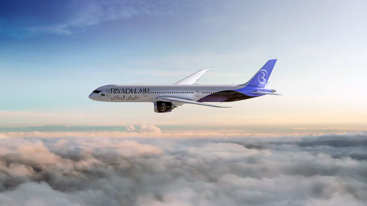
Do I think this is better than Korean Air’s old livery? Maybe. Do I think it is outstanding design? Well, no. I’m putting it in the ‘meh!’ basket. It reminds me of the livery of the yet-to-be-launched Hiyahd Air. Same tonal colour, and similar logotype albeit with a different letter. So, I suppose to that extend it does accord with contemporary corporate design.


What did you say?