
HOTEL REVIEW: Hotel Debrett – friendly, quirky gem of a hotel in the centre of Auckland, New Zealand
Series: TRIP REPORT: Double Status Credit run to New Zealand
- TRIP REPORT: Pointless New Zealand double status credit run to requalify as Qantas Platinum 2023
- FLIGHT REVIEW: Qantas Double Status Credits trip to Auckland – Sydney to Melbourne
- LOUNGE REVIEW: Qantas Melbourne International First Lounge. My first time – I was treated gently.
- FLIGHT REVIEW: Qantas QF153 Melbourne to Auckland in Business Class. Perfectly uneventful.
- HOTEL REVIEW: Hotel Debrett – friendly, quirky gem of a hotel in the centre of Auckland, New Zealand
- LOUNGE REVIEW: Qantas First Lounge Auckland Airport and smoking patio
- LOUNGE REVIEW: Strata Lounge, Priority Pass lounge at Auckland International Airport
- FLIGHT REVIEW: Qantas A330 Auckland to Brisbane, Business Class
- LOUNGE REVIEW: Brisbane Qantas Business Lounge. Packed to the gunnels!
- FLIGHT REVIEW: Brisbane to Sydney on Qantas Business Class in a Boeing 737-800
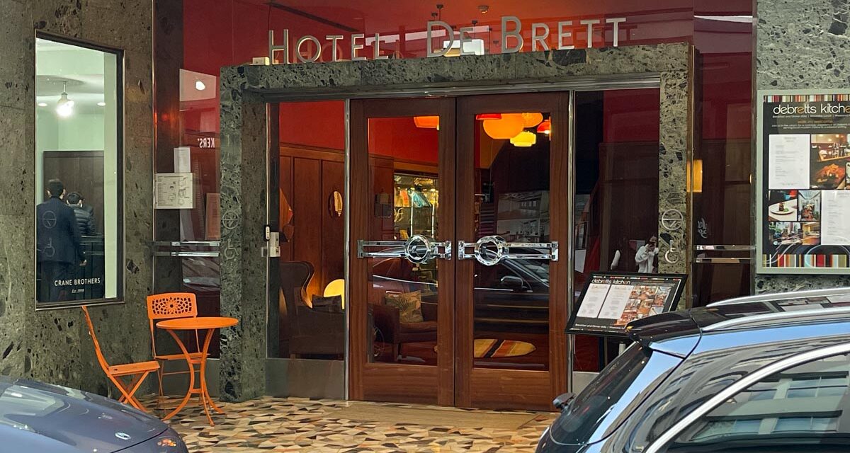
The Hotel Debrett is a delightful hotel in the heart of Auckland. Cobbled together from a range of historical buildings around a delightful courtyard, the hotel offers a bright refreshing palette with a quirky contemporary take on deco design through a sort of 1970s lens
![Hotel Debrett in central Auckland, main entrance, New Zealand [Schuetz/2PAXfly]](https://www.2paxfly.com/wp-content/uploads/2023/10/Hotel-DeBrett-Auckland-July-2023-2007.jpg)
Content of this Post:
Details
Stay: 28 to 30 July, 2023
Stars: 4.5
Room: Superior Room
Size: 26 – 33 sqm (280 – 355 sqf)
Bed: King
Per Night Average: ~NZ$276
Address: 2 High Street, Auckland, New Zealand
Phone: +64 9 925 9000
Email: reception@hoteldebrett.com
Web: hoteldebrett.com
![Cornerbar, Hotel Debrett, Cnr Shortland and High Streets, Auckland, New Zealand [Debrett Hotel]](https://www.2paxfly.com/wp-content/uploads/2023/11/hotel-debrett-external.jpg)
Booking & Price
It turned out this was the same weekend that the FIFA world cup was playing in Auckland, so good, cheap hotel rooms were hard to come by. My plan to share the delights of the Park Hyatt Auckland with A2 were shattered when the starting prices were over AU$ 650 per night. After a good search, including price and facilities comparison, I settled on the Hotel Debrett with rooms around the NZ$320 mark. I booked it through Hotels.com (Expedia), which allows me to cancel the booking until the day of arrival. That way, we could quickly switch if I found a better offer closer to our stay.
Despite countless checks, other, on the surface, more desirable hotels did not reduce in price. So, my tactic of booking early in March for a late July stay with a cancelable and refundable booking was the wise decision!
Staying at Debretts was not just the right financial decision; it was also a stay at a very comfortable hotel, which I would stay in again.
![Reception area and main entrance viewed from the staircase of Hotel Debrett, Auckland [Schuetz/2PAXfly]](https://www.2paxfly.com/wp-content/uploads/2023/10/Debrett-hotel-auckland-nz-2023-IMG_4179.jpg)
Details
Because the hotel appears to be a combination of heritage buildings, there are 25 rooms, each uniquely shaped and designed. All but one of the rooms have a bathtub, as well as a shower. The hotel has a rather nice bar, the Housebar, that leads into a lounge area that leads into the restaurant DeBretts Kitchen. There is a separate bar on the ground floor, Cornerbar.
The hotel also has some meeting facilities, offers High Tea, private dining areas, and markets itself as a wedding venue.
The hotel can be booked directly or through the usual aggregators as well as through New Zealand operator, Habitat.
There is no gym of fitness centre evident.
![The hotel from High Street, looking towards Shortland Street [Schuetz/2PAXfly]](https://www.2paxfly.com/wp-content/uploads/2023/10/Hotel-DeBrett-Auckland-July-2023-2008.jpg)
Location & Arrival
The hotel occupies frontage on three streets: High, Shortland and O’Connell. The main guest entrance in full deco style is on High Street, which also houses the wood-panelled reception area.
We arrived direct from the airport around 8pm and were dropped outside the Cornerbar on Shortland Street by our Uber.
![The wood panelled, deco inspired rentrance and eception area [Schuetz/2PAXfly]](https://www.2paxfly.com/wp-content/uploads/2023/10/Hotel-DeBrett-Auckland-July-2023-2010.jpg)
History
Shortland street is the old main street of Auckland close to the foreshore of Commercial Bay, before land was reclaimed.
Hotel DeBrett at 15–19 Shortland Street, was originally built in 1860 and rebuilt in the 1920s was called the Commercial Hotel until 1959. Once inside the hotel, especially when looking into the light well, occupied by the lounge area, its easy to read the architectural history of the hotel
![Lounge at the entrance foyer of the Hotel Debrett [Schuetz/2PAXfly]](https://www.2paxfly.com/wp-content/uploads/2023/10/Hotel-DeBrett-Auckland-July-2023-2012.jpg)
Check-in
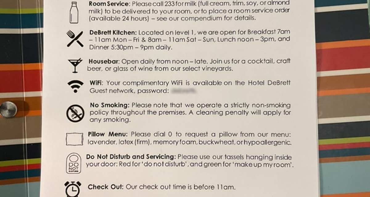
Reception was staffed, and our booking was recognised. Some explanation was required to clarify that I had booked two rooms, but all was good. The complimentary nature of the mini-bar in the rooms and WiFi access were explained, and the reception staff answered our questions about food and beverage services in the hotel.
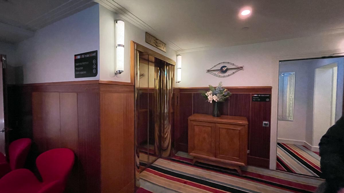
It felt like arriving at a private country hotel, personal and friendly, not cold and corporate. The warm wood-panelled and red-walled foyer helped, and the signature striped carpet throughout the hotel was introduced.
We were directed to the lift, and attempted to make our way to our rooms. 2A found his room easily, but I had more trouble with mine. It took me quite a time to find it, since it was behind a door to another corridor on the level one landing, whereas most of the other rooms were accessed directly from the landing or via an un-doored corridor. I thought it might have been my exhaustion that was causing the room confusion, but 2A had the same difficulty trying to find the room.
The Room
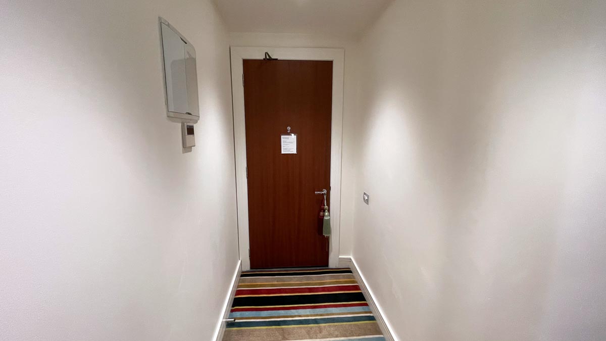
My Room 113 was entered through a short corridor ending in the bathroom’s sliding door entrance. The bedroom was to the left. The French windows at the end looked into an internal light well, part of the lounge area below.
![The Hotel Debrett room is accessed by a short corridor. [Schuetz/2PAXfly]](https://www.2paxfly.com/wp-content/uploads/2023/10/Hotel-DeBrett-Auckland-July-2023001.jpg)
This was a well-sized room with high ceilings, neutral walls, feature furniture, and the hotel’s signature carpet. I liked the slightly eclectic collection of furniture styles from different but associated periods. Everything from an Eames boardroom chair to the Accamedia curved glass desk.
![Room entrance corridor with bathroom entrance, and bedroom to left [Schuetz/2PAXfly]](https://www.2paxfly.com/wp-content/uploads/2023/10/Hotel-DeBrett-Auckland-July-2023018.jpg)
The short corridor gave a great sense of privacy to the room. It also mitigated any sound leakage from the public spaces. As you can probably see from the way the stripes in the carpet look, the floor was a little uneven, even through the thick pile and luxurious underlay.
![Different coloured tassels to demonstrate privacy. I couldn't find an explanation of which was which. [Schuetz/2PAXfly]](https://www.2paxfly.com/wp-content/uploads/2023/10/Hotel-DeBrett-Auckland-July-2023017.jpg)
I liked that corridor entrance. It added to the sense of arrival each time I entered the room, and I like an entrance that doesn’t immediately look into the room from the doorway.
![The Hotel Debrett king size bed dressed sumptuously and with a padded headboard [Schuetz/2PAXfly]](https://www.2paxfly.com/wp-content/uploads/2023/10/Hotel-DeBrett-Auckland-July-2023006.jpg)
Bedroom
The bedroom is large if a little oddly arranged. Since I suspect that no two rooms have the same footprint, it is a matter of using similar design elements and furniture pieces and rearranging them to fit the space. This is somewhat successful. Think the comfort of your grandmother’s lounge room, rather than the sleekness of contemporary interior design
![Hotel DeBrett Auckland bedroom - view to french doors onto internal courtyard [Schuetz/2PAXfly]](https://www.2paxfly.com/wp-content/uploads/2023/10/Hotel-DeBrett-Auckland-July-2023019.jpg)
Each object – the Eames office chair, the transparent glass desk, and the bespoke laquered wardrobe/bar look great, but collectively, perhaps a bit of a mish-mash. It’s not helped by that carpet which is a unifying element for the entire hotel.
My room overlooked an internal courtyard. Although well-soundproofed, it also limited the natural light in the room.
The king bed was more than comfortable with crisp white linens and feather-like synthetic pillows.
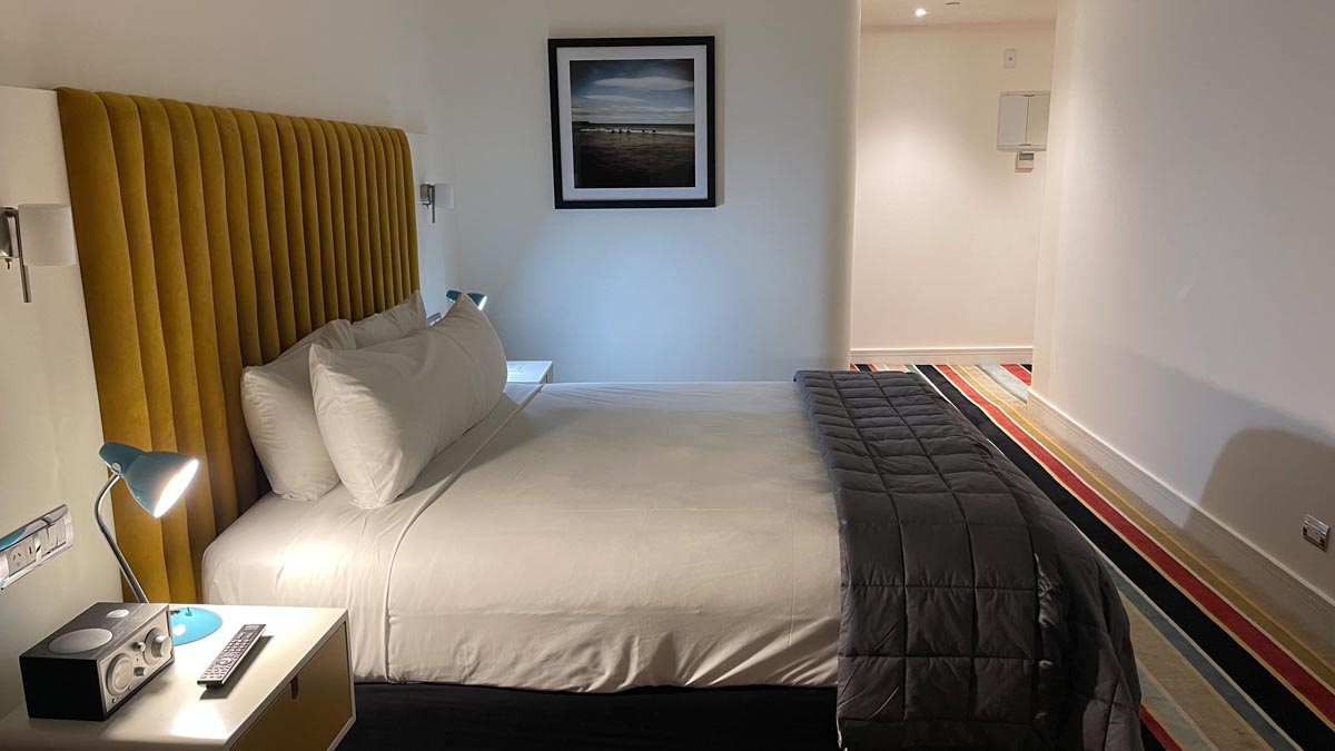
The reading lamps were a bit retro and glary. The headboard-mounted lamps were better for actual in-bed reading.
![Bedside lamp, phone and pen and paper. Hotel DeBrett, Auckland New Zealand [Schuetz/2PAXfly]](https://www.2paxfly.com/wp-content/uploads/2023/10/Hotel-DeBrett-Auckland-July-2023021.jpg)
![Wardrobe and minibar combined. Hotel DeBrett, Auckland, New Zealand [Schuetz/2PAXfly]](https://www.2paxfly.com/wp-content/uploads/2023/10/Hotel-DeBrett-Auckland-July-2023023.jpg)
Mini-Bar
The mini-bar was housed within a red lacquered and mirrored armoire housing the wardrobe, minibar and snack station.
![Armoire housing minibar, safe, wardrobe drawers and snack station. Hotel DeBrett, Auckland, New Zealand [Schuetz/2PAXfly]](https://www.2paxfly.com/wp-content/uploads/2023/10/Hotel-DeBrett-Auckland-July-2023024.jpg)
![Minibar, Hotel DeBrett, Auckland, New Zealand [Schuetz/2PAXfly]](https://www.2paxfly.com/wp-content/uploads/2023/10/Hotel-DeBrett-Auckland-July-2023026.jpg)
A good selection of local wines, beers and soft drinks. It was good to see a total absence of international brands for once. No Coka-Cola or Pepsi, or Pelligrino or Evian.
![Snack selection, Hotel DeBrett, Auckland, New Zealand [Schuetz/2PAXfly]](https://www.2paxfly.com/wp-content/uploads/2023/10/Hotel-DeBrett-Auckland-July-2023027.jpg)
Snacks were also local – no Lay’s or Pringles here—localism at its best.
![Glassware and tea selection in the armoire, Hotel DeBrett, Auckland, New Zealand [Schuetz/2PAXfly]](https://www.2paxfly.com/wp-content/uploads/2023/10/Hotel-DeBrett-Auckland-July-2023028.jpg)
Wardrobe
The wardrobe occupied one side of the armoire, and included actual drawers rather than just shelves. Much appreciated
![Selection of hangers plus iron in the armoire, Hotel DeBrett, Auckland, New Zealand [Schuetz/2PAXfly]](https://www.2paxfly.com/wp-content/uploads/2023/10/Hotel-DeBrett-Auckland-July-2023025.jpg)
This armoire was a great addition to the room locating but hiding all the storage you need in a room. It was only outdone by the design and amenity of the bathroom.
![Bathroom featuring bath and double slinks. Hotel DeBrett, Auckland, New Zealand [Schuetz/2PAXfly]](https://www.2paxfly.com/wp-content/uploads/2023/10/Hotel-DeBrett-Auckland-July-2023014.jpg)
The Bathroom
I have a love/hate relationship with the use of black in a bathroom. On the one hand I find it quite chic, retro in a deco sort of way, but on the other, I find it depressing and a little – I don’t know – S & M maybe? I actually think the use of black and white in this bathroom is a design masterstroke. It has all those qualities without the ick factor associated with S & M. Too much information?
![Sinks, toilet and accessible shower. Hotel DeBrett, Auckland, New Zealand [Schuetz/2PAXfly]](https://www.2paxfly.com/wp-content/uploads/2023/10/Hotel-DeBrett-Auckland-July-2023013.jpg)
The shower was open, which I think would make the room suitable as an accessible space. While I quite like the cosyness of a shower stall, I found this less structured shower space quite appealing. Here are a few other images of the bathroom.
![Double mirrors and sinks. Hotel DeBrett, Auckland, New Zealand [Schuetz/2PAXfly]](https://www.2paxfly.com/wp-content/uploads/2023/10/Hotel-DeBrett-Auckland-July-2023009.jpg)
Love a shaving mirror in a hotel room, and appreciated the basket for the hairdryer. The only think the bathroom lacked was any drawer storage space. So useful for storage, and to leave things behind in.
![Double mirrors, sinks and toilet. Hotel DeBrett, Auckland, New Zealand [Schuetz/2PAXfly]](https://www.2paxfly.com/wp-content/uploads/2023/10/Hotel-DeBrett-Auckland-July-2023015.jpg)
A nice touch is what looks like an X-ray reader light over the toilet. This could be used as a night light for the room, with just enough illumination for this male guest to be able to target the toilet correctly. TMI?
![Bathtub, sufficiently deep and fillable. Hotel DeBrett, Auckland, New Zealand [Schuetz/2PAXfly]](https://www.2paxfly.com/wp-content/uploads/2023/10/Hotel-DeBrett-Auckland-July-2023007.jpg)
Bathtub
This was a great bathtub. Often in hotel rooms, the bath is not deep enough for a good soak. Or they have an overflow outlet, which makes it impossible to fill the bath to the level you need for proper immersion. Not the case here. There were even some bath salts provided. I took full advantage and enjoyed a long hot bath.
Amenities
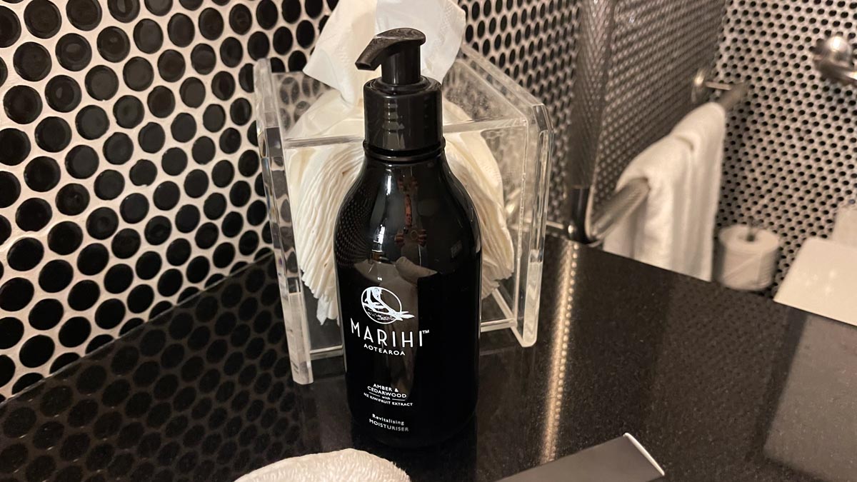
Marihi, a New Zealand luxury brand, provided the amenities. The Māori term means precious, prized and valuable. The non-binary fragrance is a pleasant mix of Amber & Cedarwood with Kiwifruit extract.
The transparent tissue box was also a great touch. At least you knew when it was getting empty.
![Hand towels and amenities. Hotel DeBrett, Auckland, New Zealand [Schuetz/2PAXfly]](https://www.2paxfly.com/wp-content/uploads/2023/10/Hotel-DeBrett-Auckland-July-2023010.jpg)
Public Areas – Bars, Restaurants & Gyms
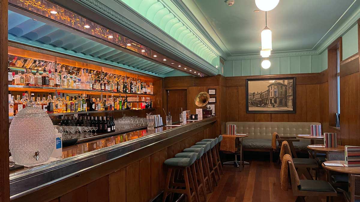
All the public areas of the hotel have a late deco vibe combined with a retro 1960’s sort of aesthetic. It’s less 20’s flapper, and more 30’s cruise liner if you will. Wood panelling, archival images and some select furniture echoing the 50s and 60s is the go.
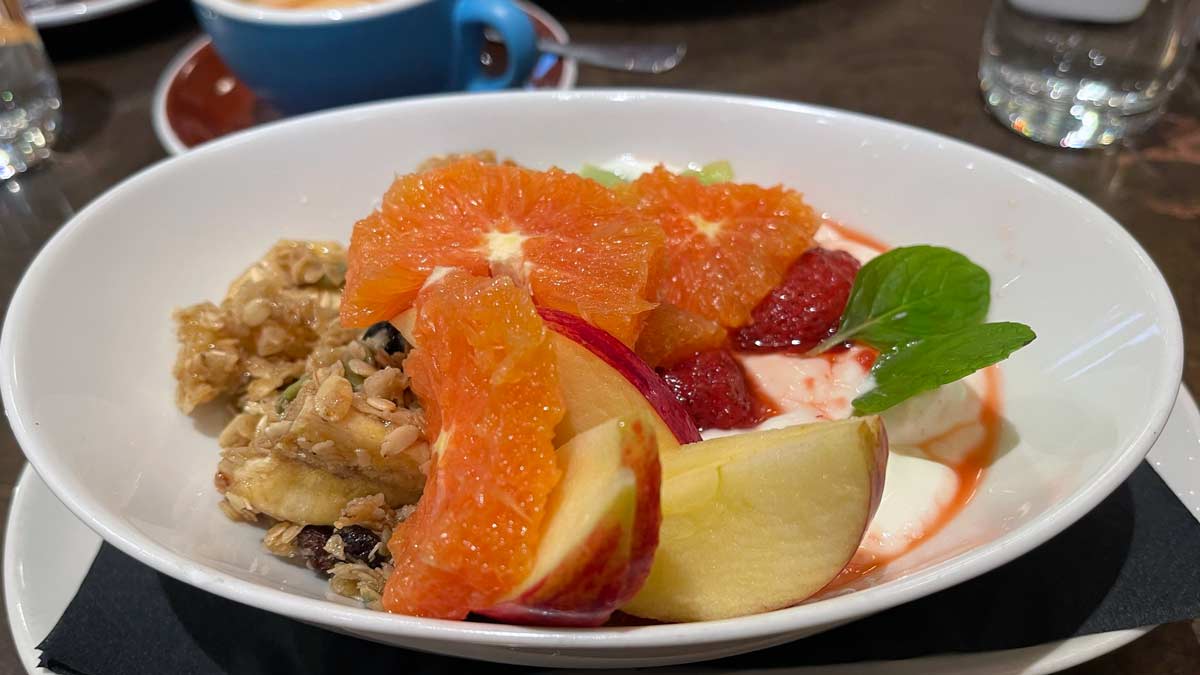
The hotel has two linked food and beverage outlets, plus the ‘Cornerbar’ public bar. DeBretts Kitchen is the main hotel food outlet where breakfast is served. It specialises in contemporary New Zealand cuisine, which is to say it’s a bit international with a nod to local ingredients and seasonality. The Housebar, with its late Art Deco detailing, is just a cosy stunner serving classic cocktails.
![Private dining, DeBrett Hotel, Auckland, New Zealand [Schuetz/2PAXfly]](https://www.2paxfly.com/wp-content/uploads/2023/12/hotel-debrett-convention-private-room-space.jpg)
2PAXfly Takeout
I was pleasantly surprised by this Auckland hotel. It’s a little quirky. It’s small and intimate. It doesn’t have some amenities of larger establishments, like a gym, but it makes up for this with oodles of character.
I enjoyed the boutique hotel vibe of the place, and although I don’t think all design elements are a total success, I appreciated the evident thought and consideration that went into the design. I also loved the public spaces with their wood panelling, ironwork balustrades and thoughtful furnishings
As the poor cousin to the outrageous charges of our first preferences in accommodation (I’m looking at you Park Hyatt!), this turned out to be a very different but worthwhile alternative.
I would definitely stay here again. Partly for value for money, but partly because it is just a nice hotel.
Hotel DeBrett, Auckland, New Zealand
80%
Art Deco design gem This is a small gem of an Art Deco hotel which makes up in quirky design what it may lack in modern sleekness. Comfy, chic and homely.














What did you say?