
HOTEL REVIEW: Majestic Roof Garden Hotel
Content of this Post:
Introduction
As regular readers would know, I travel to Adelaide, South Australia – my home town about once a month to visit my mother, friends and family.
I have some regular hotel haunts that include the Intercontinental, the Waymouth Peppers and the Mayfair. I also have my least favourites like the Hilton and the Stamford. Sometimes, I try something new. In this case the Majestic Roof Garden Hotel. I wrote about my first impressions of this hotel a few months ago, but today, you get the full review.
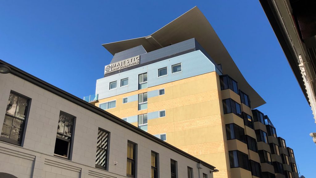
Hotel Information
Stay: 14 to 16 May 2019
Stars: 4.5
Room: Superior Room East
Size: 35 sqm (377 sqf)
Bed: King
Per Night Average: ~AU$176
Address: 55 Frome Street, Adelaide, South Australia 5000
Phone: +61 8 8100 4400
Email: mrghres@majestichotels.com.au
Web: www.roofgardenhotel.com.au/
History
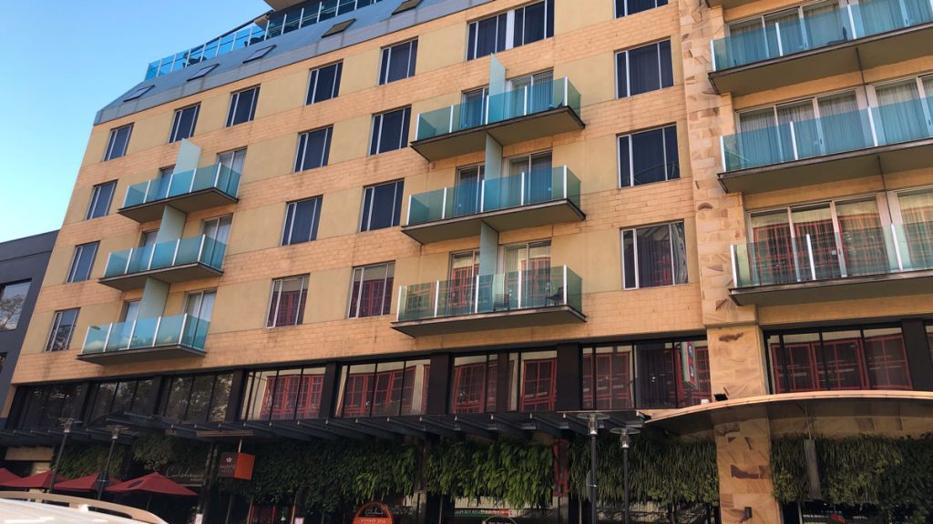
The Majestic Roofgarden Hotel was opened in 2004 and is owned by the Culshaw family. The Majestic Hotel Group was founded by John Culshaw in 1986. The group owns 5 hotel properties, including the Minima Hotel and the Majestic Old Lion hotel, both in North Adelaide, and the Oasis Apartments in Port Augusta. The group is currently developing the Majestic All Suites Hotel in North Adelaide which is scheduled to open later in 2020.
Arrival & Location
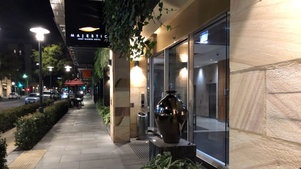
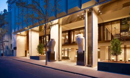
The hotel entrance is on Frome Street, near the corner with North Terrace, so it is in the ‘square mile’ of Adelaide but a little outside the main business district. Its located relatively close to the arts and gallery hub of North Terrace, and the revitalised East End shopping and dining precinct of Adelaide.
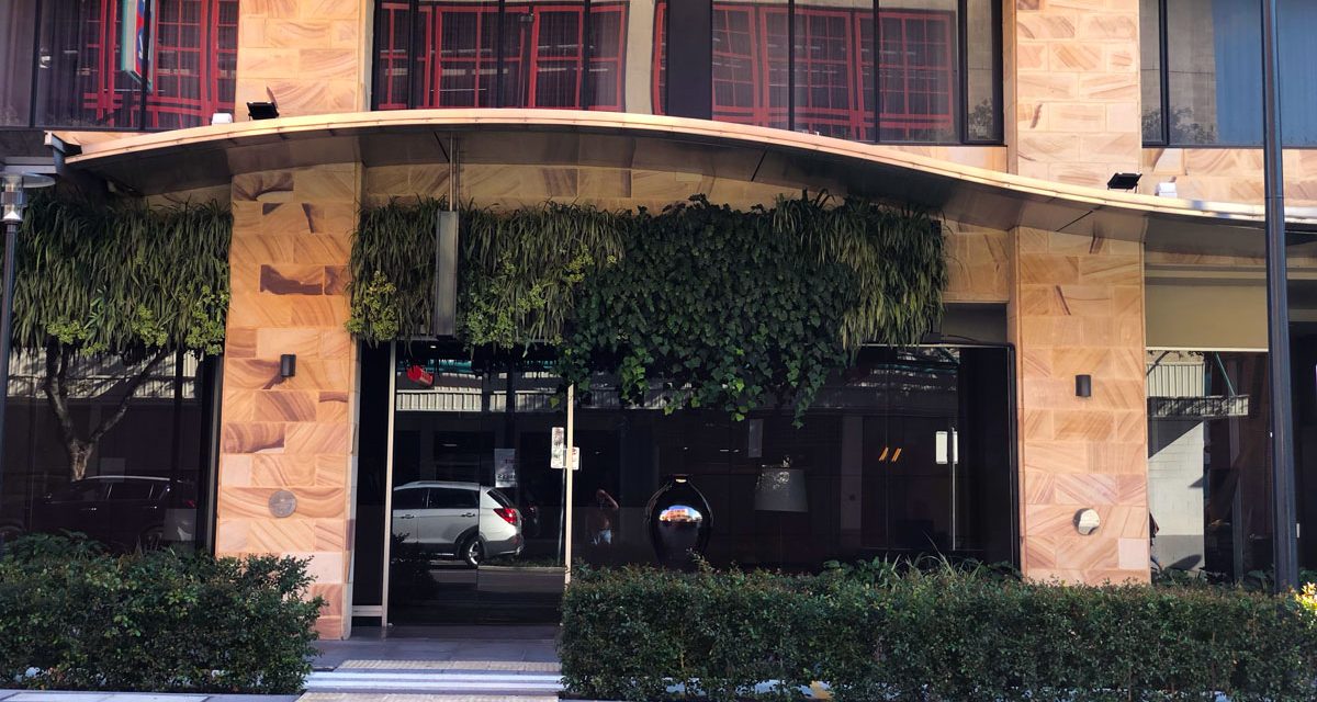
Arrival confused me here. What looks like the main entrance, is actually the entrance to the Culshaws restaurant, which is part of the hotel. The hotel restaurant is actually further to the right. Its no problem, as there is a ramp joining the two.
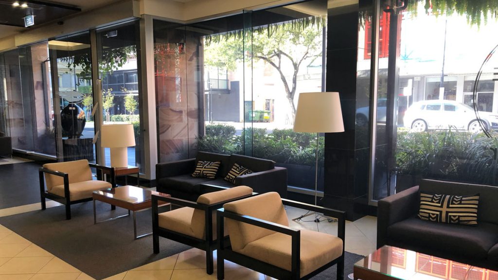
The reception area is quite small, which becomes obvious when more than one or two guests are trying to check-in or out.
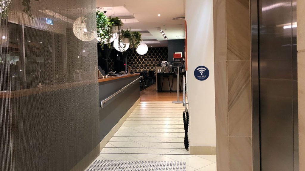
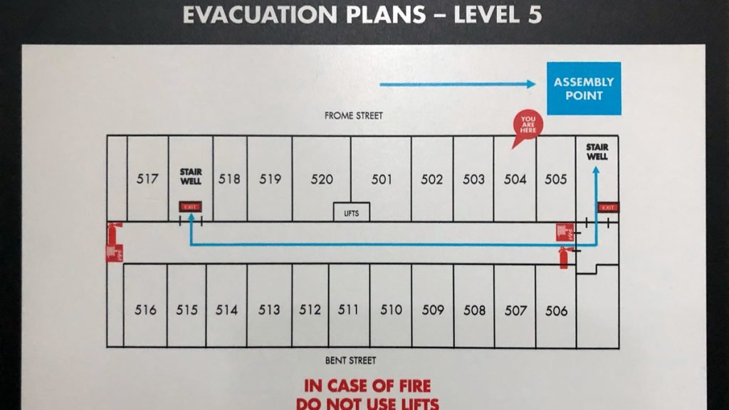
Check-in was efficient, and I was on my way up to room 504 pretty quickly.
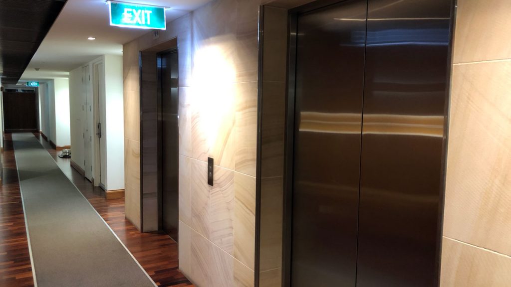
I headed up to the fifth floor, in the lifts to the left of the reception desk. Oh and those lifts open on one side on the ground floor and then open on the other side on subsequent floors. Confusing until you get used to it.
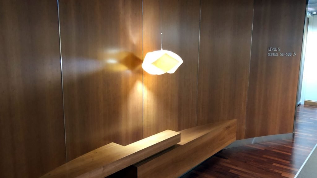
I loved the design of the public areas of the hotel. Lots of custom woodwork, a little sandstone, some curves, and simple but direct signage.
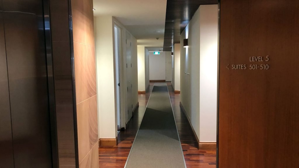
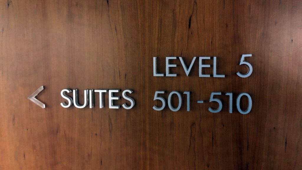
I followed the signage to my room, which was left out of the lifts and down the hall.
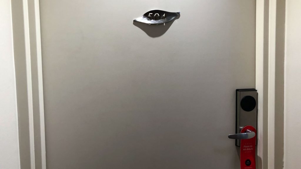
My room was on the left-hand side of the corridor, towards the end. Strangely the room door has no spyhole.
The corridors were a little white and lacked some mood lighting, which proved to be a harbinger of what was to come.
The Room
On entry, there were two things apparent. The room was very brightly lit – a result of having very white fluorescent bulbs and was in a fairly standard format – bathroom on one side of an entry corridor, with the room beyond.
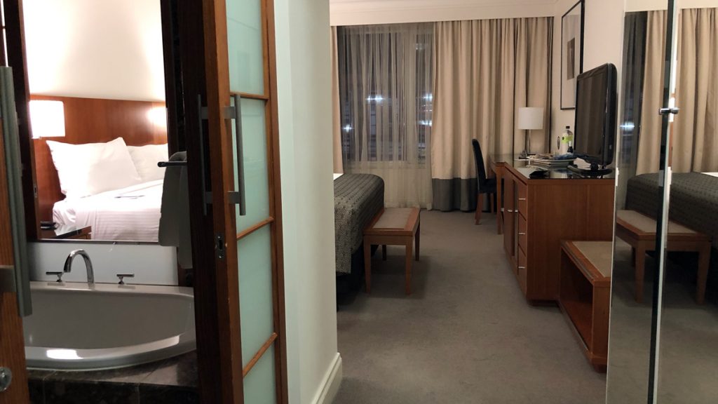
The room was quite spacious, and although individual elements are fine – despite some design choices being questionable – the overall feeling is a little clinical. I think that’s because of a few things. The extreme lighting doesn’t help, nor does the fairly stark white walls. I think a softer colour, and maybe a feature colour on one wall could have helped.
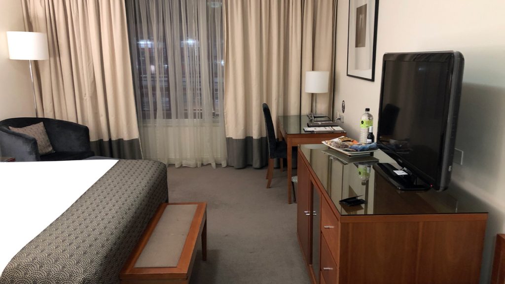
But the final clincher for the clinical feel is the smell of the room. It may have been cleaning products, but, it smells like the room has been sprayed by some cheap scent that is meant to indicate ‘freshness’. It’s horrible. Fortunately, it either dissipates, or I just got acclimatised to it. But on reflection, I realise that it has coloured my entire view of the hotel.
The airconditioning is off when you enter the room, so the room is a bit stuffy on entry. When you do turn the air-con on, it’s quite loud even on the lowest fan setting.
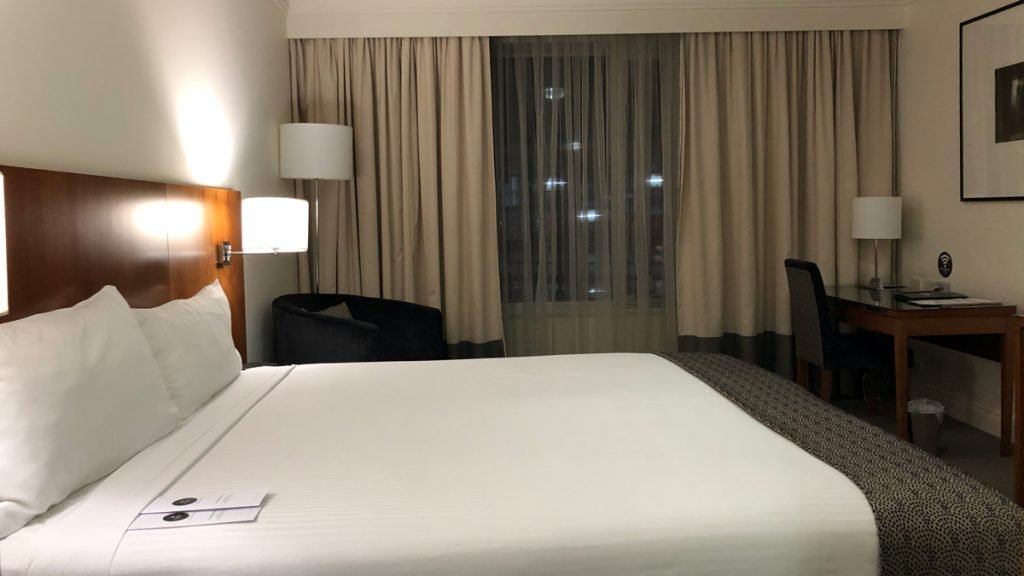
Bedroom
It’s a nice bedroom, but something doesn’t quite gel. All the elements are there, but maybe its just that there is nothing here to distinguish it from a standard chain hotel.
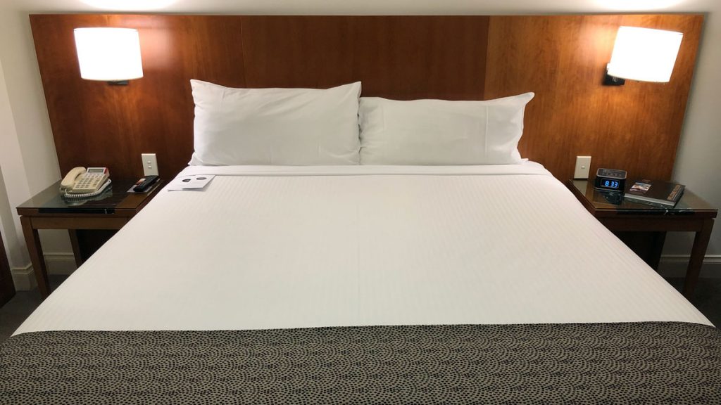
It does commit a cardinal sin in my book, and that is not carrying feather pillows. All options are synthetic, and the number of pillows is not generous – just one per side.
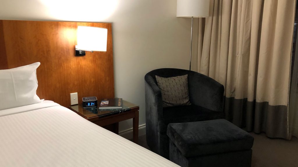
The bucket lounge chair and footstool are plush and generous but could have done with an additional side table.
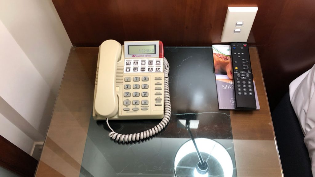
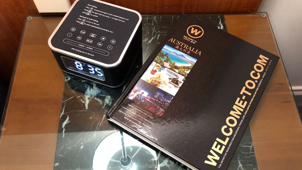
Bedside tables were generously sized, glass-covered, and not over cluttered with literature.
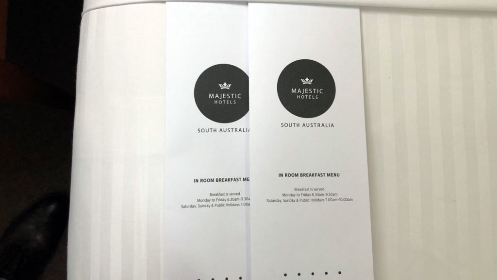
Breakfast menus were tucked into the sheeting, which I thought an elegant touch.
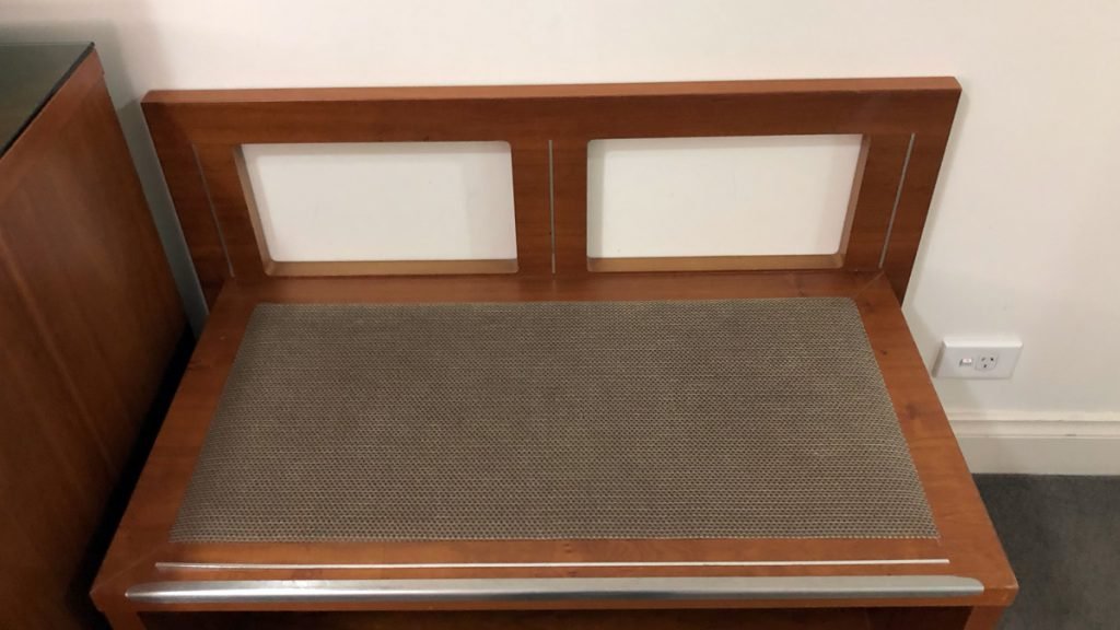
The room has a padded bench at the end of the bed as well as a luggage bench.

I like this. You can forage in a bag on it, sit there to put on your shoes and socks, and it’s a good place for that annoying thing on the end of the bed to be kicked off too.
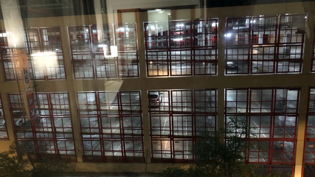
I arrived in the evening, so my view from the room is at night. Probably fortunate, since its actually of a carpark.
I’m not a fan of the bathroom that open or have views into a bedroom. You can read my views about hotels with this attribute in South America and Brisbane Airport, and elsewhere in Adelaide. And if you really want more – my detailed view of the bathroom in this hotel is below.
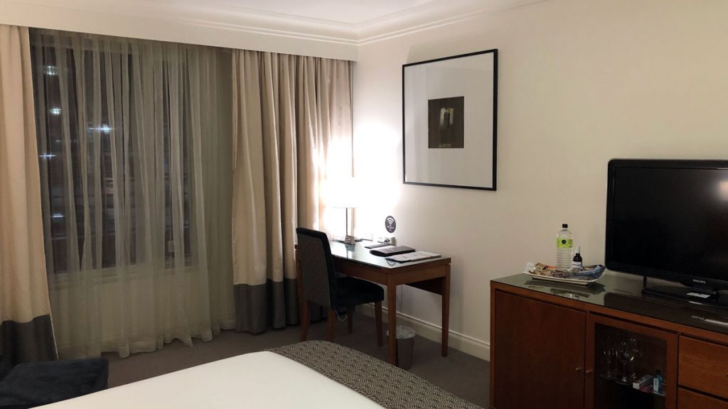
Desk
I like a desk by a window, but on the whole, don’t like a desk facing a wall. Especially one that is basically blank save for a wifi sign! Did I mention that the desk was rickety, and didn’t have a proper office chair?
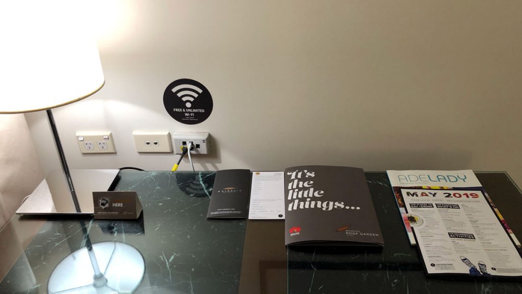
On the positive side, powerpoints and other connectors were at desk height, which makes things convenient.
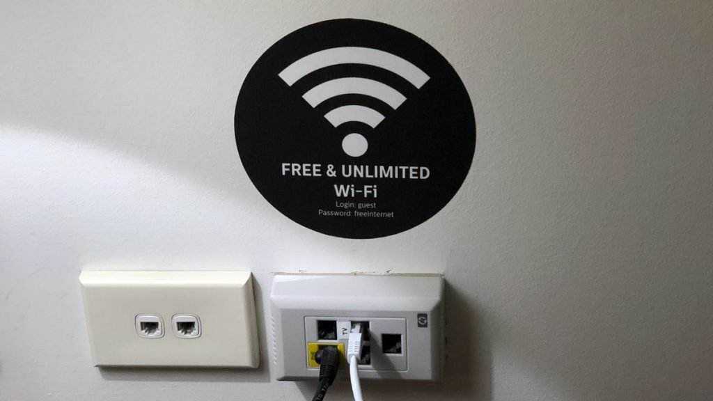
On the downside, the desk was overpopulated with information – good information although it was.
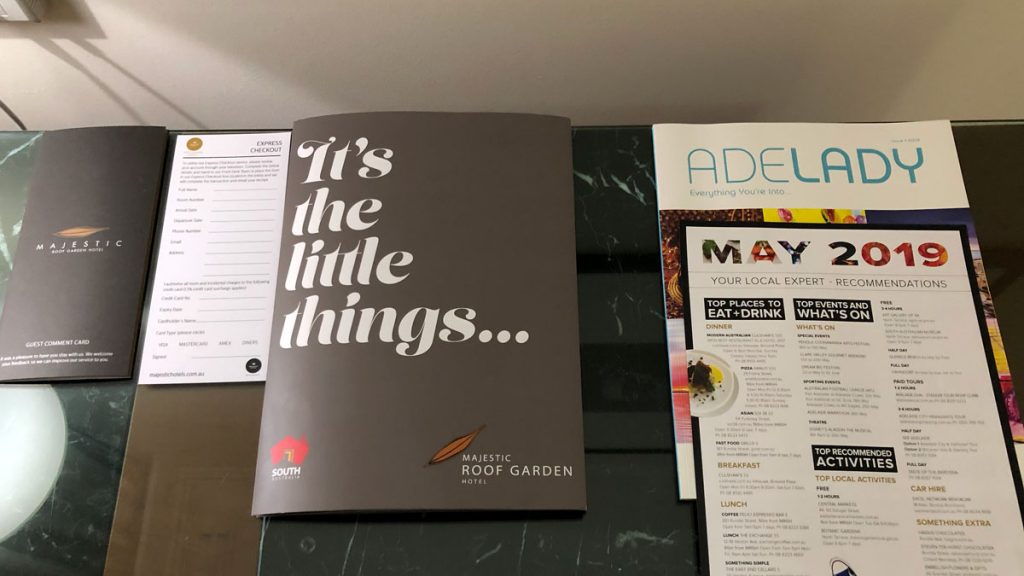
That ‘It’s the little things’ brochure was actually quite helpful providing all the essential information a guest requires.
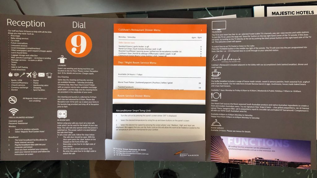
I liked this presentation folder, with its pocket of information, and the location map (below). Its a much better idea than leafing through a dog-eared tabbed folder, with lots of information you don’t need.
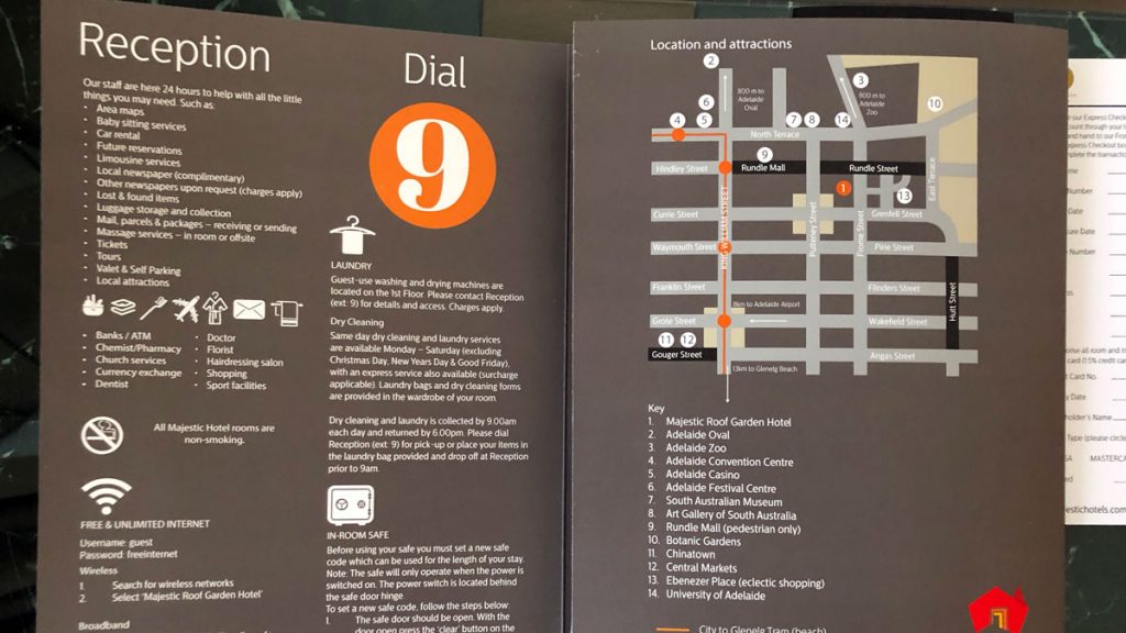
Having said that, who actually plugs in their computer to use the internet and doesn’t use WiFi?

With all these bibs and bobs swept to the side, there was a large useable desk adjacent to a window, although that WiFi wall sticker is a bit of a visual clanger.
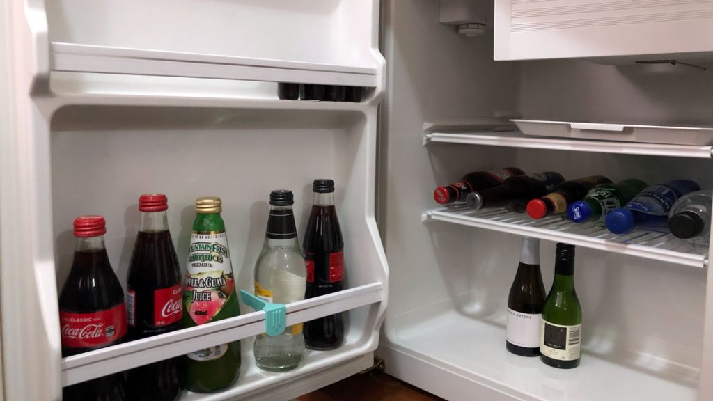
Mini-Bar
The minibar was generous but sparely stocked. But I did appreciate the space available and spare shelf for the hotel guest to use. I rarely use the contents of a bar fridge, unless they are complimentary. Not only are they expensive, but rarely do they represent the brands I like. I usually head off to the local 7/11 for some San Pellegrino, and a good bottle shop for an Australian Red – Kaleskie ‘Clarrie’ GSM for example.
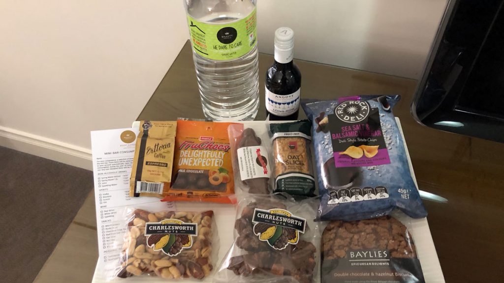
Over on the dresser with the TV atop it, is a further selection of snacks, water and wine. I know its an income stream for the hotel, but I really hate these selections. First, they are usually very bad for you, encourage you to snack, and finally, they add visual pollution to an otherwise pleasant hotel room as far as I am concerned.
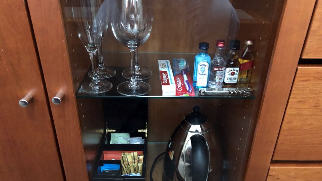
And finally, glassware, miniatures, coffee and tea and toothpaste and brush under glass in the dresser.
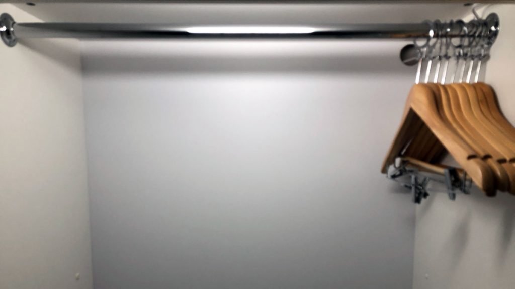
Wardrobe
I’ve said it before, and I’ll say it again I hate these security-conscious, non-theft coathangers. One of these days, I’m going to remove all the wood parts and just leave the metal top just to spite them.
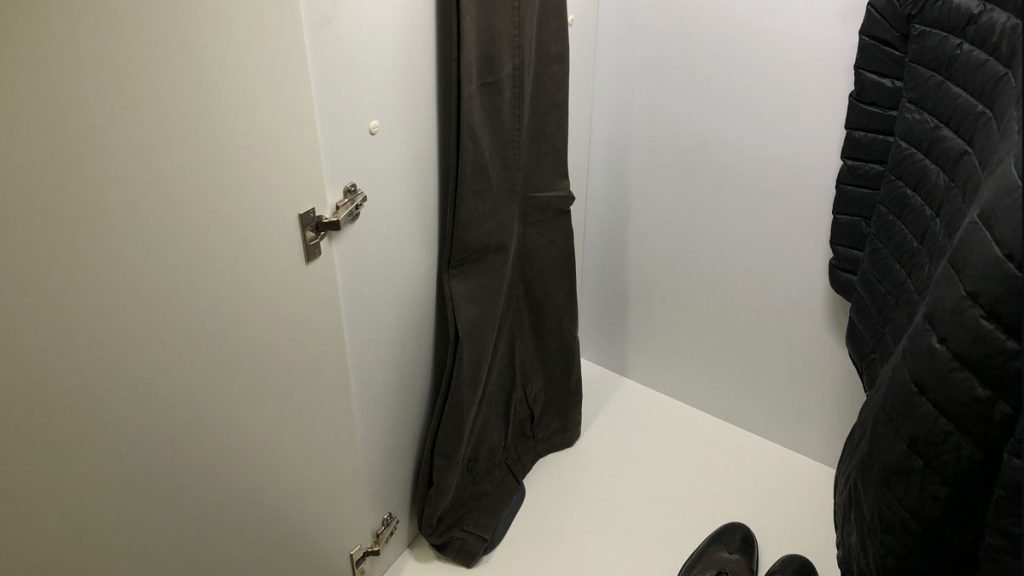
The wardrobe was annoying – and not just because of the coathangers. It was not very tall – see above – it wouldn’t even take the hang of my trousers, and it’s not like I’m 6’5″ or anything.
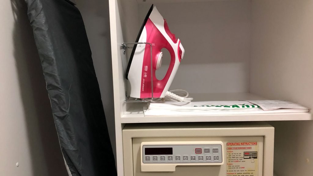
The other half of the wardrobe was occupied by ironing board, iron and safe. Iron cheap, safe, not really laptop size.
Bathroom
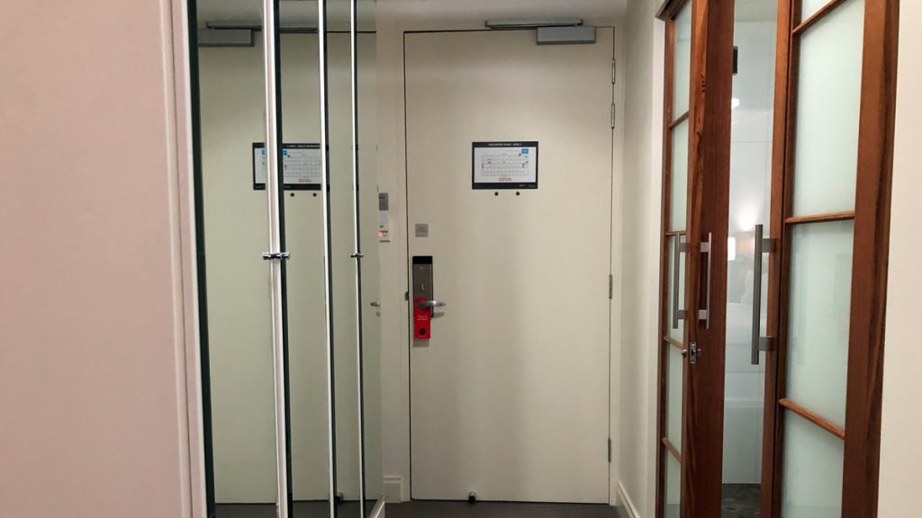
This is where the real oddity of the room begins. On the surface, its a perfectly nice bathroom, despite having double ‘doors that open onto the bedroom, as well as the double doors that provide an entrance from the hallway.
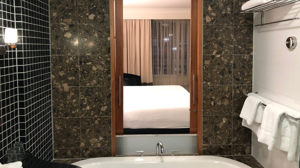
The double doors to the bedroom, are just not well resolved, given that the bath spout and taps share the space. So, on the bedroom side, there are floor to ceiling double glassed doors, but from the inside, they are cut off at bath height.
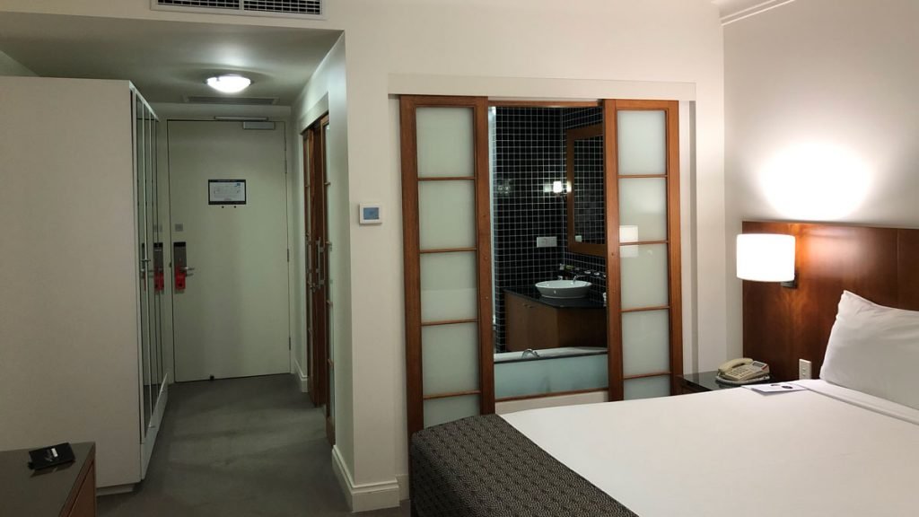
See, it just looks weird, as well as serving little purpose.
Oh, and did I mention that the bathroom had that whiff of ‘drain’ or possibly ‘sewerage’ about it, which contrasted markedly with the scent of the rest of the room.
Having said that the one basin was fine, and the bath deep. I didn’t mind the dark brown marble, but the black tile with white grouting, contrasting with the white tiled wall was a bit too contrasty for my tastes.
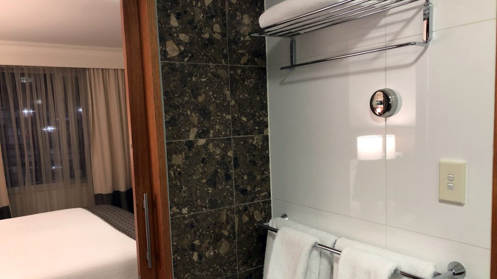
The room comes without robes – which I know is a cost-saving, but for me reduces the relaxing nature and comfort of a hotel room.
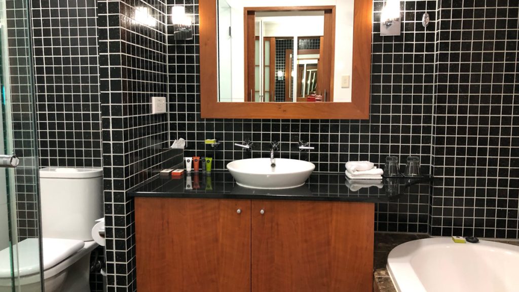
A bit of a trip around the bathroom.
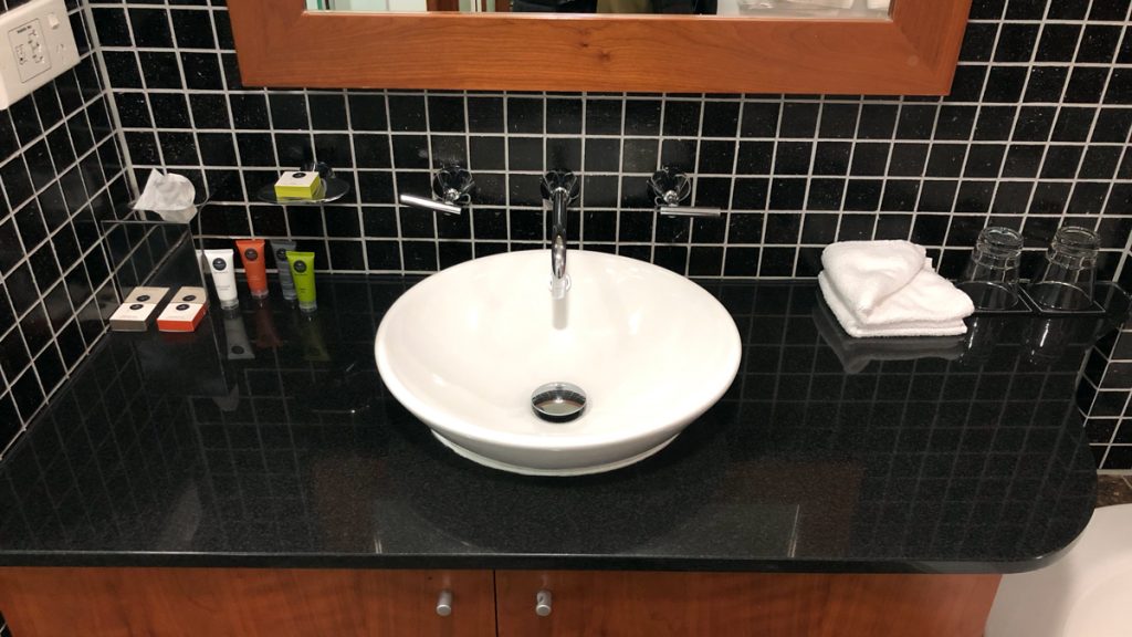
See the weird glass lip divider thingy they have had to introduce on the ‘doors’ into the bedroom from the bathroom?
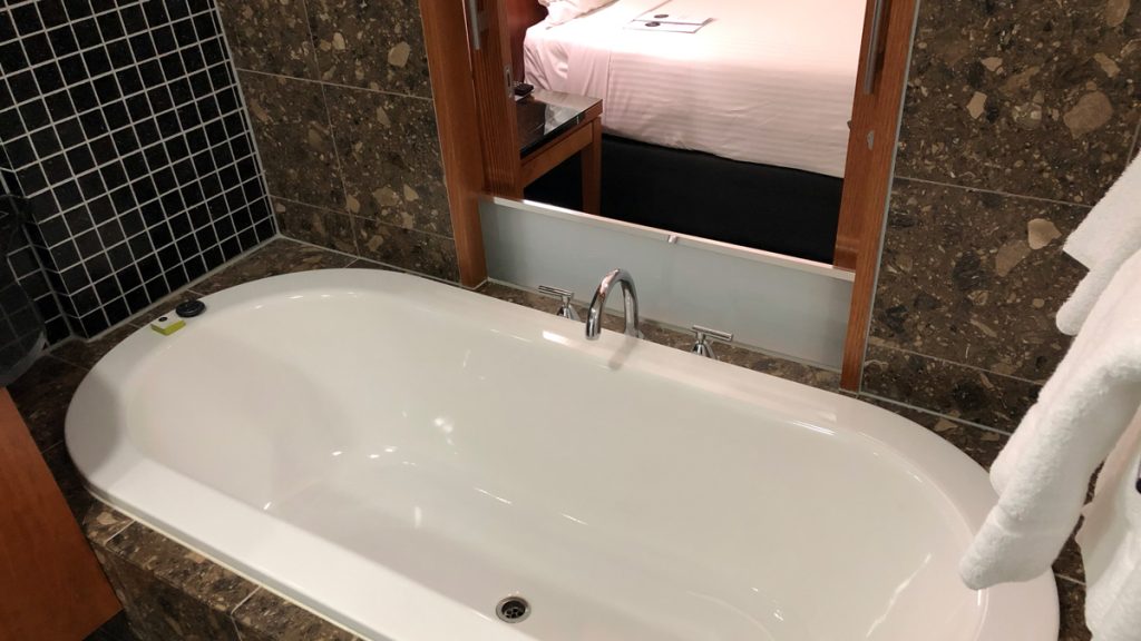
The bath is nice and deep, but strangely truncated, so it sort of promises a great bath, and then doesn’t deliver.
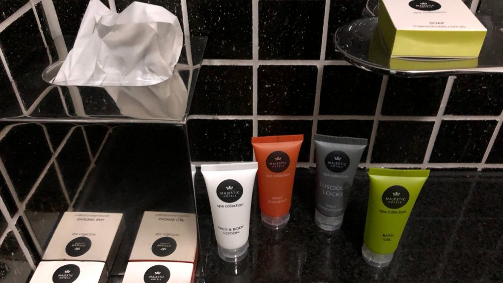
Amenities
These are branded after the hotel group: Majestic Hotels – spa collection, which seems a little odd, given that the hotel has no spa. The brand is nothing to write home about, but perfectly pleasant, although a bit chemically.

Restaurant
The Restaurant down on the ground floor is Culshaws and is more of a cafe operating during the day and into the evening until 9 pm. It supplies room service 24 hours – or does it? The in-room information is contradictory – on the one hand, it says last orders by 9 pm, and on the other offers a 24-hour menu? I can’t comment on the food or its availability, as I didn’t attend the restaurant or order any room service.
Fitness
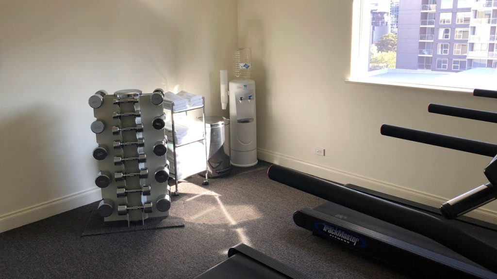
The Gym is a bit of an excuse with pretty flimsy cheap, domestic style treadmills and bike, and a set of weights.
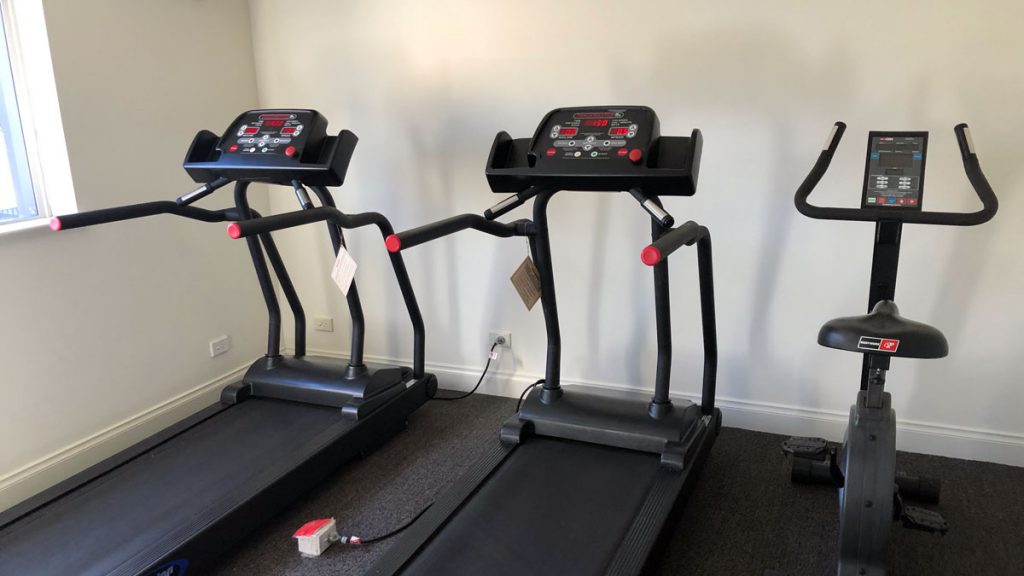
Having inspected it, I didn’t use it, opting for a brisk walk in the Botanic Gardens as a preferable alternative.
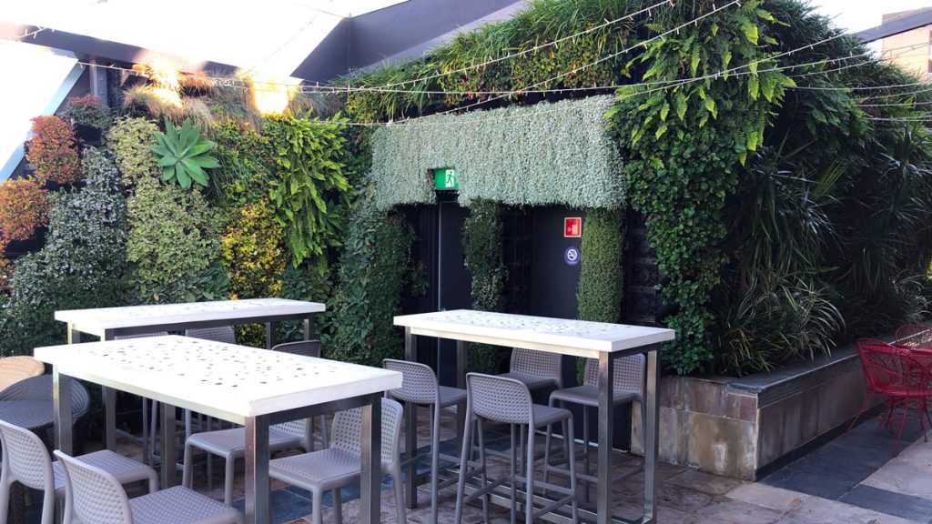
Roof Garden
I popped up to the roof garden for a look, since this is part of the hotel’s name. This was May, and it was on the cold side, and the garden didn’t appear to be operating. It’s nice enough if broken up space on the 7th floor of the building, which also incorporates some function rooms and offices, and the gym space.
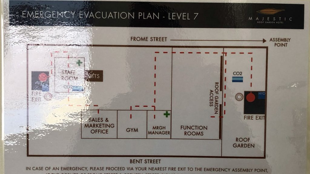
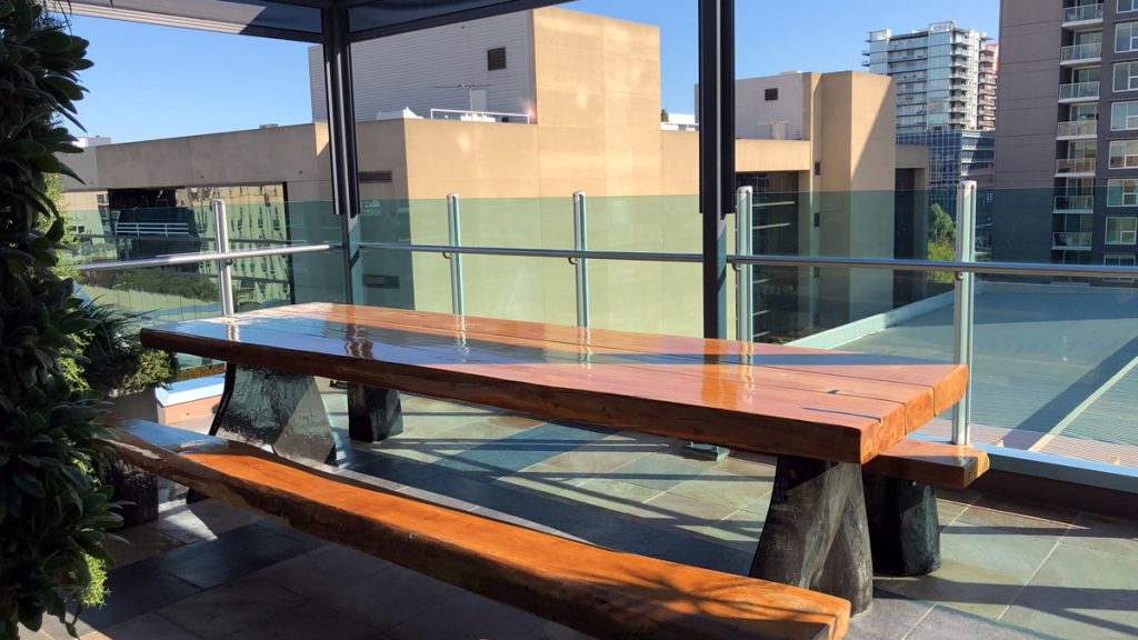
It covers a range of balcony and other spaces with several types of tables and chairs from bar height to restaurant height.
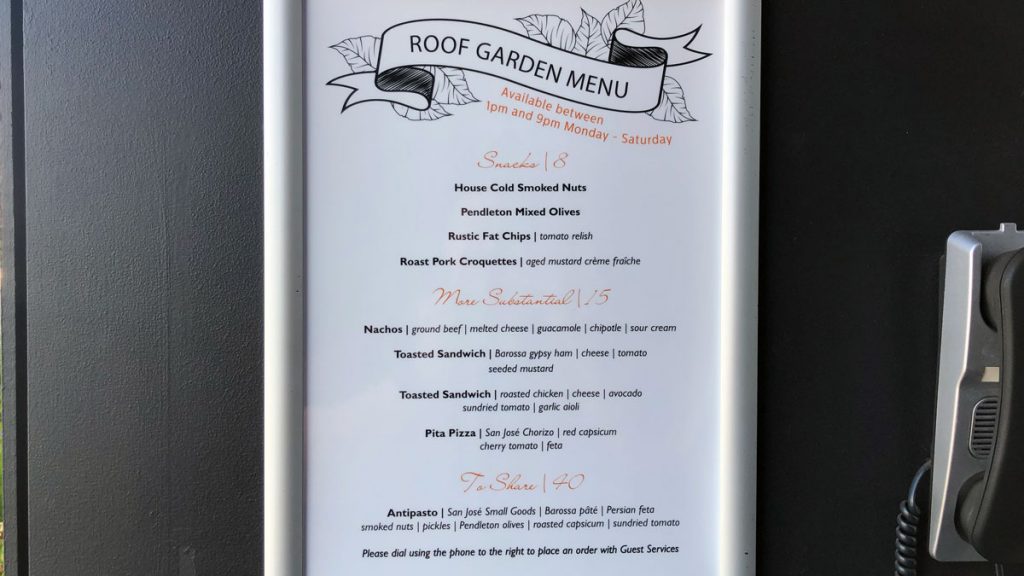
You can dine in the space, and there is a basic, but interesting menu available – when it’s operating.
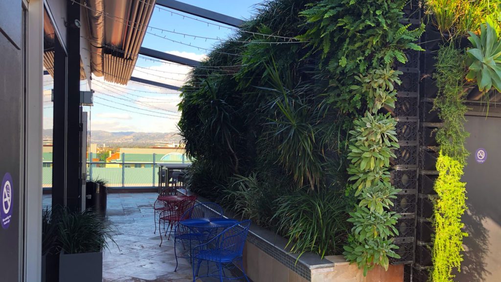
The garden part of the Roof Terrace basically consists of a couple of living walls, some faux grass, and some potted plants.
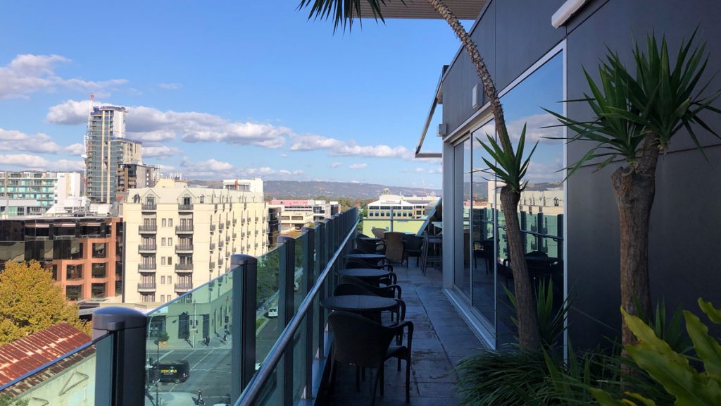
It’s pleasant enough, especially given some warmer weather, actual staffing, a drink and a snack.
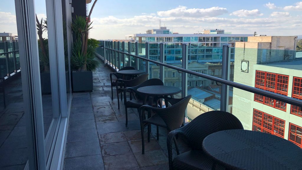
The views across the city and towards the hills are quite pleasant.
My Stay
Let me start by saying, I would not choose to stay here again. It has all the basics, but it just doesn’t gel, and I didn’t get a good feeling about the hotel.
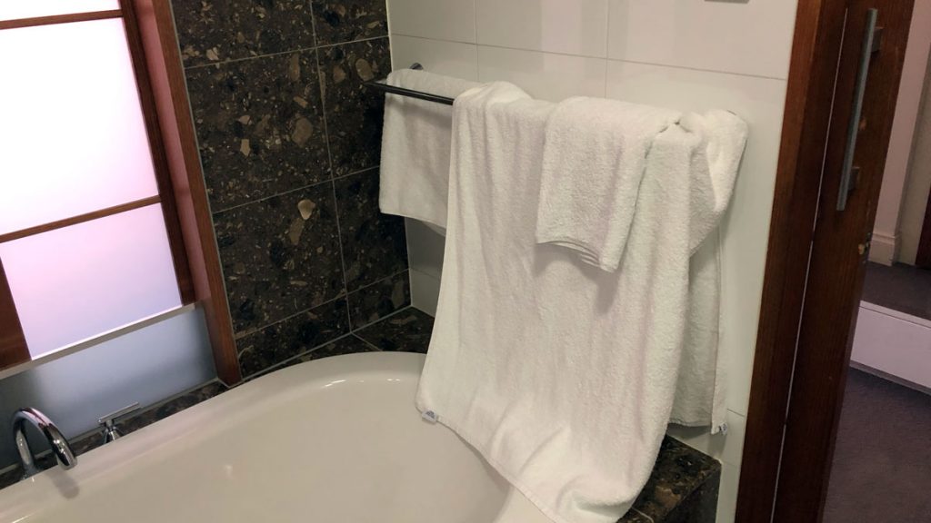
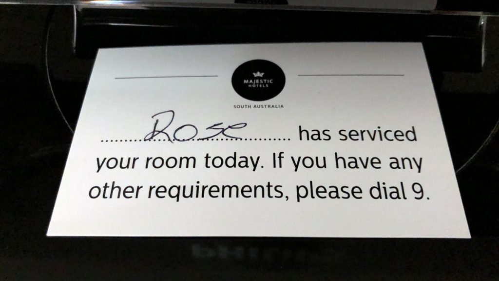
It’s hard to pin down why this hotel is not my cup of tea. Its something about the harsh light, the cheap scent, the badly designed bathroom, the dense foam uncomfortable pillows, and the lack of service. See what the cleaning staff did with my towels (above). There is none of that ‘fresh’ feeling about the guest experience here.
2PAXfly Takeout
This hotel is not for me. While on the surface it has most of the essentials, it lacks the service and forethought of a good hotel. But some like it – its gets a ‘Supurb 9.2’ guest review score in Hotels.com
For me, the following failings make this hotel a miss for me
- No bathrobes
- No feather pillows
- no door spyhole
- stark fluro lighting
- unclear room service
- smell
- inadequate gym
- anti-theft coathangers
- carpark outlook
- clinical feel
On the positive side, the public spaces, corridors and lift foyers, and well designed and pleasant to be in, as is the Roof Garden – if it had been operating. The rooms are also large.
Its as if someone built the hotel from a description of a hotel to someone who had never stayed in one.
Review
65%
Summary A simulacrum of a hotel room












What did you say?