
Western Sydney International Airport: preliminary designs dissapoint.
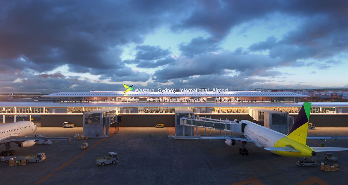
Two world-famous architecture firms, Zaha Hadid Architects and Australian firm Cox Architecture were selected to design the new Western Sydney International Airport precinct, scheduled to open in 2026.
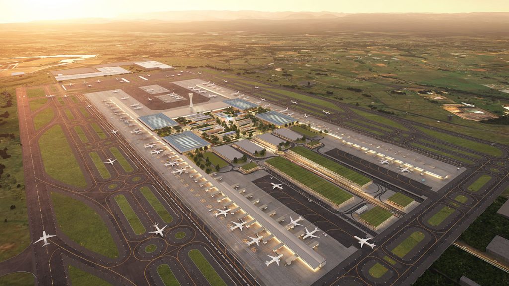
They can’t think much of the people of Western Sydney if this is what they came up with!
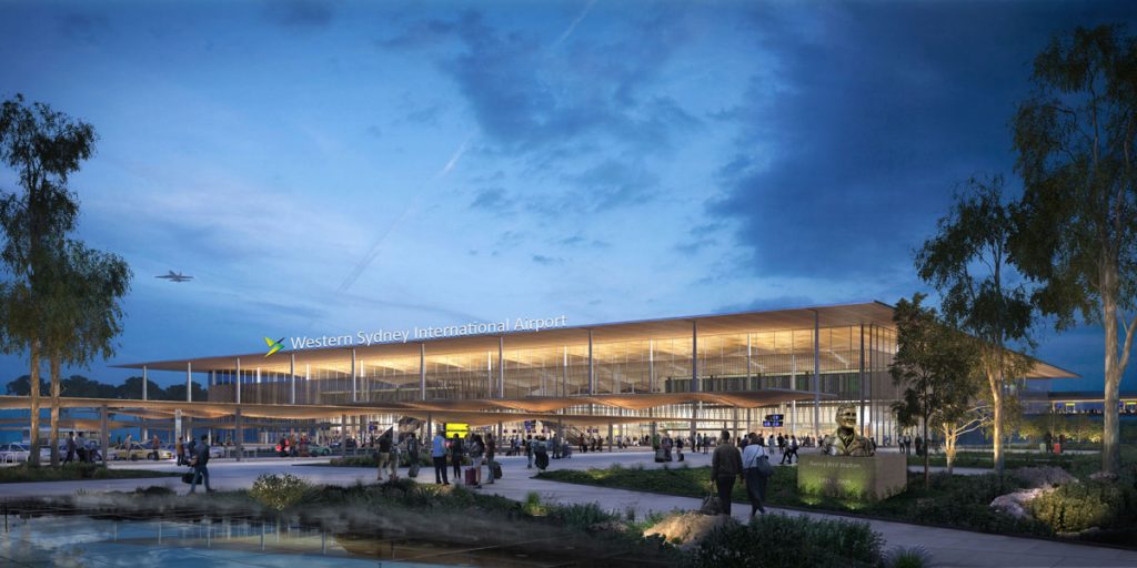
Apparently, their brief was to design an airport that the people of Western Sydney can be proud of. Well, I don’t think the people of Western Sydney, or the two world-famous architecture firms should be proud of these concepts.
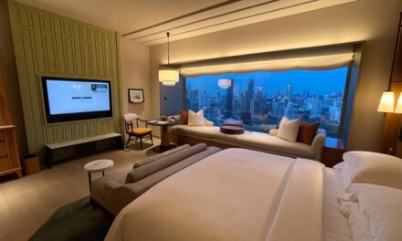
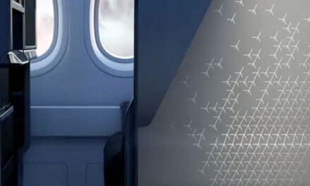
To give you an idea of how unimaginative these designs are, we just need to compare them to other work by the same architects:
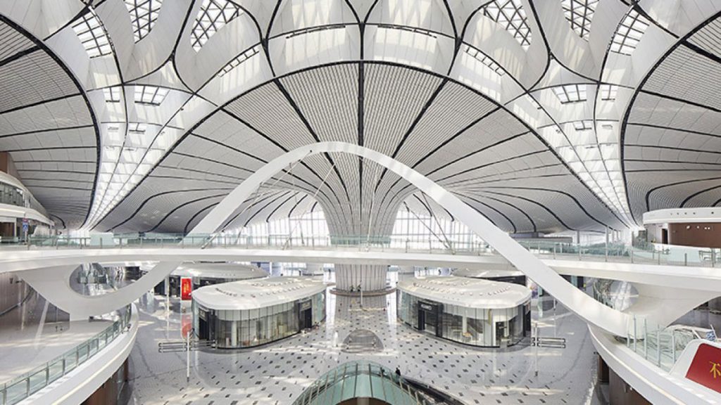
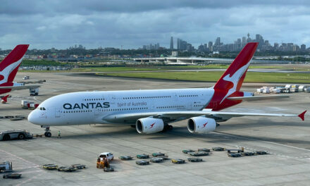
. . . and even Cox Architects work at the current Sydney Airport:

Is it only me that thinks that the renders below are boring and derivative.
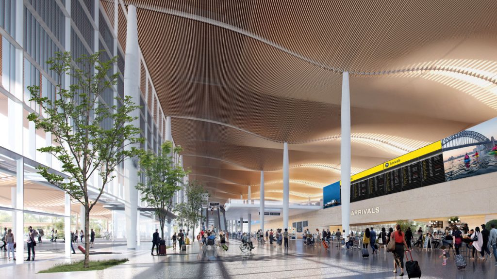
Now I know that ‘concept’ plans can change a lot by the time of implementation and building – let’s hope that’s the case here.
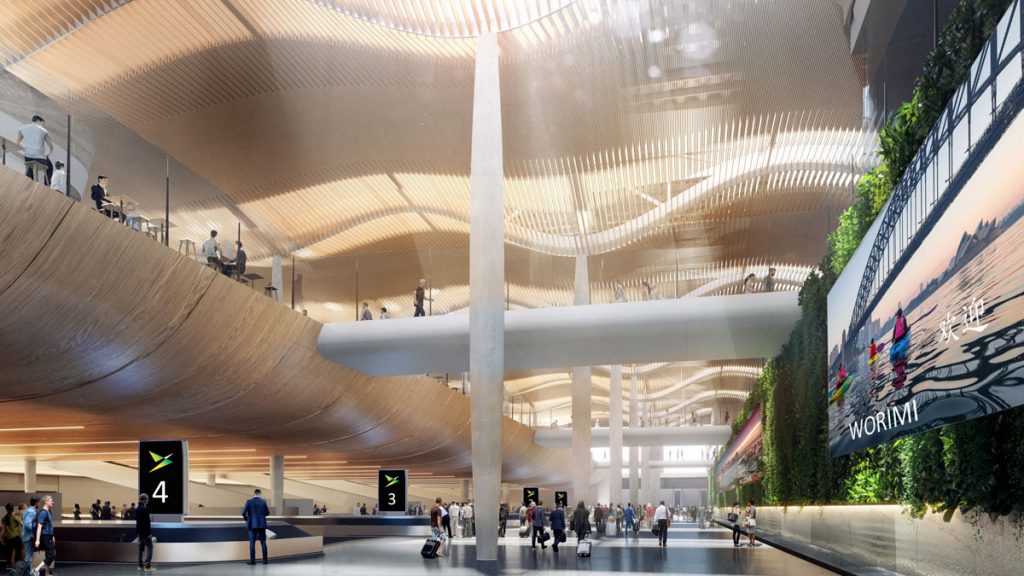
Here is what the web page has to say about the nature of the concept designs for the Western Sydney International (Nancy-Bird Walton) Airport. Do you agree?
The exterior of the terminal complements the natural landscape, paying tribute to the local area.Our key focus is always on the customer journey within the terminal and that shines through in the designs. Arriving passengers will be greeted by landscaped gardens within a grand public plaza with a great choice of retail, dining and entertainment. When they enter the terminal, the lighting and curvature of the soaring timber ceilings will help to guide them through the building while stunning vertical gardens will provide an inviting and relaxing start to their journey.
If ‘relaxing’ is a synonym for ‘boring’ then this design is a success. The web copy goes on:
Western Sydney University students and Dharug community members were engaged during the initial concept design development. Engagement with government, industry and community stakeholders will increase as we drill down into the design details.
Sounds like they are blaming the students and Dharug community, with the government and industry stakeholders held out to save the day.
2PAXfly Takeout
Am I being too harsh?
But a box with a wavy roof interior, and its biggest innovation being ‘stunning vertical gardens’ doesn’t really seem to me to be statement architecture worthy of an international city.
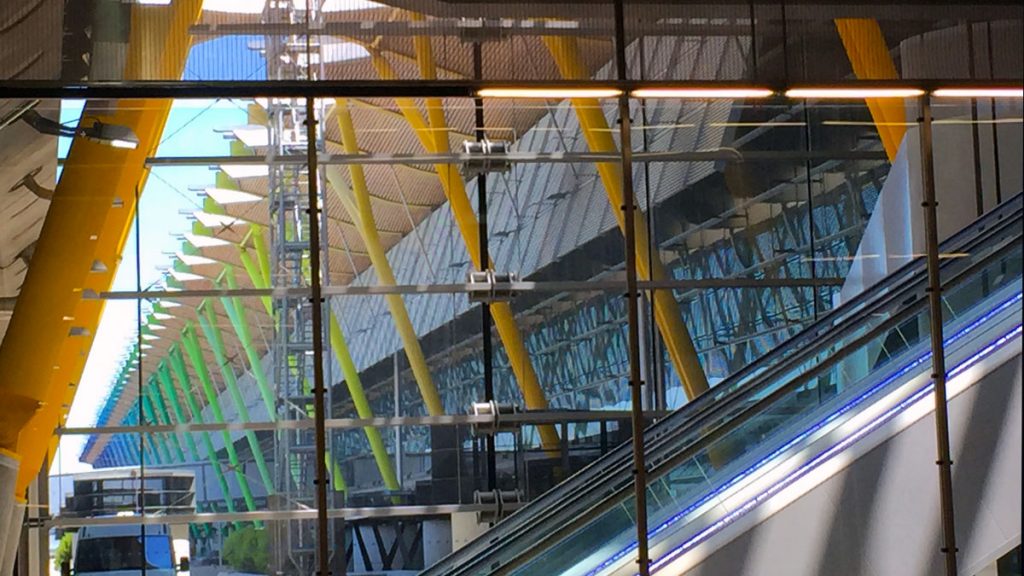
Surely we can come up with a design that is more than just fit for purpose? Why can’t we build something that is also an architectural gem? We did build the Sydney Opera House, didn’t we?
Oh yes, and they are releasing these designs before they release the intended flight paths to the public. Cart before horse?










What did you say?