
Four Seasons Sydney – Presidential Suite (thank you very much!)

Series: Honeymoon - South America
- Trip Report – Introduction: Honeymoon – I go to Rio
- Four Seasons – You did it again!
- Four Seasons Sydney – Presidential Suite (thank you very much!)
- Four Seasons Sydney – Club 32 and other amenities
- Review: Qantas Business Class 747-400 Sydney to Santiago
- Review: LATAM 787-9 Business Class, Santiago to Buenos Aires
- HOTEL REVIEW: Hotel Palo Santo, Buenos Aires, Argentina
- Food: Eating in Buenos Aires
- Review: LATAM A320 Economy, LA 7504 – Buenos Aires to Iguazú
- HOTEL REVIEW: Gran Melia Iguazú Falls Hotel
- Review: LATAM flight Iguazu to Rio
- HOTEL REVIEW: Sol Ipanema Hotel
- REVIEW: Admirals Club Rio Airport
- REVIEW: LATAM flight 2419 Rio to Lima
- HOTEL REVIEW: Cost Del Sol Wyndham Airport Hotel, Jorge Chavez International Airport, Lima, Peru
When you get into a hotel room, you lock the door, and you know there is a secrecy, there is a luxury, there is fantasy. There is comfort. There is reassurance.
Diane von Furstenberg
Content of this Post:
Introduction
This was our wedding night and the start of our honeymoon – which explains why we were staying in a hotel in our home city.
We had booked a two-night stay in a suite, but through some hotel bungling, later topped by overwhelming hospitality on the part of Four Seasons Sydney, were upgraded to the Presidential Suite.
Cost and worth
We had booked a one bedroom Full Harbour Suite, that came with a rate change during the stay:
– 16 Feb – AUD$1,160
– 17 Feb – AUD$870
Total: AUD2,030 including tax
This compares to the rack rate for the suite of AUD$6,343 per night – so a total of AUD$12,686 for the two nights.
So although over AUD$2,000 sounds a lot, when you get six times that in value – seems cheap!
I’m going to skip the slight kurfuffle of our arrival, which was more than adequately remedied by our upgrade. If you want to read all about the misstep, then go here. But just like we did – lets start this review with a clean slate.
I’m just going to review the suite here. It’s a suite, and it’s vast, so I am relegating coverage of the Club and the hotel’s other facilities to a later post. Otherwise, you would definitely suffer hotel photo fatigue.
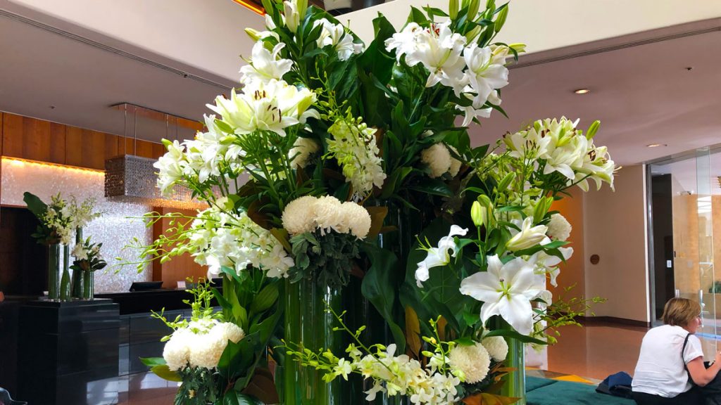
Location and arrival – dated, but Flowers!
The Four Seasons Sydney is located on George Street, just where the Central Business district of Sydney gives way to the oldest part of Sydney: ‘The Rocks’, which runs along the western edge of the spectacular Circular Quay of Sydney Harbour.
First impressions – mixed
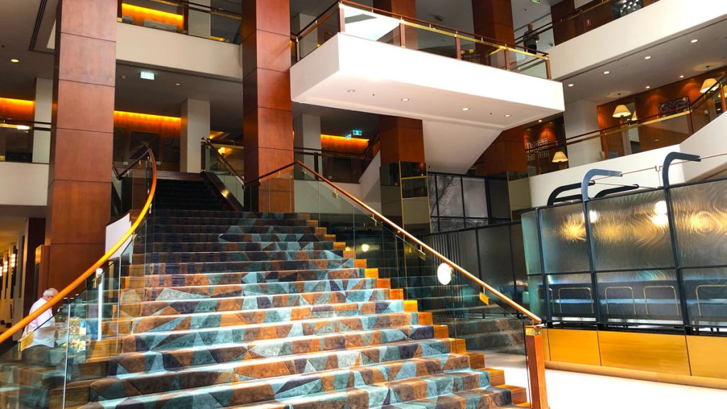
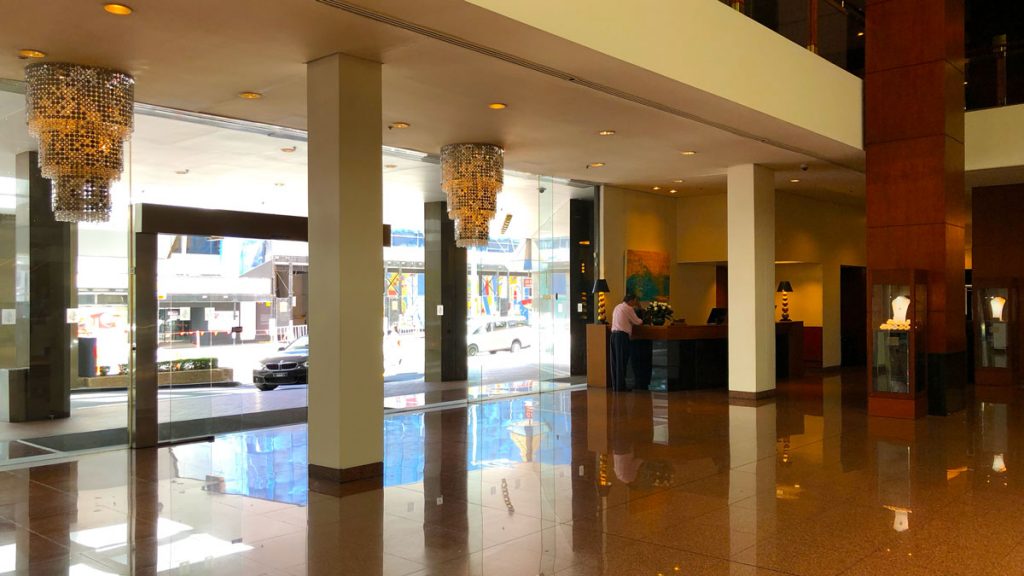
The foyer space is large but lacks a theme, and the expanse of reddish brown granite is imposing but not necessarily contemporary. The use of aquamarine highlights is impressive, but, I’m not sure it is in the best of taste.
The space is vastly changed from its debut in 1983 as the Regent when it featured lots of tubular brass, and the must-be-seen-in restaurant Kables, where Serge Dansereau, plied his impressive culinary skills to the gliterati of Sydney
Check-in, my worst fear confirmed
Check-in was marred by the unavailability of our room. Let’s start when the duty manager Harsh arrived with a bell boy and trolley to transport us from our tawdry basic room in the back blocks of the hotel on a low floor to the 34th floor Presidential Suite.
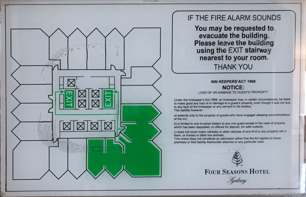
Compare that to the footprint of our original temporary room:
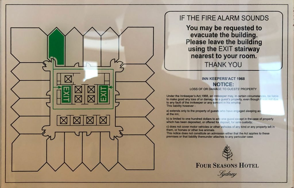
However duty manager Harsh was about to turn the proverbial sow’s ear, into a silk purse, as he introduced us to the Presidential Suite.
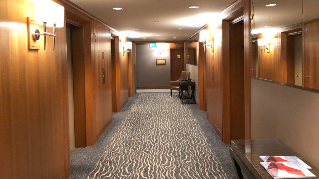
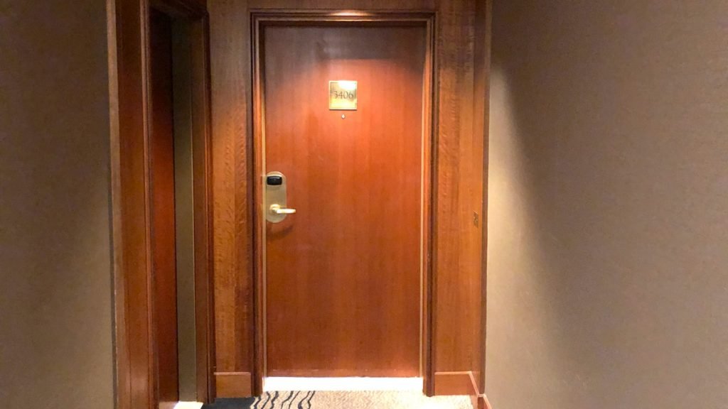
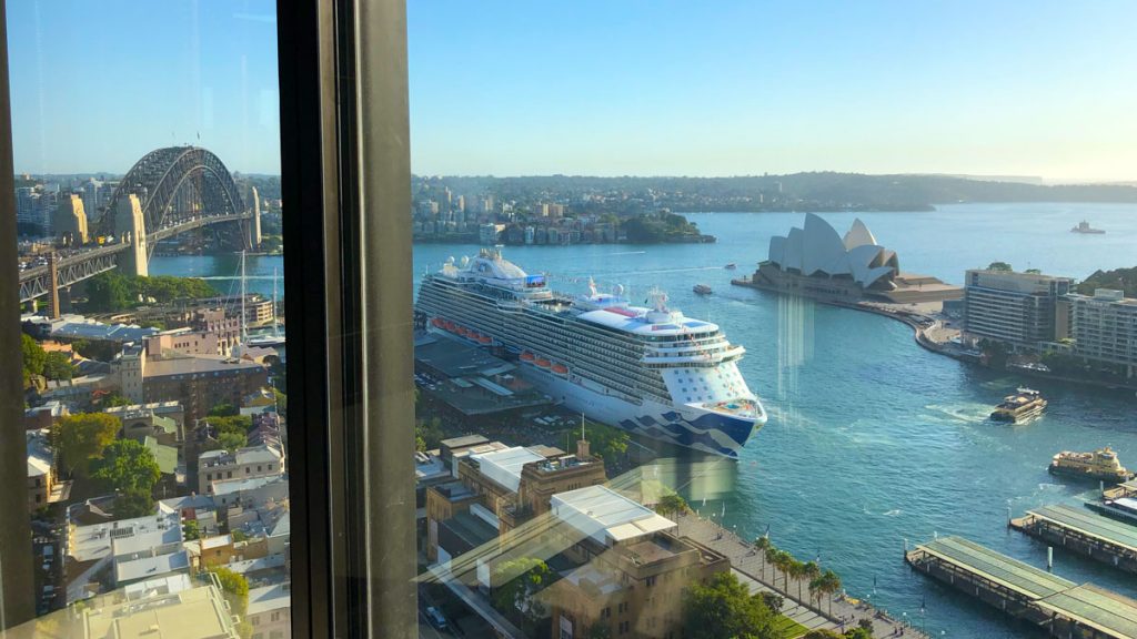
We had quickly repacked our bags, ready to be transported to the new suite. Harsh and accompanying bellboy completed the transition seamlessly. We could tell from the orientation of the door, that we were about to enter a room with stunning views of the harbour instead of our previous tawdry views of the Bradfield highway and entrance to the Sydney Harbour Bridge
History of one of Sydneys modern great hotels
Originally opened as The Regent in 1983 – a brand owned by the Intercontinental Hotel Group has been managed by Four Seasons since 1992 and rebranded as Four Seasons Hotel Sydney in 2002.
The hotel is spread over 34 floors, with a total of 531 rooms, comprised of 498 guest rooms and 33 suites. It has one of the largest outdoor hotel swimming pools in Sydney with a separate whirlpool and sundeck.
In the 1980’s it was famous for its ground floor restaurant ‘Kables’ where Serge Dansereau made his name with innovative cooking, and Sydney society flocked to, like flamingoes in heat.
PRAWN salad. Duck a l’orange. Chicken kiev. Veal schnitzel. Chateaubriand. Lobster thermidor. The menu takes me back to the early 1980s when Kable’s was waiting for Serge Dansereau to turn up and revolutionise the way Sydney ate. Twenty years ago, Kable’s was a three-hat restaurant. Its influence was profound during the Canadian chef’s 14-year reign.
Simon Thomson, SMH July 7, 2009
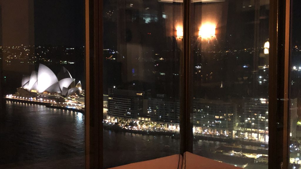
Presidential Suite or Trump suite?
Cleverly, the entrance to the Presidential suite does not immediately give away its greatest asset – the view. It tempts you with glimpses, but you have to fully enter the suite, and head for the lounge area before it reveals itself entirely.
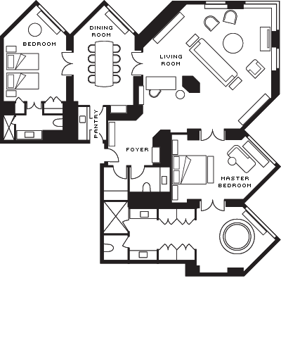
It’s big right?
This suite is large, 156 m2 (1,679 sq.ft.) large.

To the left of the entrance is a padded bench (perfect for placing the bags with your wedding presents) and to the right separate powder and cloakroom.

On the left of the entrance foyer, is the introduction to the lounge.
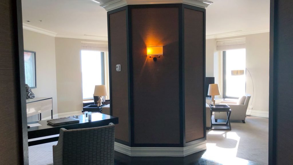
Directly in front (beyond that hexagonal pylon, is the lounge proper with its amazing views. To the left is a desk area, and the entrance to the dining room, with kitchen, 2nd bedroom and bathroom beyond. To the right is a further reception area, and then onto the master suite consisting of a bedroom, and a vast combined bathroom and dressing room.
The vast lounge
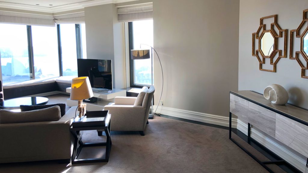
The suite has a series of zones and rooms. The large living area has several places to sit, magnificent views of Sydney Harbour, And is spacious and contemporary in its design.
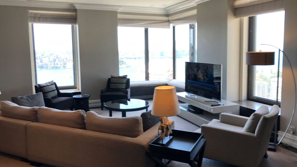
Overall the furnishings are fairly neutral, and given that view, you don’t really need anything to distract your gaze.
The main sitting area was extremely comfortable. We spent a couple hours here after the wedding reception, winding down, and de-briefing with our wonderful friend and and event advisor Lisa. The view filled any gaps in the conversation.
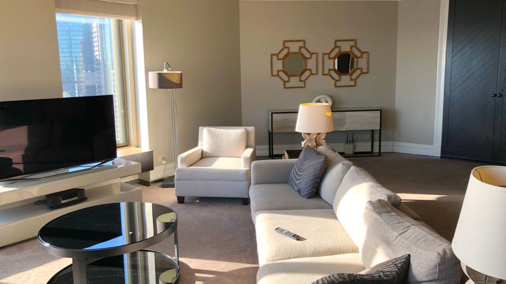
We spent a little of Sunday sprawled on this lounge, and over those chairs, recuperating from the night before, and resting up before a catch up with friends and family later in the day.
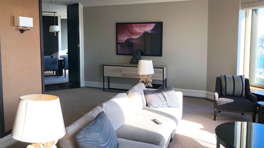
The sun streams into this area in the morning. There are blinds to be drawn, but yet again ‘the view’!
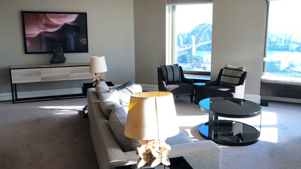
There is oodles of space in this living area, and plenty of places to sit, including right up against the windows on banquettes.
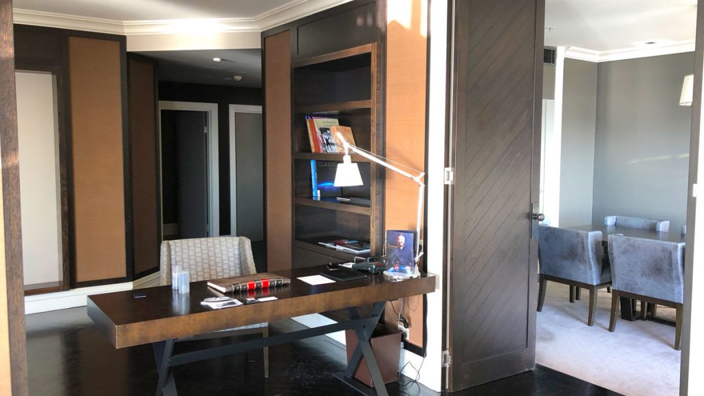
A Desk is not quite the same thing as a study
There is a desk area adjacent to the entrance. It opens onto the lounge and is really just a section of the living area rather than a separate room. For accessing the internet, while staying engaged in the action – it works. However, if you had to do some serious work, or hold a meeting, an actual study would be a much better option in this vast suite. Mind you, you could probably use the dining room on the right as your meeting room.
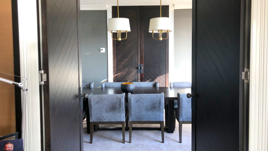
Everyone needs a Dining Room in their hotel suite
This is a stunning room, all rich greys, dark browns and neutrals. We spent virtually no time here – mainly because we ate no meal here – opting for the lounge for breakfast.
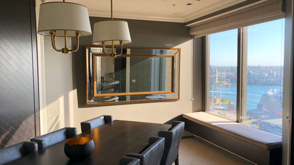
You get stunning views into circular quay, with a well placed mirror which reflects the view as you enter the room. My head would be out the window inspecting cruise ships if I ever attended a meeting here.
What’s in the Pantry?
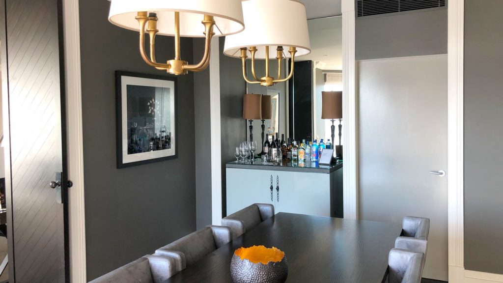
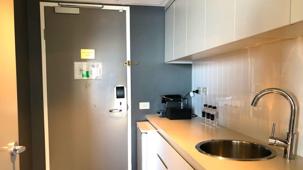
The Dining Room is serviced by a kitchenette that can be accessed directly from the corridor, or from the dining room. Its more a preparation area rather than a kitchen, as there are only fridges, and not stove or oven.
We need a second bedroom because?
This is accessed from the Dining Room. It’s an odd arrangement on the face of it but it places the two bedrooms at opposite ends of the suite, which is a good thing.
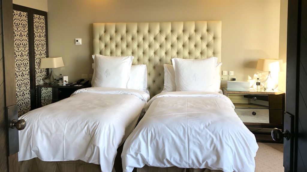
The decoration of this bedroom and bathroom echoes that of the Master Bedroom – althought he colours are more yellows than greys.
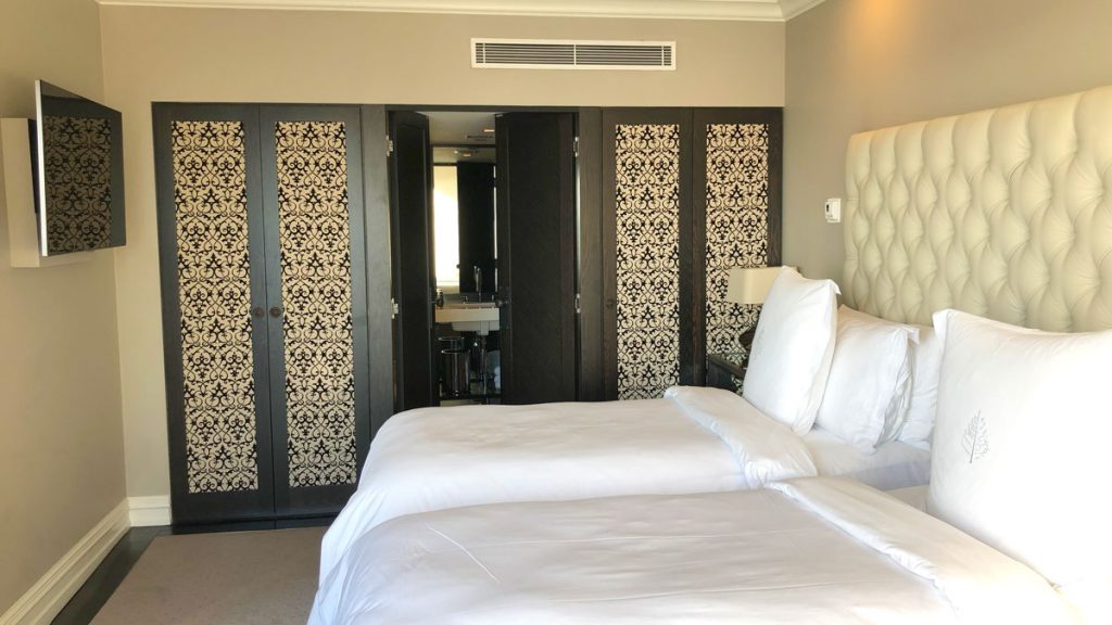
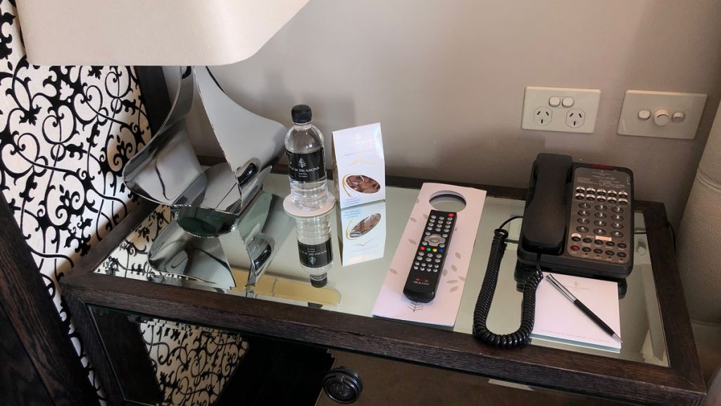
Bedsides were well populated with everything from phones and remote controls through to notepaper and water. A little too many, for my taste making the table verging on the untidy. But that’s the price you pay for amenity. I suppose the alternate is a leather box to hide things in – but that solution has its own problems. Note the electrical outlets – could maybe do with a refresh.
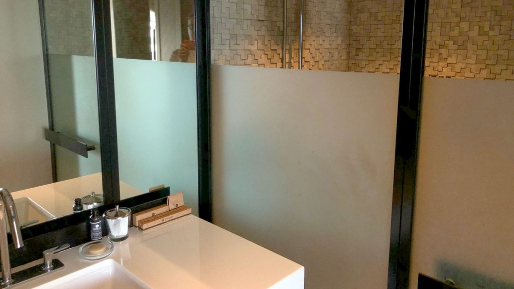
I somehow managed to forget to get shots of the sinks in the master bathroom, but the partial shot of the one below from the second bedroom echo’s the set up and design of the master.
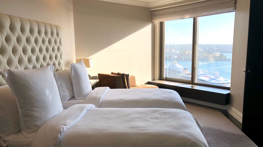
And of course, you still get the fabulous view from the bedroom:
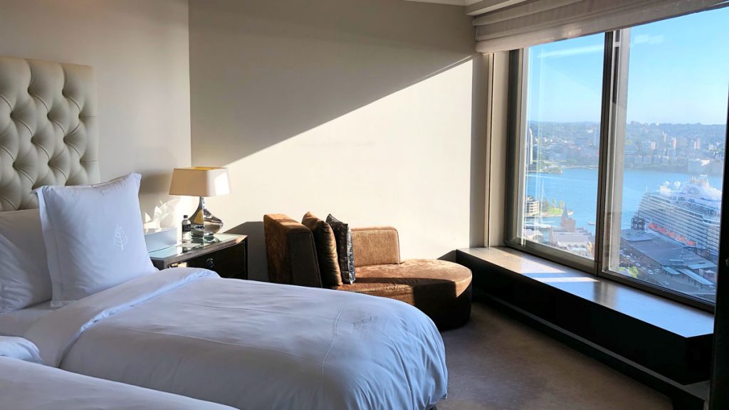
And in case you can’t get enough – here’s another shot – with more cruise liner in Circular Quay.
A master bedroom suite as big as my house!
Well, we were staying here after our wedding, so, as they say, here was where all the magic happened! (The person who thinks that has never organised a wedding!)
The master suite was massive, including a bedroom with a seating area, a literal bathroom, wardrobe area, and then sink, shower and toilet area.
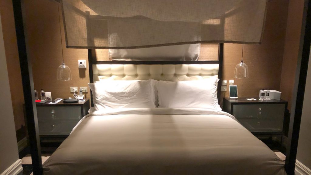
The bed, and bedding as you would expect was stunning, soft, cocooning, and delightful. The room seemed serviced virtually every time we stepped out.
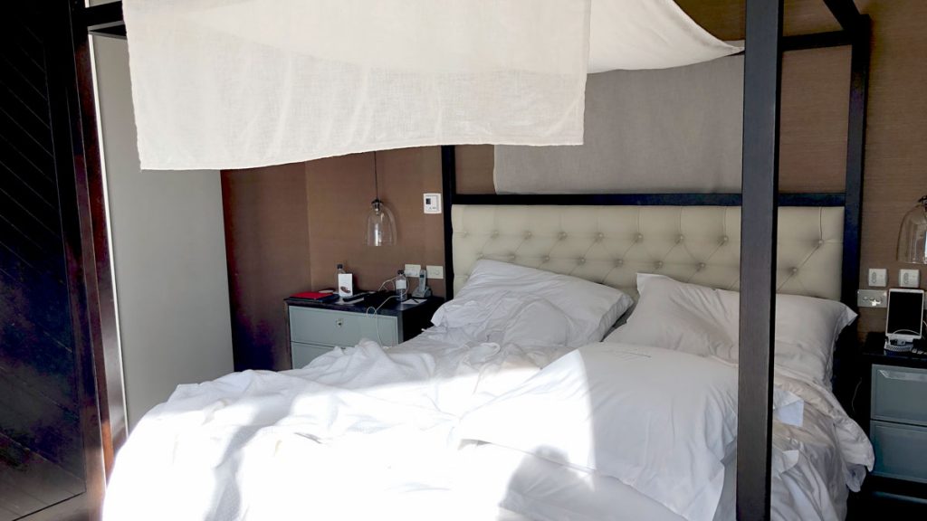
The actual bedroom part of the master suite, was quite cosy, which I appreciated. It still had enough room for a chaise lounge, and a TV on the wall that could be angled for viewing from the bed.
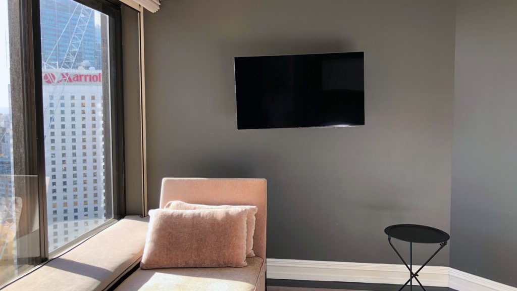
The greys, cream, black/brown and dusty pink worked well in the room, and added to that cosy feel.
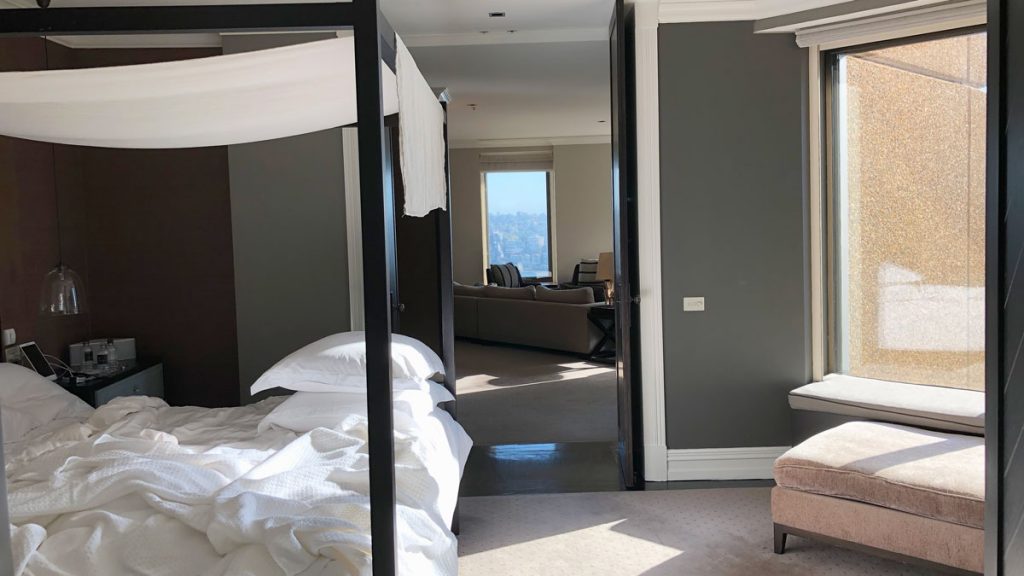
Yep – you almost need to call an Uber.
A bathroom mastered
The entrance to the bathroom is behind the point of view of the above image, and was divided into 4 areas, first a wardrobe and dressing area – or actually two walls of wardrobes facing each other. Love the lined and padded wardrobes, not to mention the copious hangers.
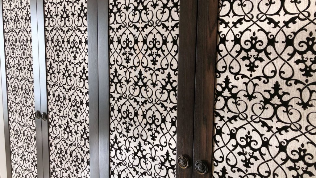
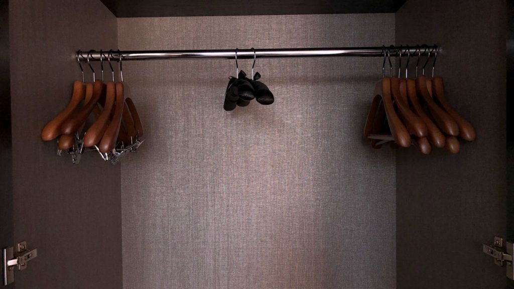
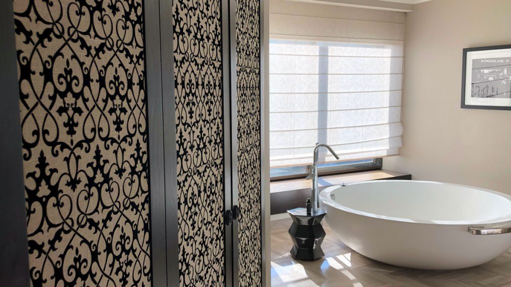
Take a note of those floor tiles – you will see the design repeated in the carpet of the room, but in a different palette.
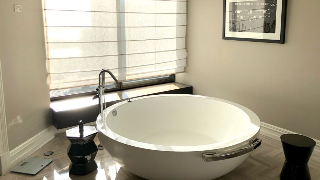
The bath is deep, takes for ever to fill, and is not the best shape to relax in. It looks stunning, but lacks practicality.
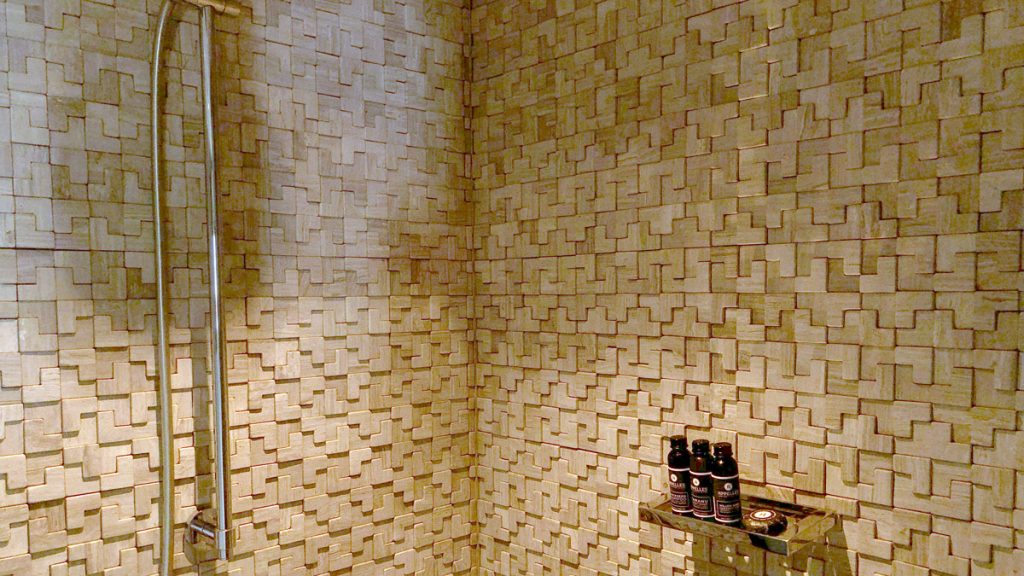
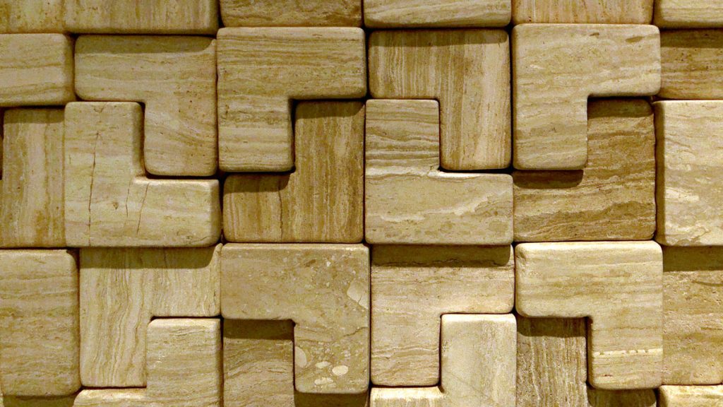
These little ‘L’ shaped tiles cover the walls of the shower and the toilet. Because they are in relief, despite the hardness of the stone, are amazingly sound absorptive, and soften the noise of the shower.
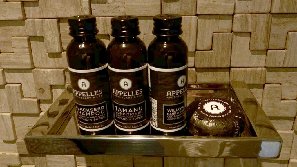
Amenities are Appelles – a brand I think is so-so. I like the scent, but find them a little chemically. I am also not wrapt in the design.
Separate basins, separate mirrors, opposite each other and a shaving mirror, and plentiful towels completed the luxe feel of the bathroom. Sorry I somehow didn’t get any good shots.
2PAXfly takeout
What’s not to like when upgraded to a Presidential Suite, with sweeping views of Sydney Harbour and Circular Quay?
Four Seasons consistently rectifies missteps in service with dramatic upgrades. Not just one class, but take me to the top. I have experienced this in multiple hotels that the groups manage, and seems to be standard operating proceedure. Once upgraded, they then deliver superior service.
There are few hotel suites in Sydney that can match the views and the service values of the Four Seasons brand.
This vast suite is perfect for a special event, or entertaining a couple of dozen of your nearest and dearest.
After the initial snafu – this two night stay was a perfect start to our married life, and a wonderful introduction to our six week sojourn in South America.
Review
90%
Summary The most spectacular thing about this suite is the view. The decor is great but may be due for a refresh in the near future. Who's complaining? We were upgraded










What did you say?