
HOTEL REVIEW: Mayfair Hotel Adelaide – what you can do with an old insurance building
Details
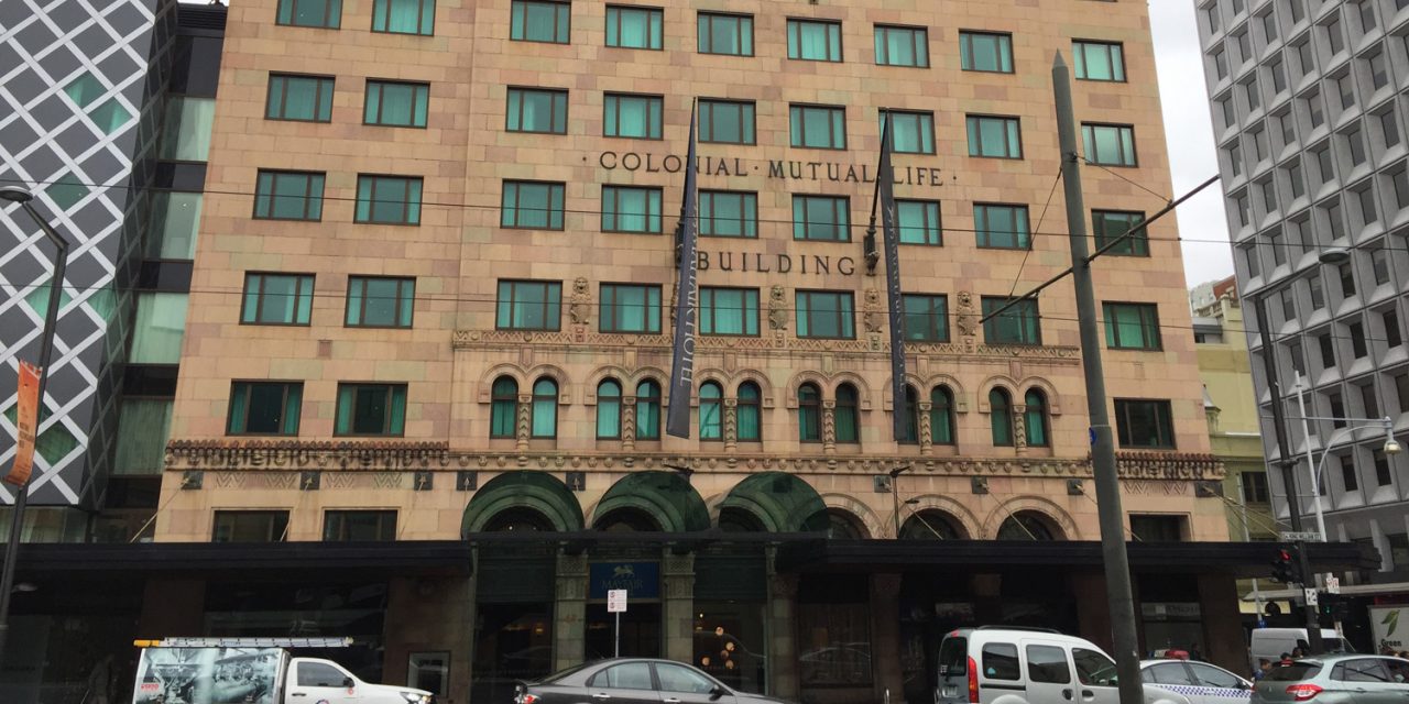
Mayfair Hotel
45 King William Street, Adelaide, South Australia
+61 08 8210 8888
Booking: Via Hotels.com
Room: Deluxe King Room, 708
Rate: AU$540 total for two nights
Stay: Two week nights, May 2018
Inclusions: Free WiFi & Minibar; 10th night free on Hotels.com
Guests: younger, business and leisure
History
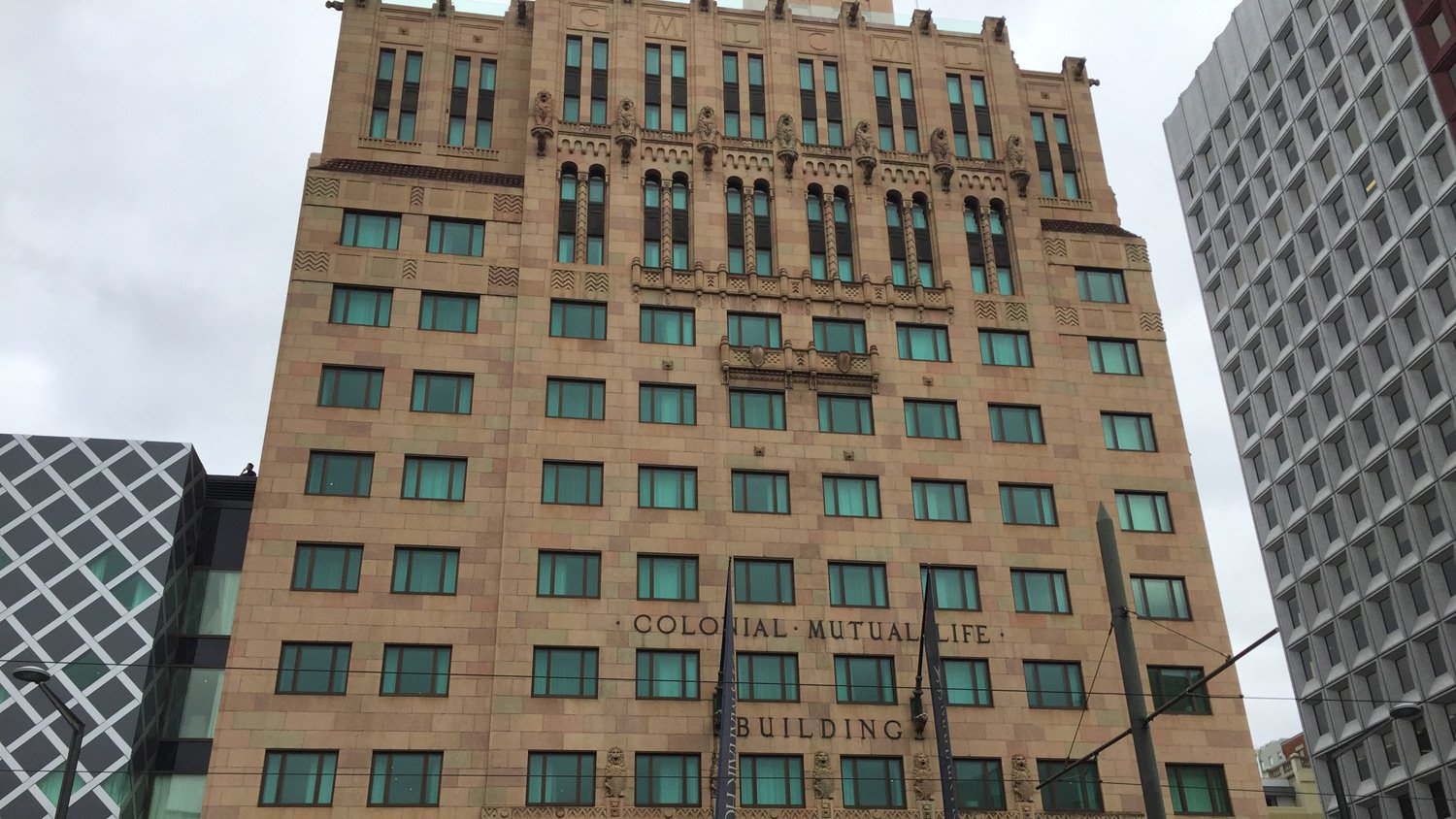
The Mayfair Hotel, opening in January 2015 adding 170 rooms to Adelaide’s small store of five-star hotel rooms.
This hotel conversion of the heritage listed Colonial Mutual Life building on the corner of Hindley Street and King William Street was highly anticipated in Adelaide, one of Australia’s smallest state capital cities. It was the first 5-star hotel addition to the city since the building of the old Hyatt, now the Intercontinental Adelaide.
Location
Adelaide is the city I grew up in. I visit regularly to see my family. When I was growing up, the corner where the Mayfair hotel now stands, represented the Rubicon between the thriving and slightly sleazy entertainment strip of Hindley Street, and the home of Adelaide’s department stores in Rundle Street – latterly Rundle Mall. King William Street was all banks and insurance companies. Now, unfortunately, its a lot of vacant shop fronts, and failed conversions of banking chambers into restaurants. Business seems to have moved south – closer to Victoria Square, and the once great department stores are mere shadows of their former selves. In contrast – the small streets and laneways off Hindley street – Leigh and Peel Streets in particular now are the home of a thriving restaurant and bar scene.
Arrival
There is an entrance on both King William Street, and just around the corner in Hindley Street. Given the traffic lights on this corner, it’s probably easiest to stop on Hindley Street for drop off.
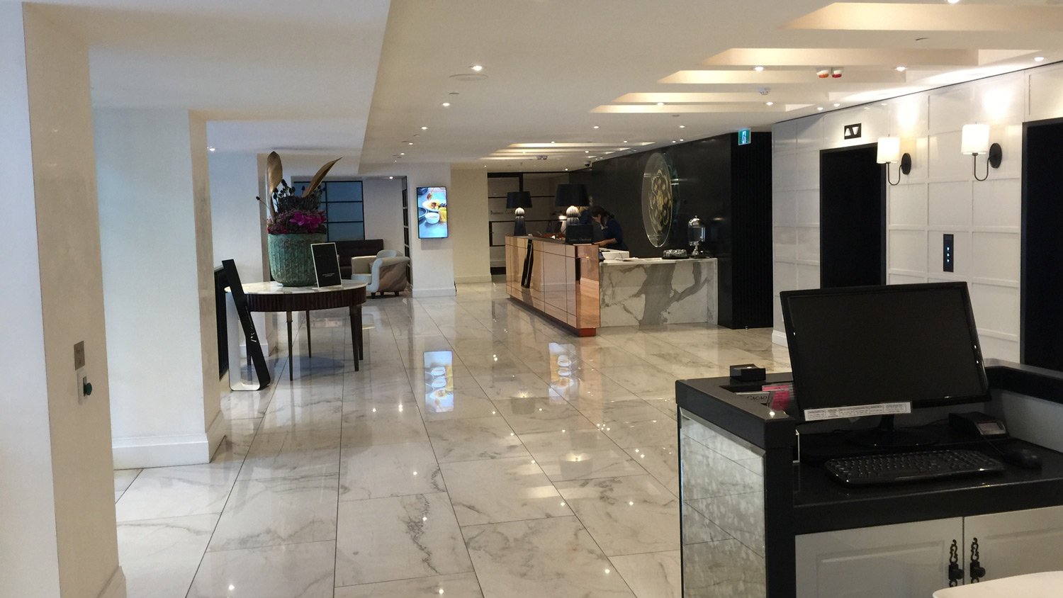
The Mayfair Foyer
If entering from Hindley street, you would enter to the right of the computer on the right of the above image, and if entering from King William Street, you would enter through the gap on the left of this image.
My flight from Sydney got in at around 6:30pm, and I arrived a little after 7pm on a Tuesday evening in May 2018 at the King William Street entrance. Staff at the reception retrieved my booking, and gave me the standard, comprehensive rundown of the hotel and its facilities. There is something confusing about the lifts – which I think is about reserving one or more lifts in the evening to send people up to the champagne bar ‘Hennessey’s’, on the top floor of the hotel.
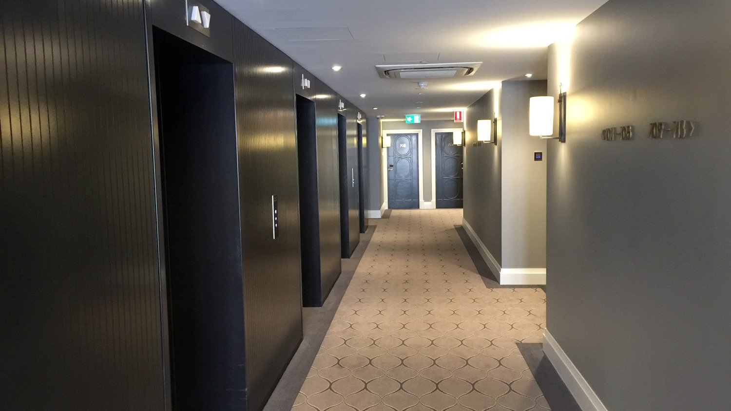
There are 4 lifts, and I took the one to the far right up to the 7th floor.
7th Floor lift foyer
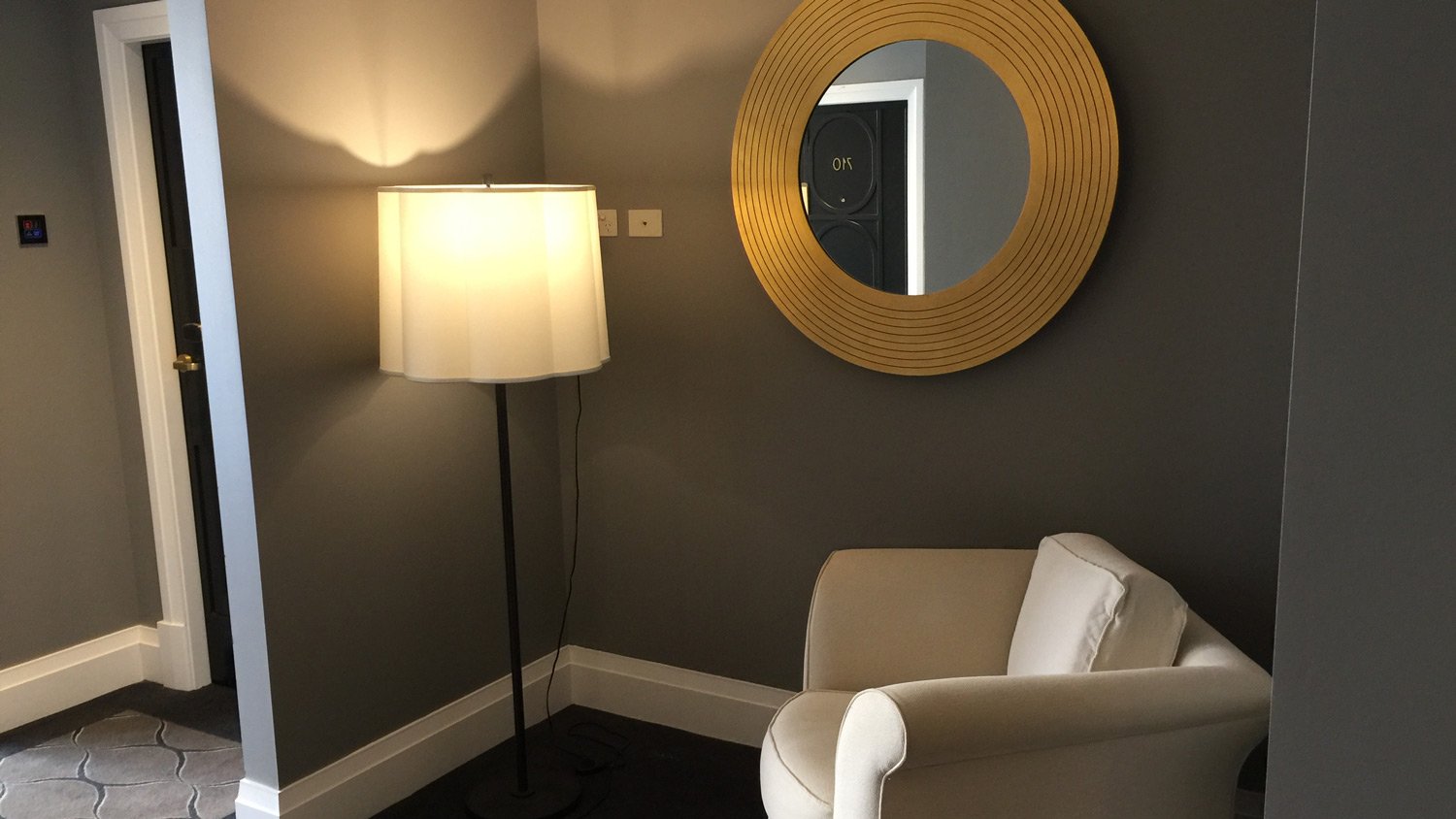
To the left of the lifts was a small sitting area.
Lift foyer sitting area
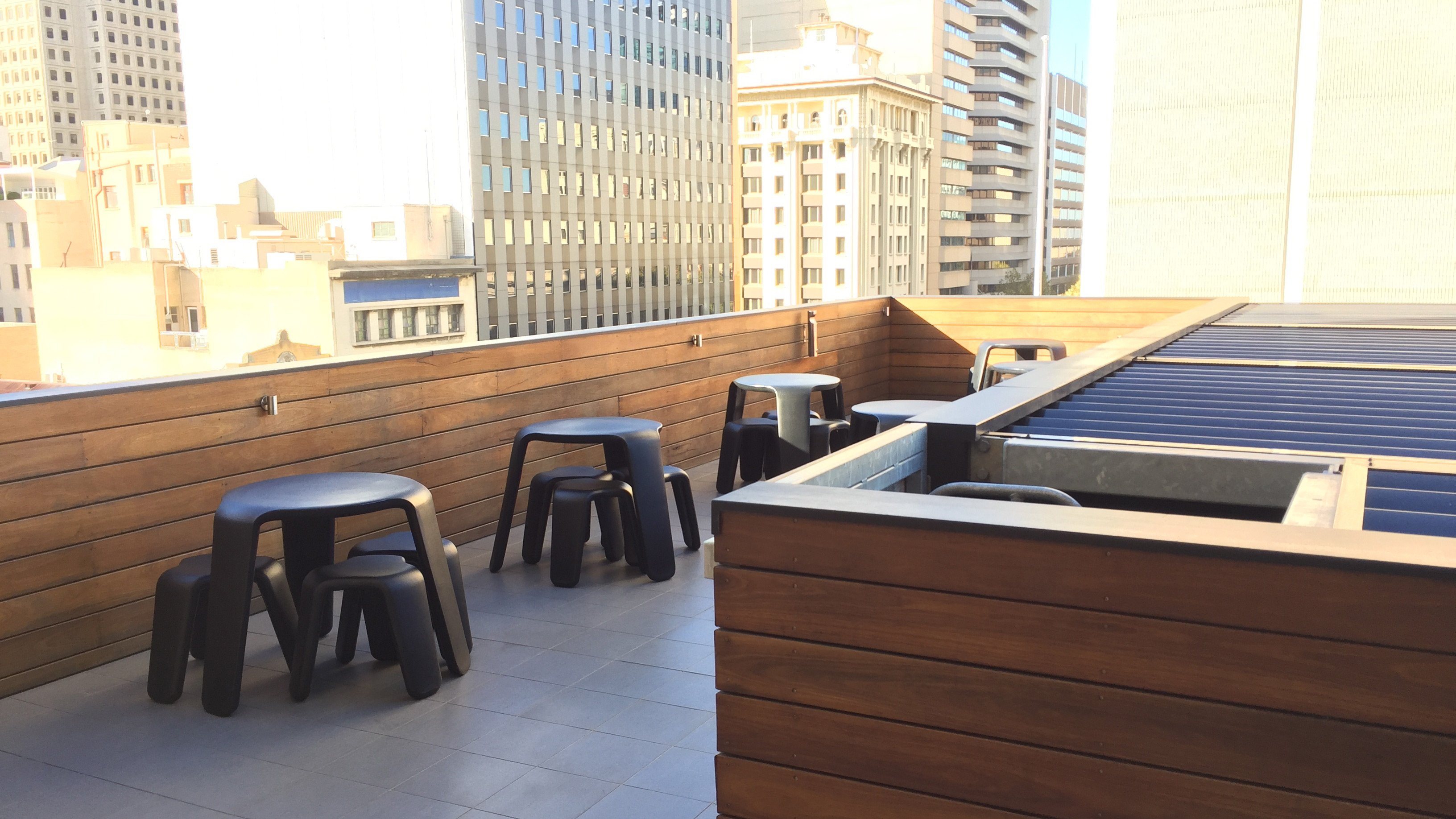
Further left is an entrance (exit?) to the smoking deck. Fortunately, it’s been many years since I have needed to make use of that kind of facility.
The Room
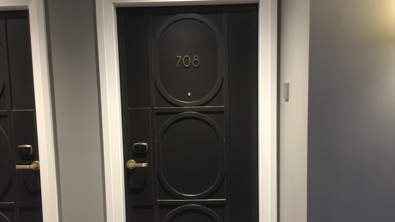
My Deluxe King Room was almost straight ahead, but a little to the right as I exited the lift – Room 708.
Entry was by electronic room key.
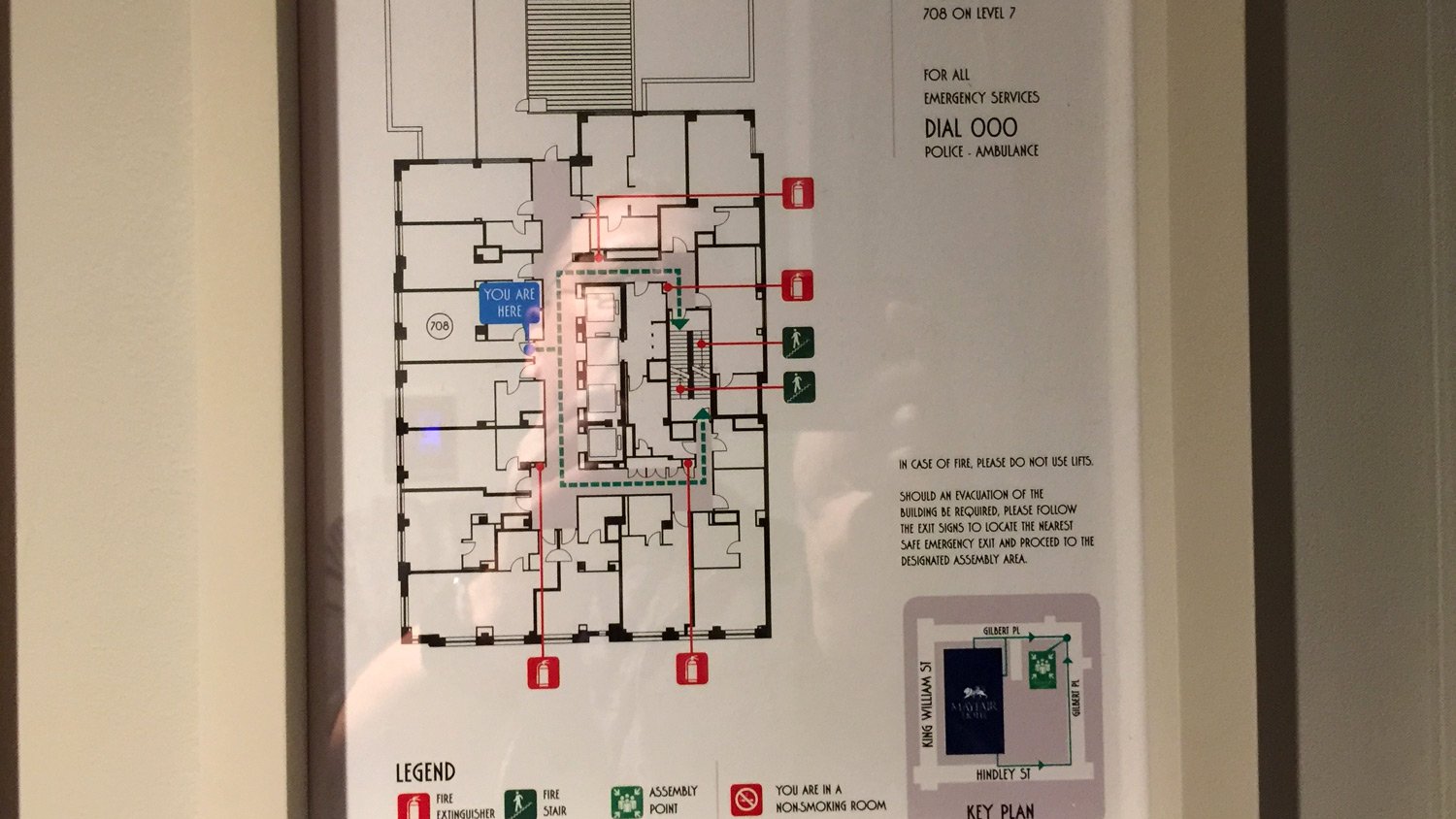
You can see the layout of the 7th floor – below.
As is common with older building hotel conversions, rooms vary in layout and size to fit the existing building structure.
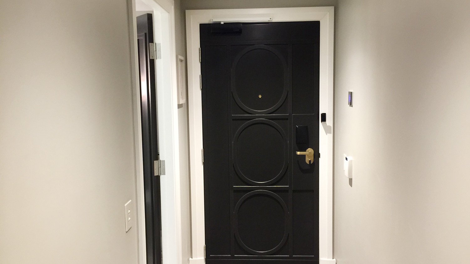
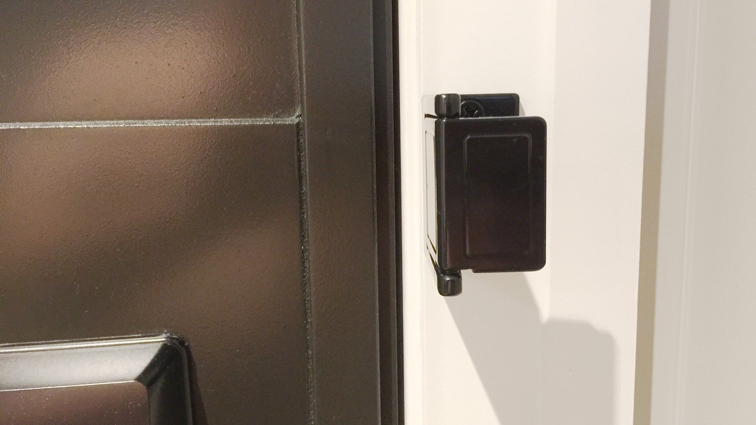
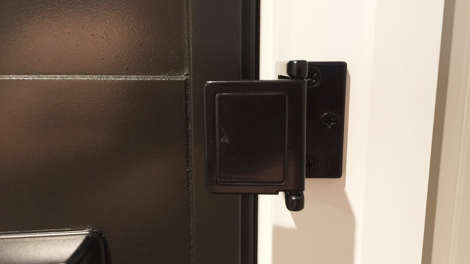
One feature I really like about these rooms is the door-stop security system:
No chains or hook and pin – just this simple device:
Simple in design, and simple to use. Big tick to the Mayfair Hotel for this one.
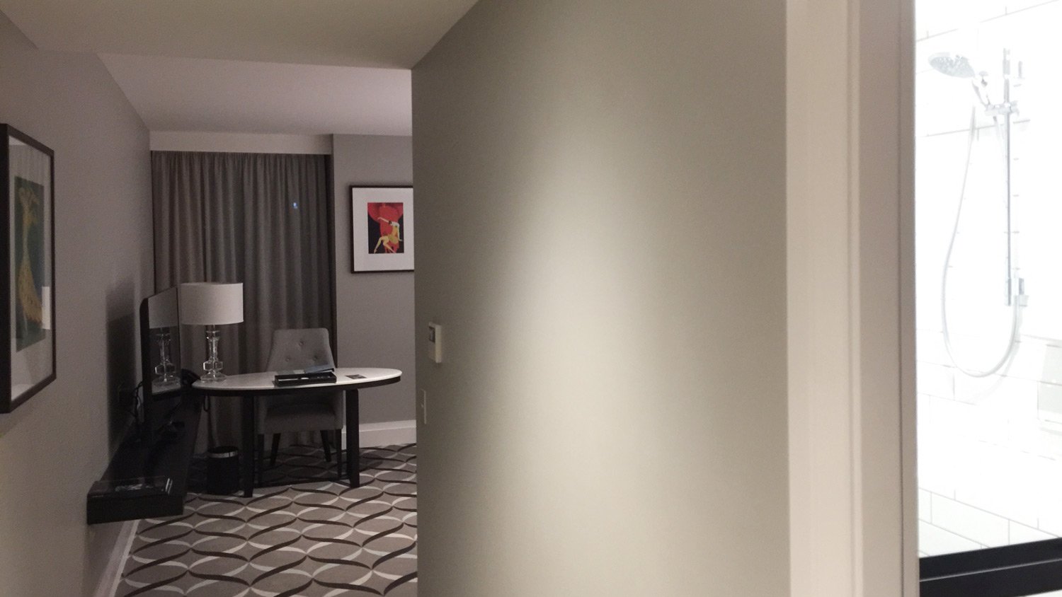
View from the entrance
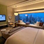
From the entrance lies a bathroom to the right, and the TV on the left-hand wall, with a work desk directly ahead. I like the fact that you don’t look directly at the bed on entry.
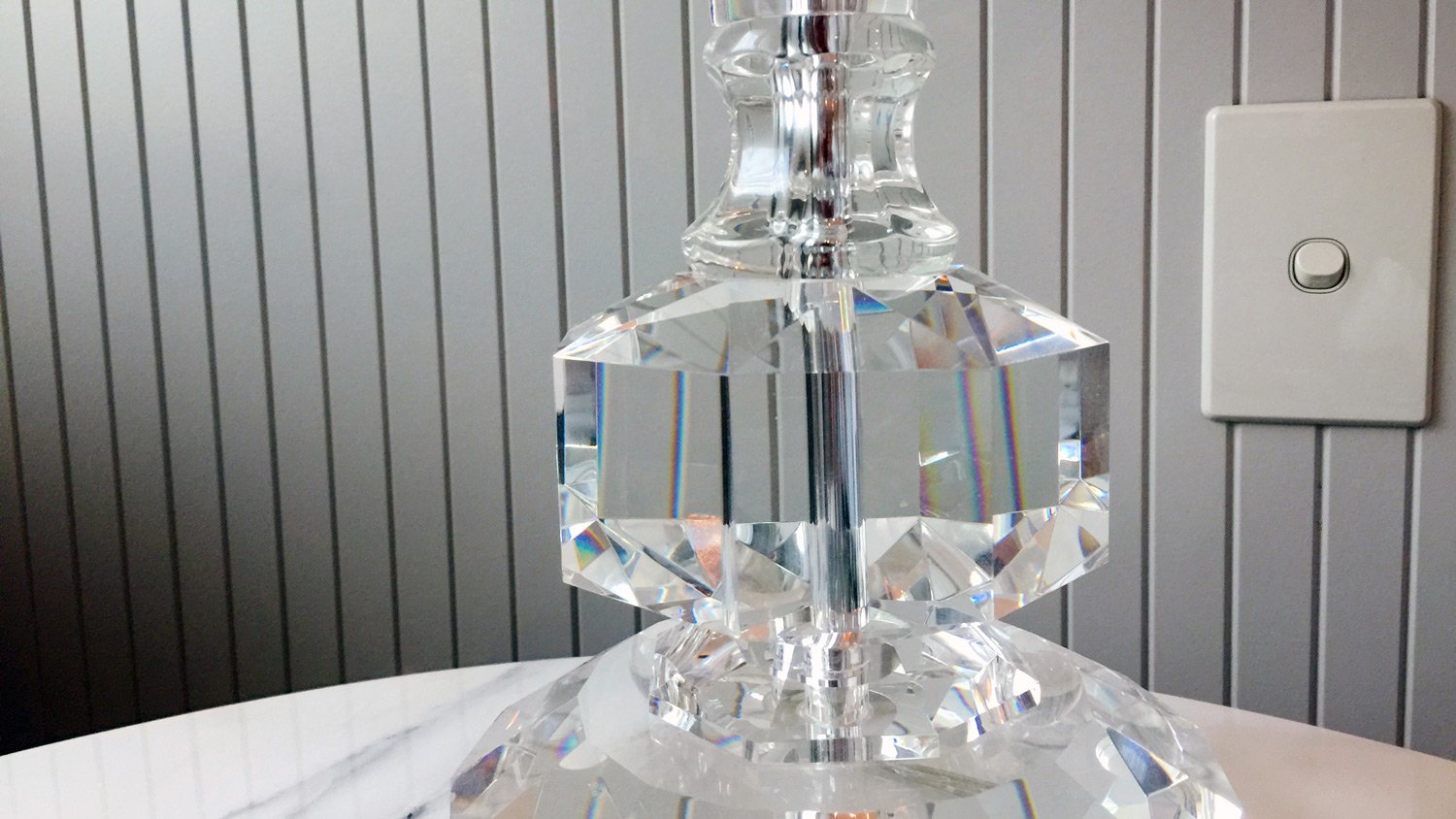
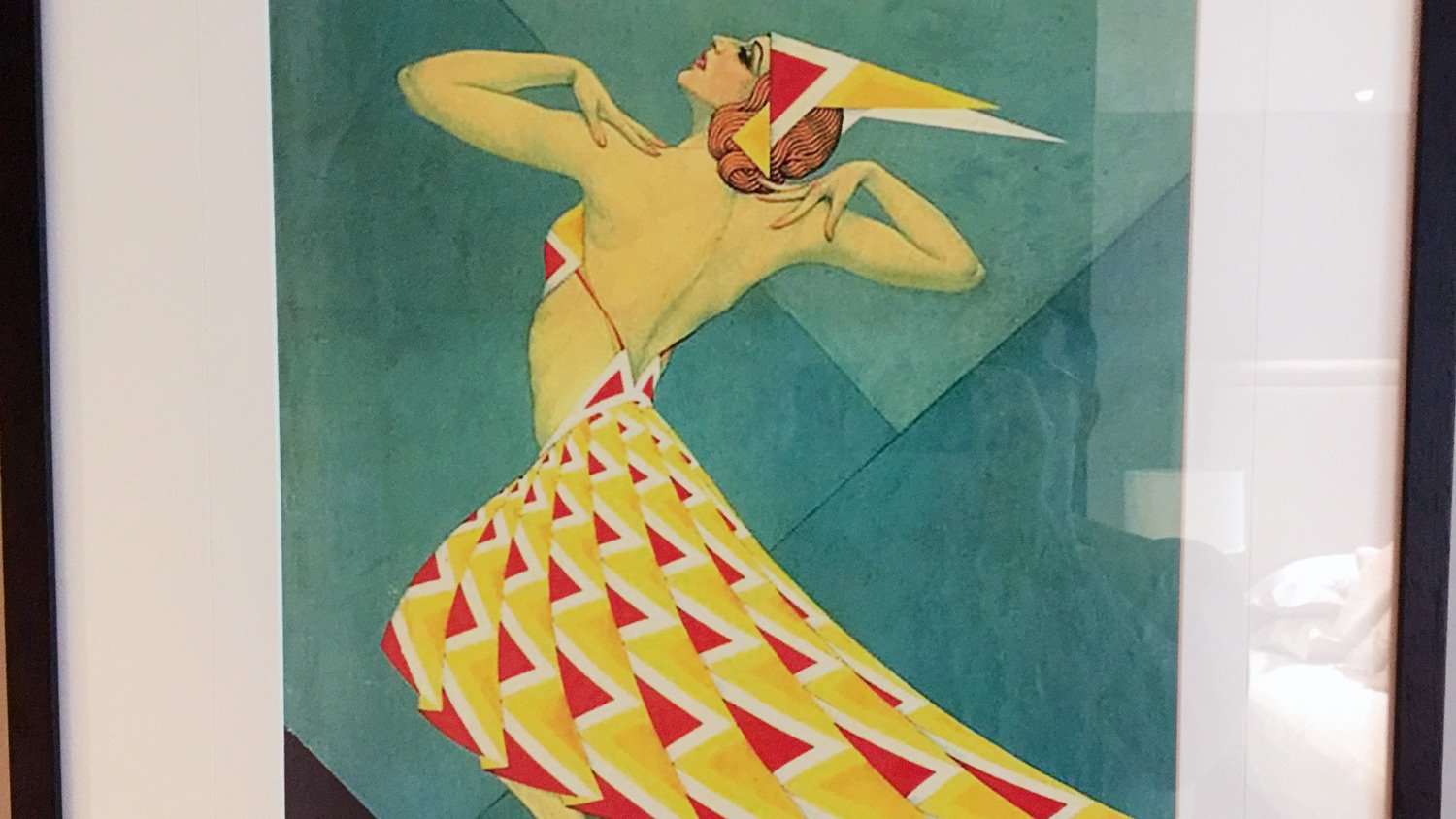
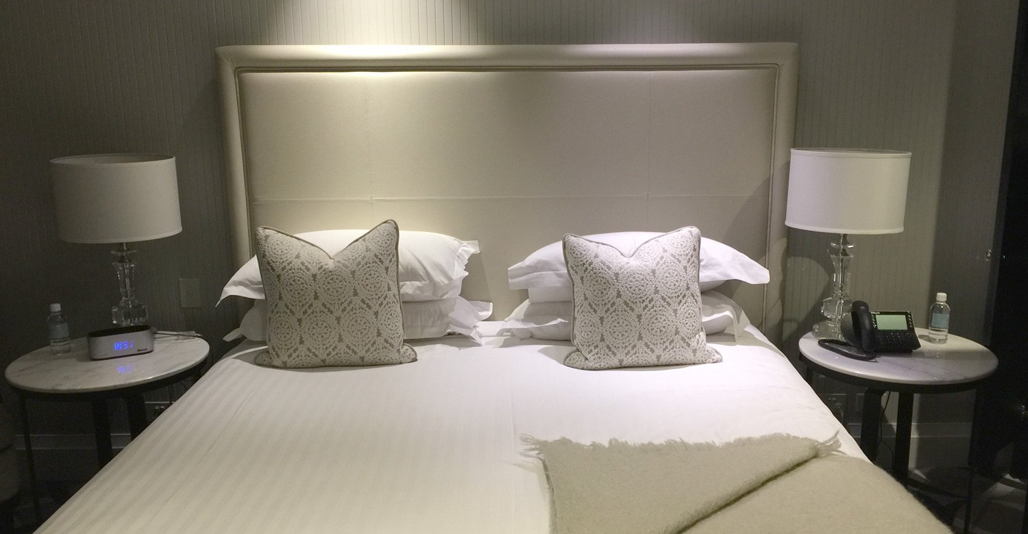
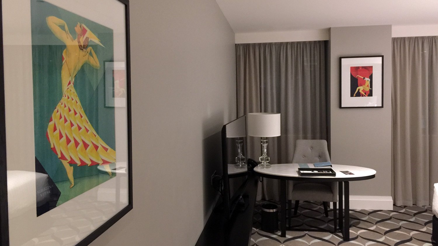
I loved the colour and texture palette of this room – warm greys, marble, clear crystal, black metal, and some highlights in a duck-egg light blue. Accents of copper, as well as deco theatrical costume prints in bright primaries.
. . . although I’m not so sure about the clapboard tongue and groove panelling.
I like this artwork, although they are rather low-resolution digital copies.
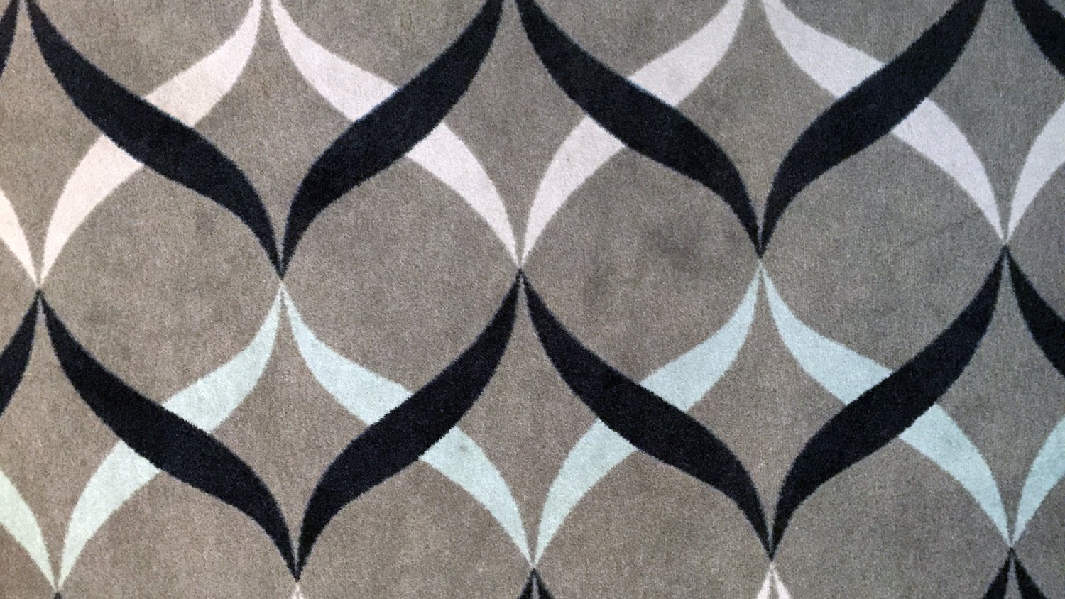
Detail of the carpet reflecting the main colour palette of black, warm grey, white and light blue.
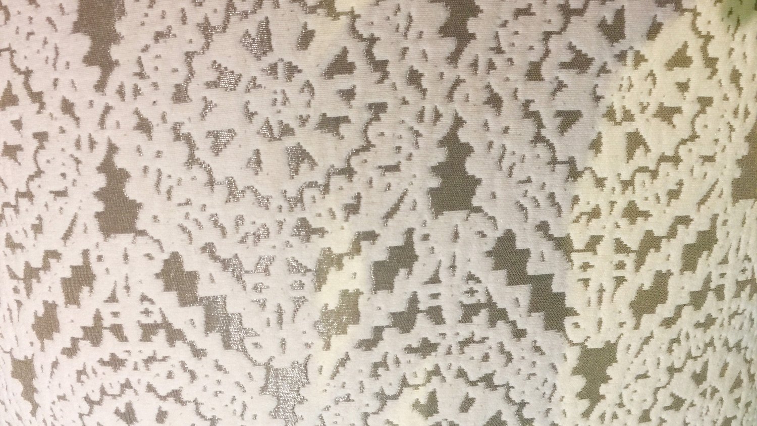
Detail from feature cushions.
The Bathroom
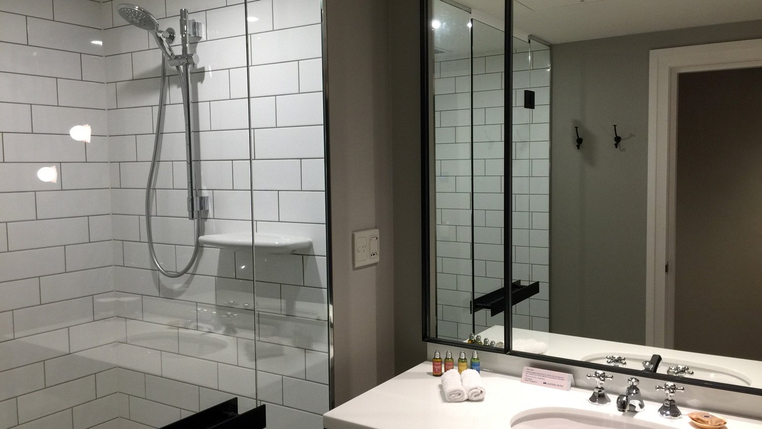
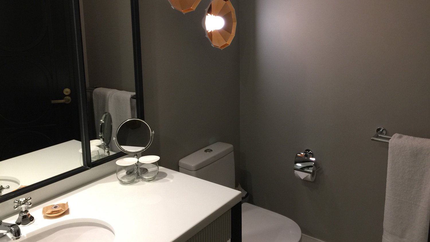
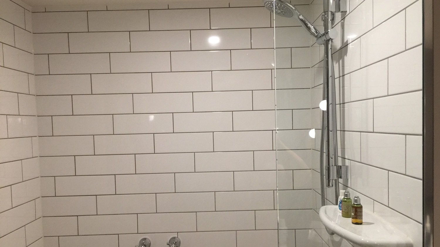
Public toilet tiles – better known as ‘Subway’ tiles seemed to be the theme of the bathroom, along with chrome and those bronze feature wall lights.
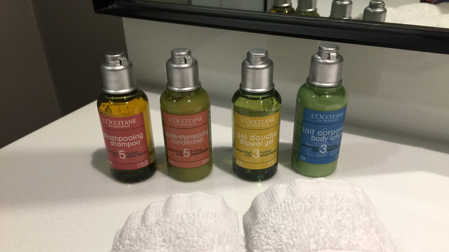
Amenities were by L’Occitane
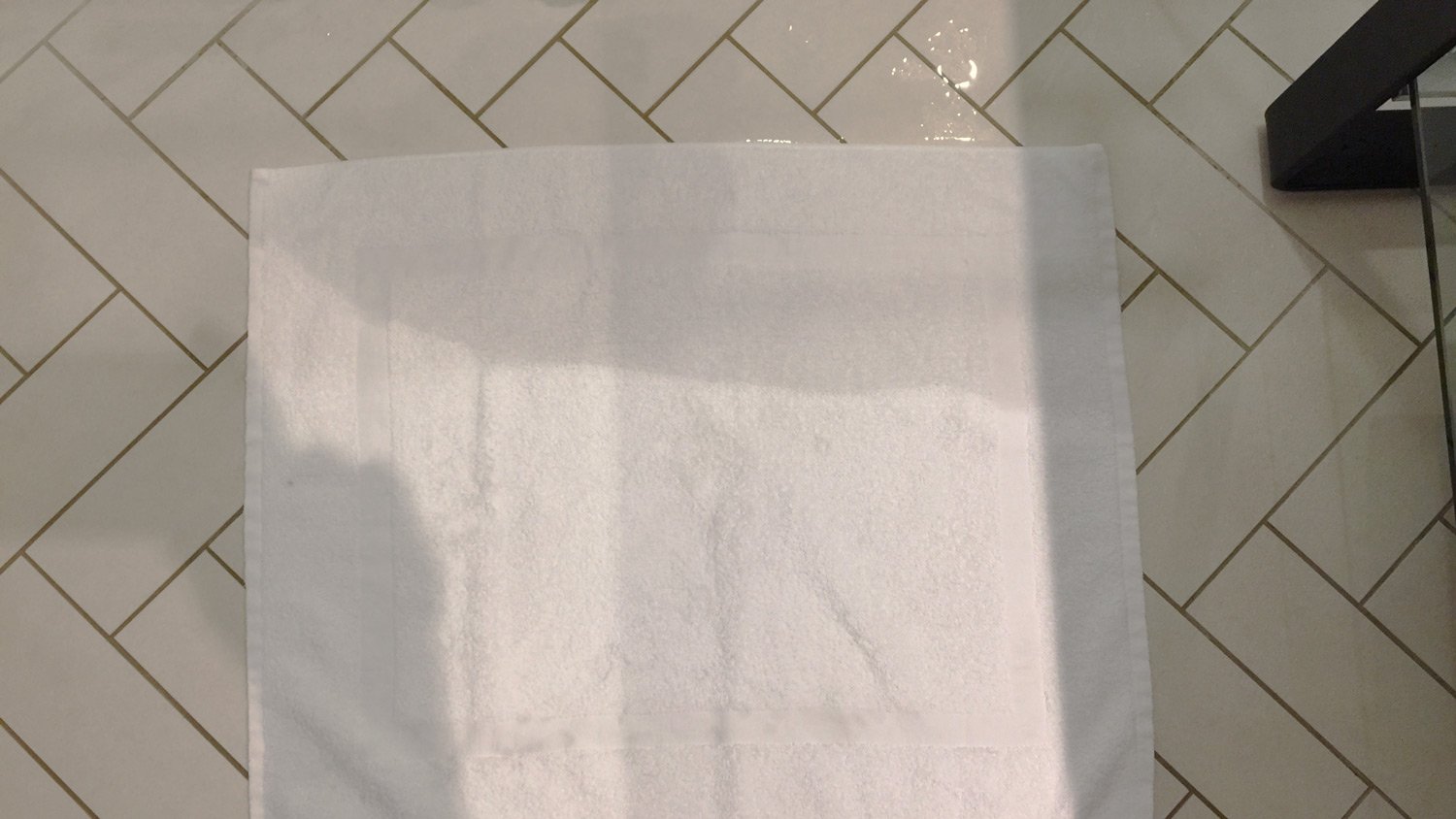
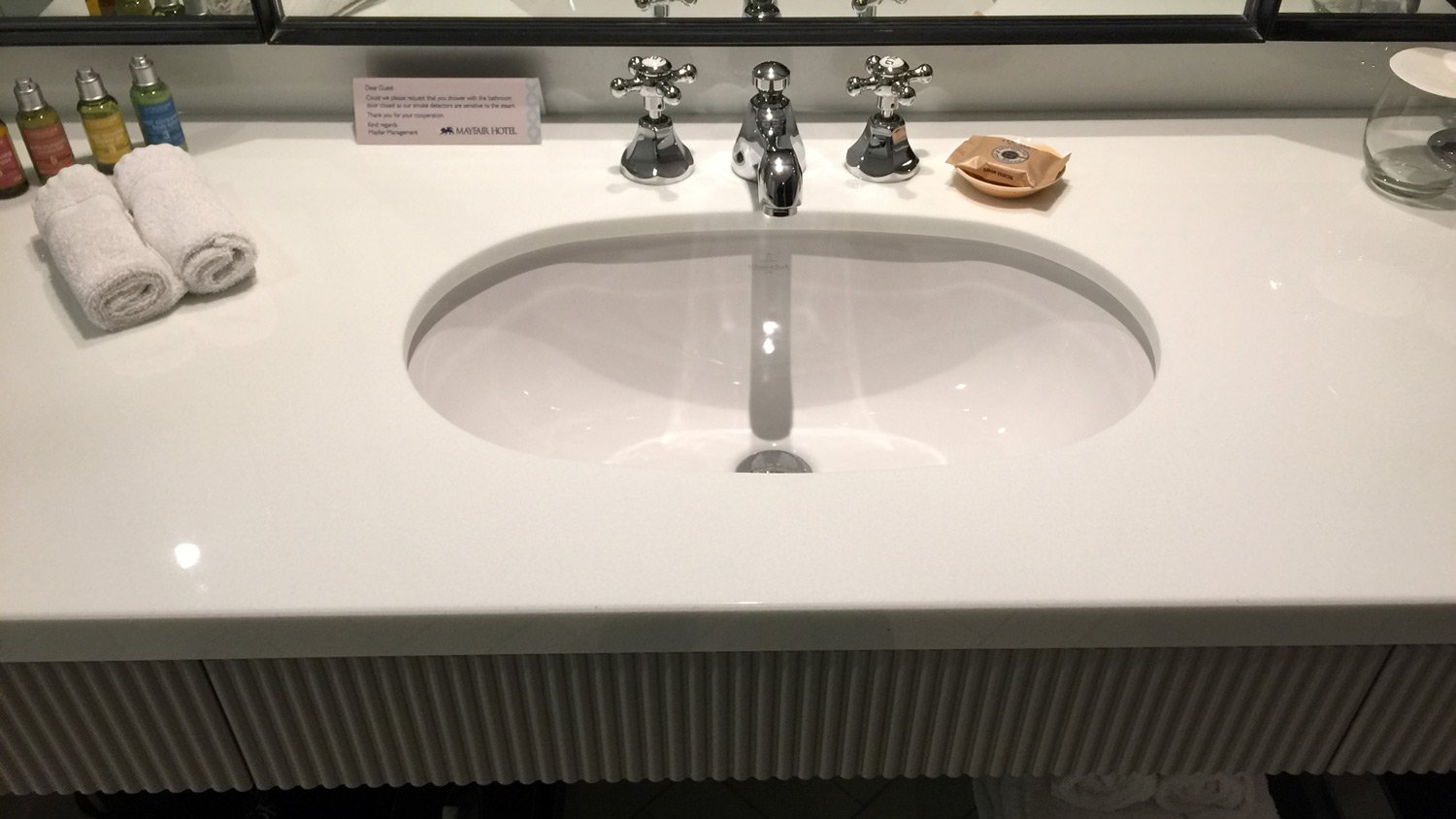
The sink is directly opposite the door, with the shower to the left and the toilet to the right. I liked this bathroom, despite a couple of faults. The most egregious being the flooding shower.
Getting on my high horse – it appals me that hotel designers can get such basic things wrong – from the Penninsula in Bangkok to the Mayfair in Adelaide – surely it is possible to design a shower that does not flood the bathroom?
A single basin – but there is room for two. You may not be able to read that sign to the left of the taps. It requests that guests close the bathroom door when showering, as steam can trigger the fire alarm! Strengthen the exhaust fan I say.
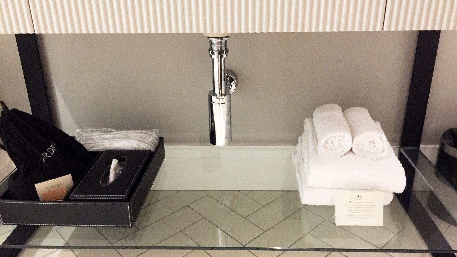
What is it with towel rail placement – in this bathroom, you have to go from one end of the room where the shower is, to the other end of the room where the towel rail is! – unless you pause midway and grab a towel from under the basin.
And another thing – this rookie mistake in bathroom design, so you have to get wet from the shower head if you want to turn on the taps.
The bedroom
Now, having dissed the Bathroom, let’s move onto the bedroom, and while there are lots to like in this bedroom – there is another gaping flaw. Let’s start with the good things. The palette of textures, colours, and soft furnishings are all lovely.
Simple white striped bed linen, with some decorative cushions, and a ‘mohair’ throw. Simple round side tables topped with ‘crystal’ based lamps – phone on one side, radio-alarm on the other, bottles of water each side, with a padded neutral toned bedhead to pull it all together. I didn’t confirm, but I am pretty sure pillows were feather – or at least they felt like feather. Very happy hotel guest . . . until . . .
Wardrobe
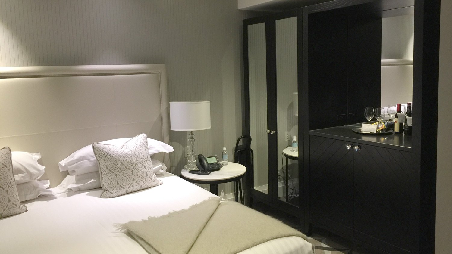
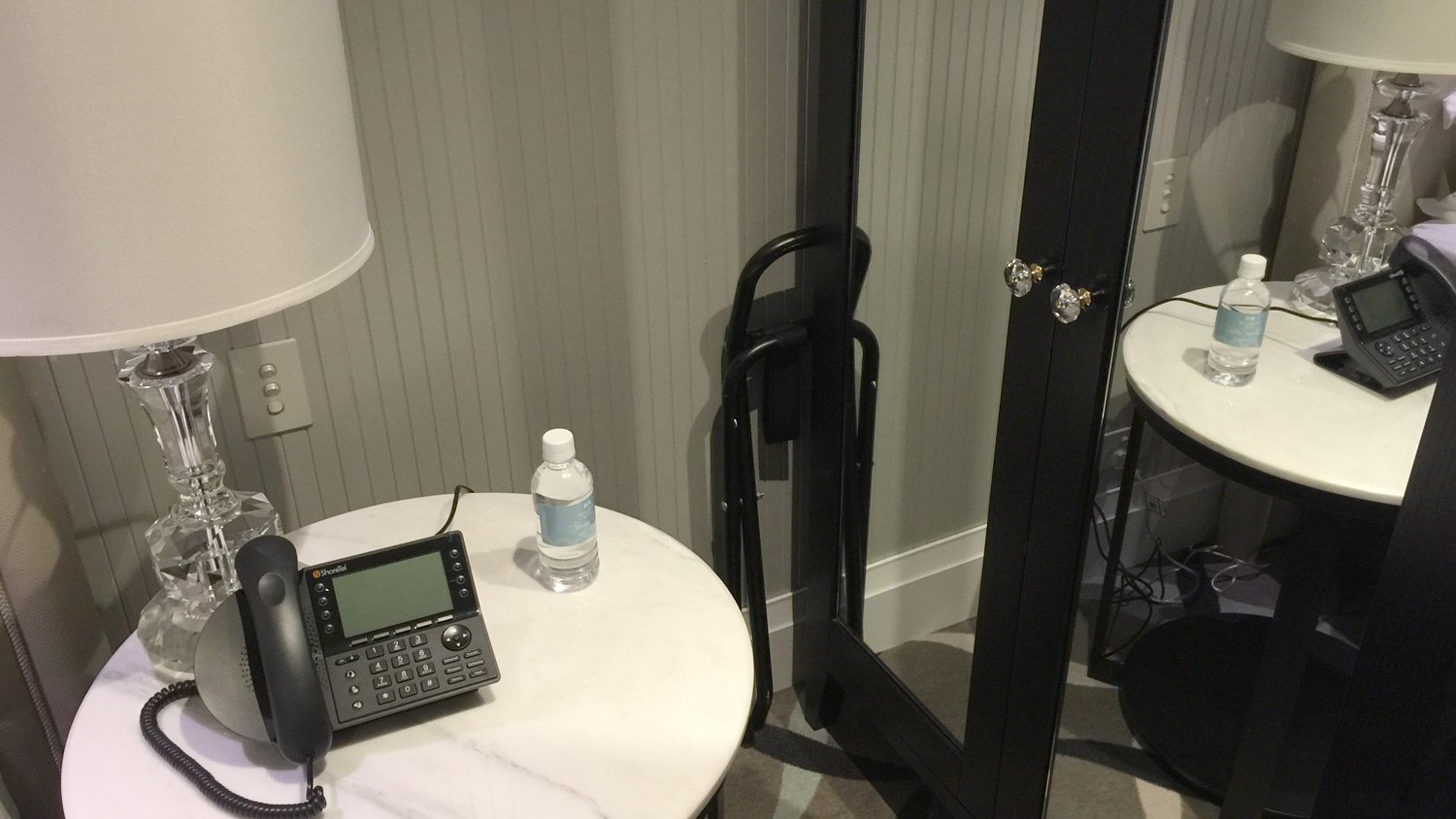
Am I being pernickety – or should a 5-star hotel have a wardrobe where you can easily open the wardrobe door, without having to do a major re-arrangement of the furniture? Am I asking too much?
Its hard to judge the distance in this image between the side table and the wardrobe. Let me make that crystal clear . . .
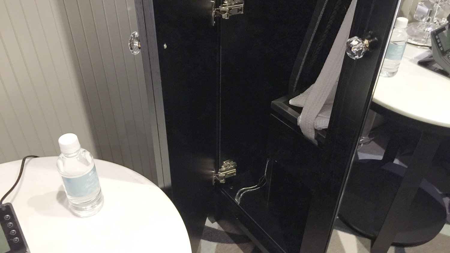
Ok – still not clear enough – how about this:
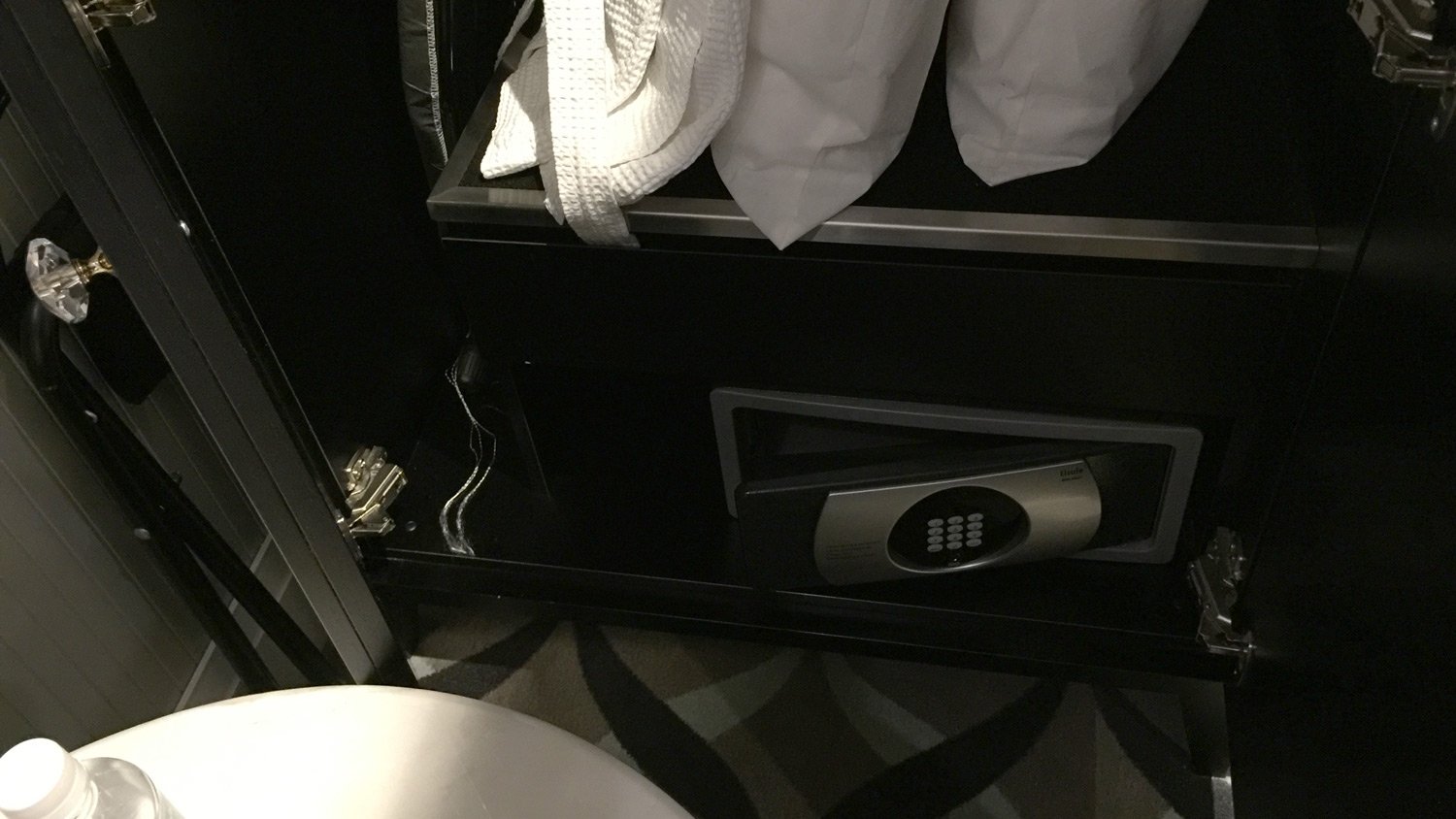
Yep, you got it now – open the wardrobe door, and unless you’re a contortionist, you are not going to even get near the safe.
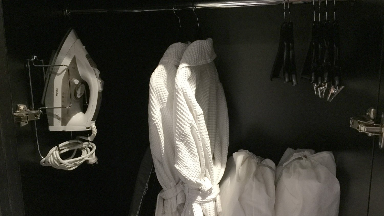
Nor those cotton robes.
Oh, and before I forget – love the wooden hangers, and the ones with holdy, clippy things, but where are the padded coat hangers for my delicate shirts, not to mention my silk frocks?
Mini Bar
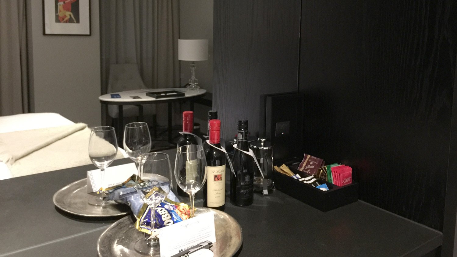
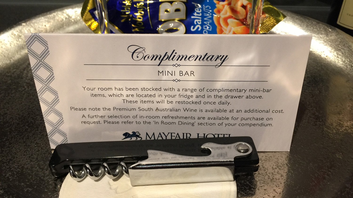
The hotel trumpets – on its website, and certainly at check-in, that the contents of the minibar and surrounds (with the exception of the two bottles of ‘premium’ wine) is included in your room rate. This is a great thing. It means you don’t have to go into automatic ‘outraged of Sydney’ mode each time you consume something and then look at the minibar prices. Or in my case (when in penny pincher mode) race out to the nearest 7-11 or equivalent and buy some soft drinks and snacks.
Please note the coffee French press, and the card explaining what is and isn’t free from the minibar.
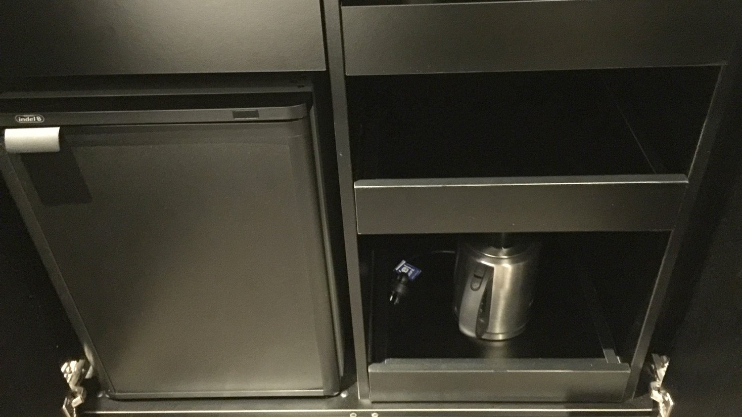
Inside the cupboard below the bar snacks, tea & coffee, and non-complimentary wine is the minibar fridge, kettle, cups and glassware.
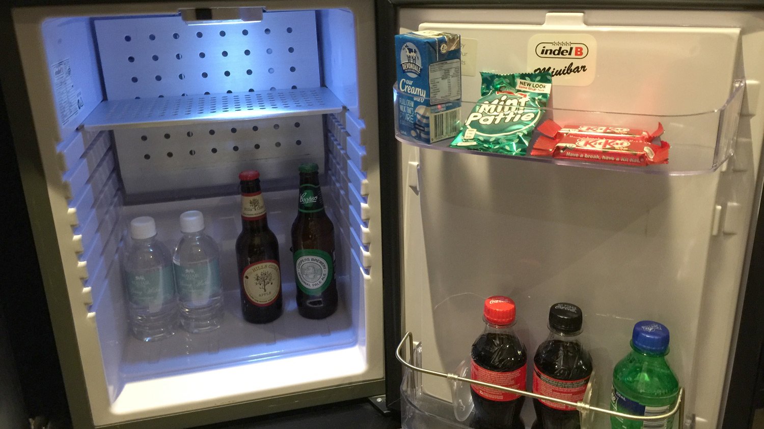
And inside – your complimentary beverages and snacks. So we are talking some water, some artisanal beer, some Adelaide homegrown, Coopers Ale, a couple of Coca-Cola beverages, some lemonade (wish they still produced Woodroofe’s Lemonade), a couple of Kit Kat’s, a Mint Pattie, and some UHT milk (marking you down for this Hotel Mayfair). Note to other hoteliers – see – they also leave free space so that guests can add their own produce to the fridge. Please take note, and I’m talking to you, Mr Hilton!
The Desk
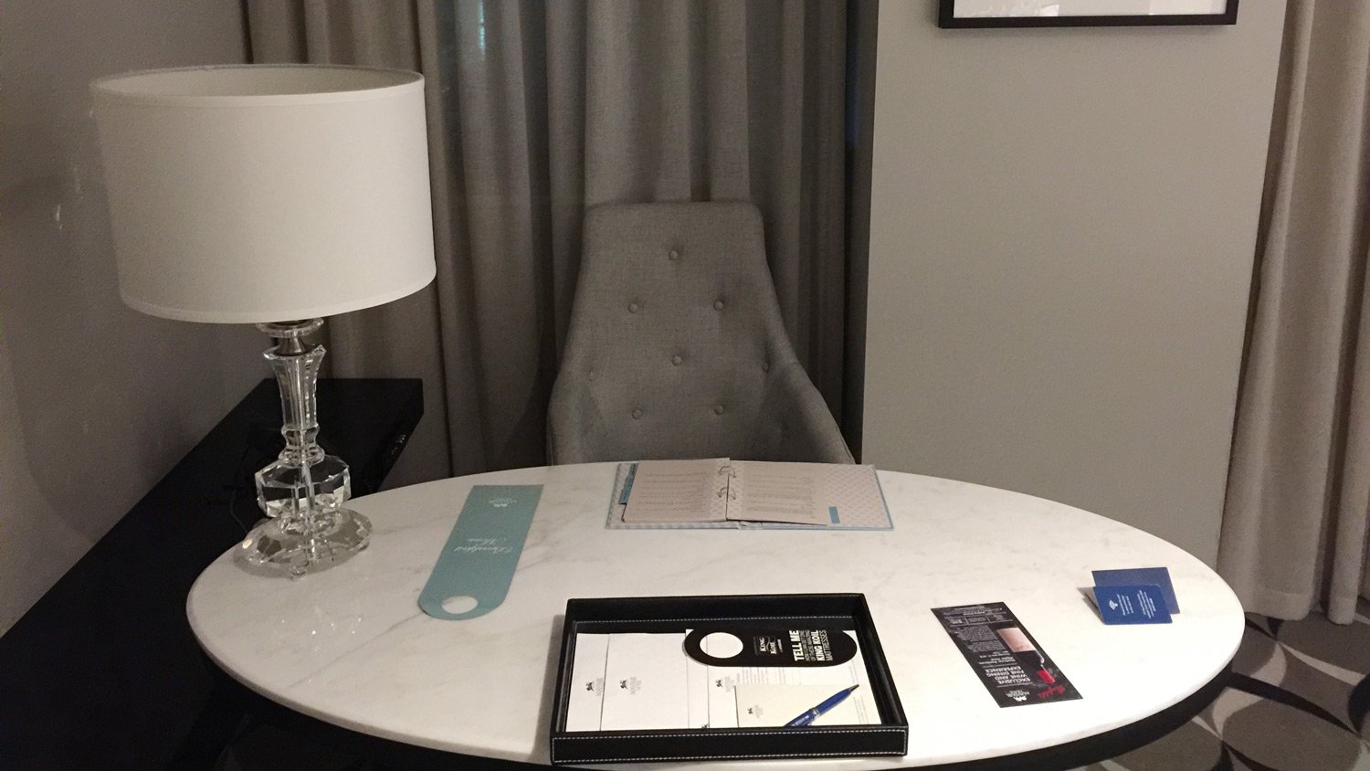
I regard a desk as an essential part of a hotel room – pretty much as important as a bed. I rarely don’t work in a hotel room, and have been known to request a proper office chair for the desk in numerous hotel rooms. As a contemporary hotel, the desk in this room kinda doubles as a dining table, but with no 2nd chair, would not be great if you were staying and in-room dining with a partner. Another rookie design error.
OK – it’s not an office chair, but quite comfortable, and those decorative cushions on the bed work quite well as lumbar support if needed.
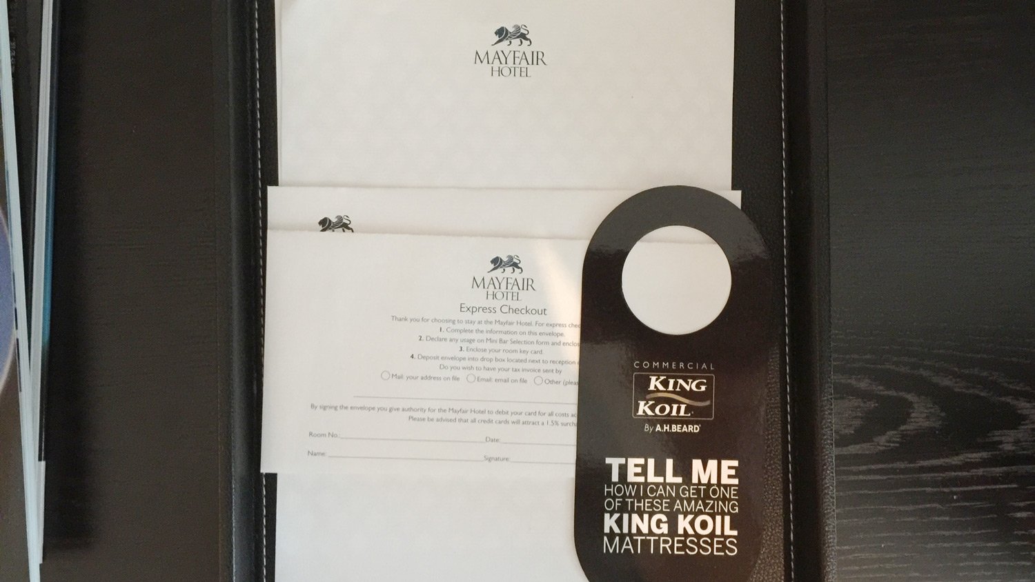
Most of the promo crap (my pet hotel hate) is confined to a ‘leather’ tray or the compendium. although there is a ‘door menu’ for breakfast, and a promo DL for some wine promotion. That went straight into the bin.
The mattress promo – I can forgive – just.
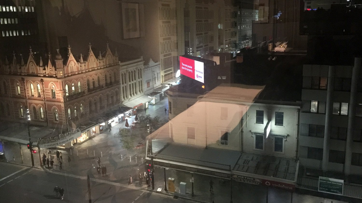
Behind the desk is a view through double-glazed soundproof windows of Rundle Mall, and the famous Beehive building housing the wonderful Haigh’s chocolate. (Fun Fact, I used to live around the corner from their Parkside factory in Adelaide, many years ago.)
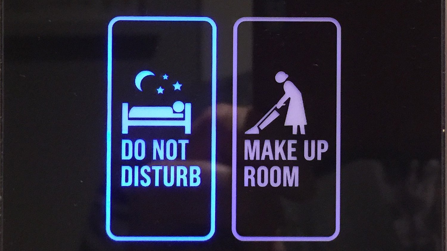
And that’s about it for the room. Oh, I nearly forgot – I really like these touch panels at the entrance for telling staff whether you need your room made up, or don’t want to be disturbed. Pretty pictograms.
Food and Beverage
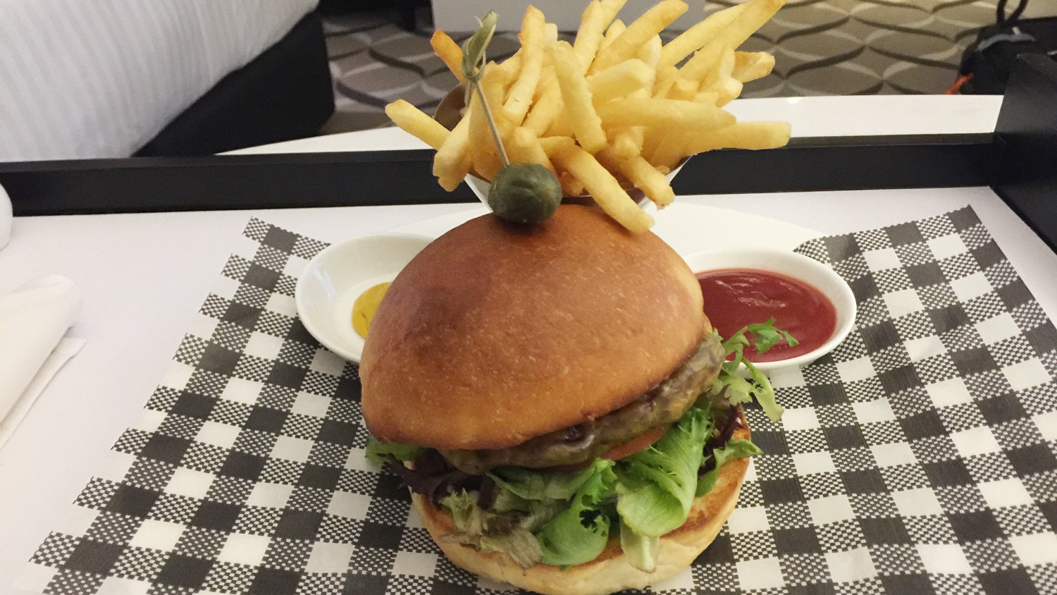
I had two meals at the hotel – one in the room on arrival – the traditional burger and chips. Perfectly acceptable, and came with mustard and tomato sauce, salt and pepper. I really must remember to ask for mayonnaise as well. My order was handled promptly and was in my room within the half hour as promised. I liked the pickle served outside the burger!
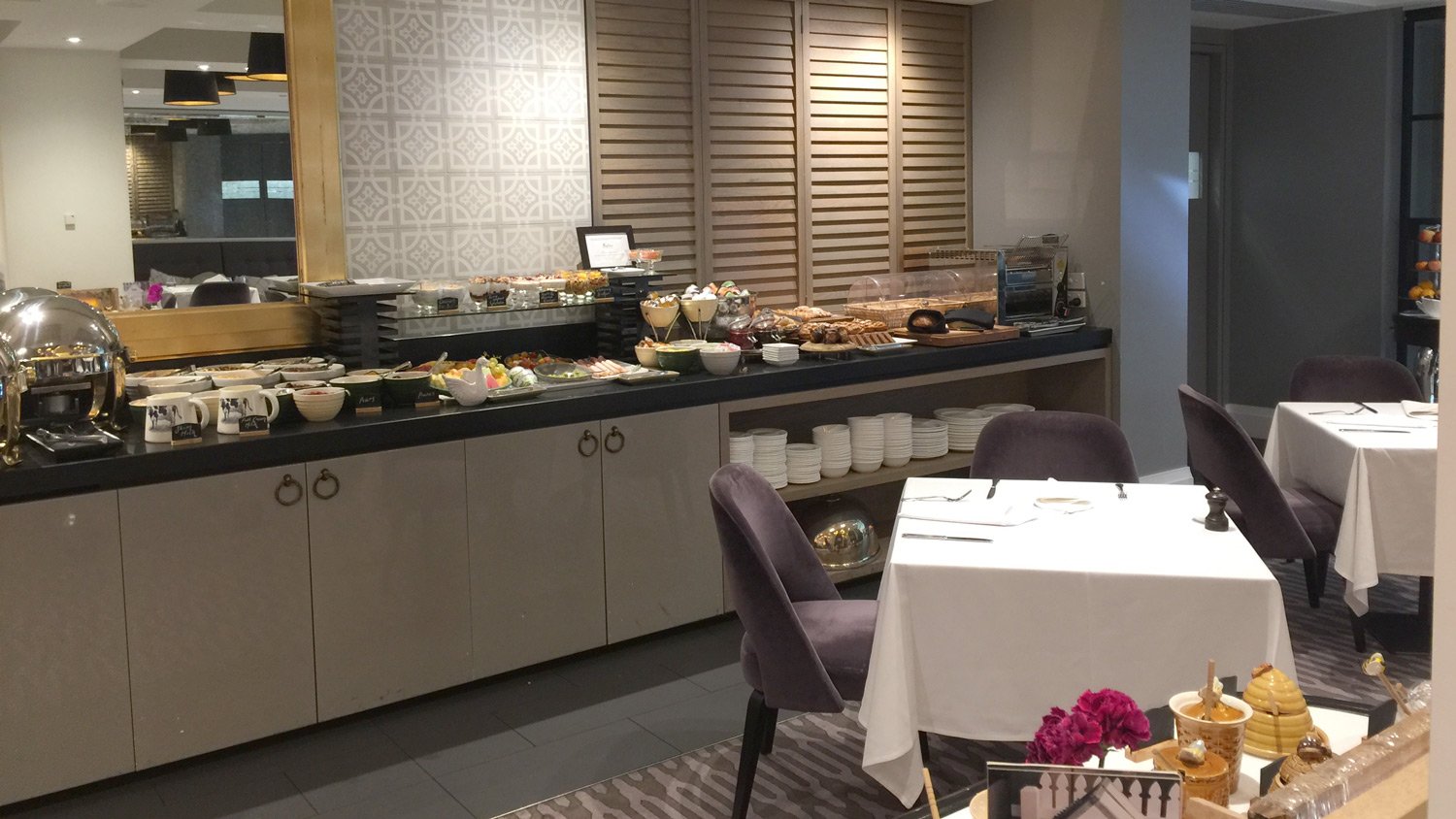
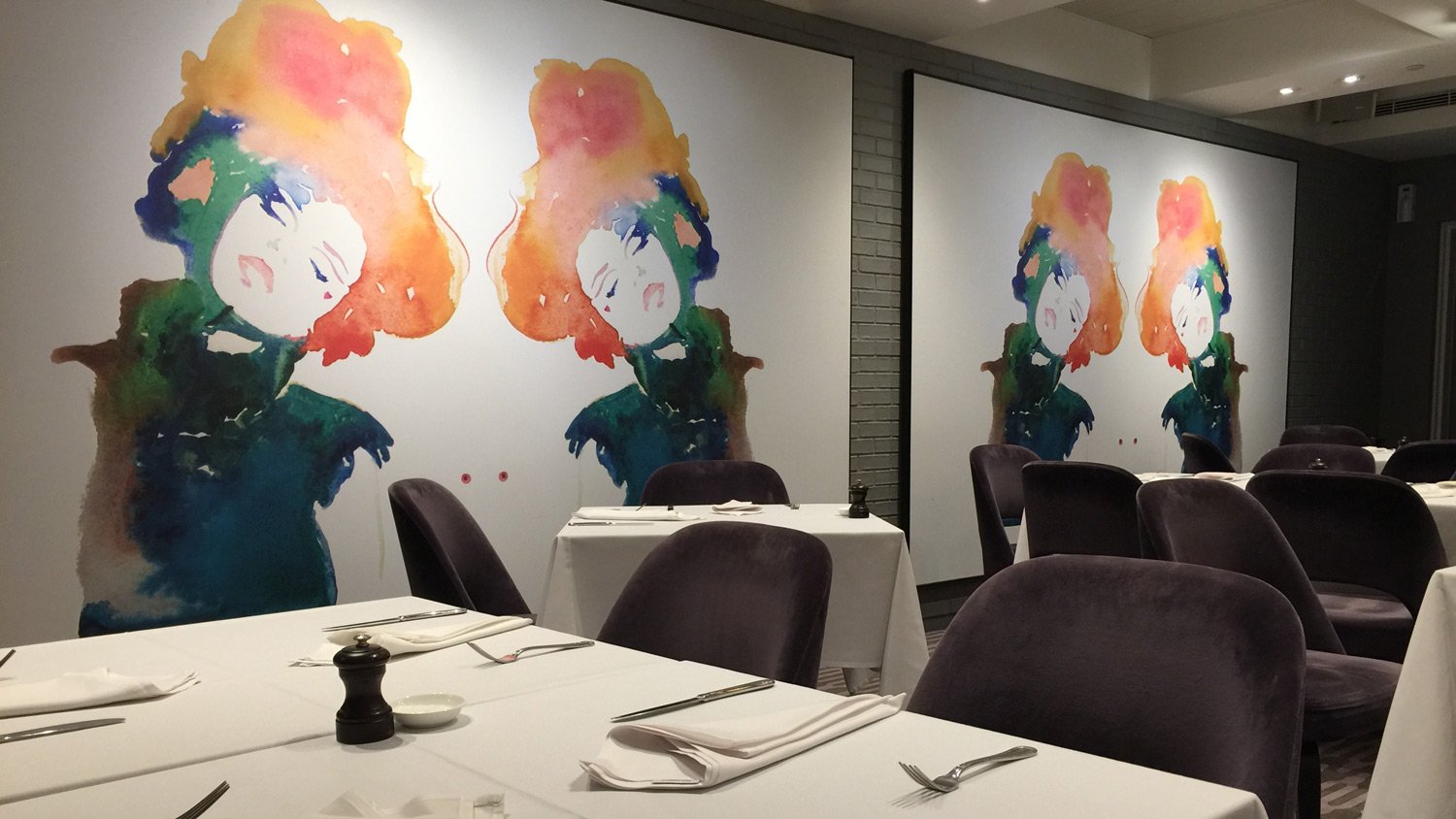
Next morning, I went to grab some breakfast at the Mayflower restaurant which is downstairs from the entrance foyer.
The breakfast selection looked pretty good, but I was not in the mood for a large breakfast.
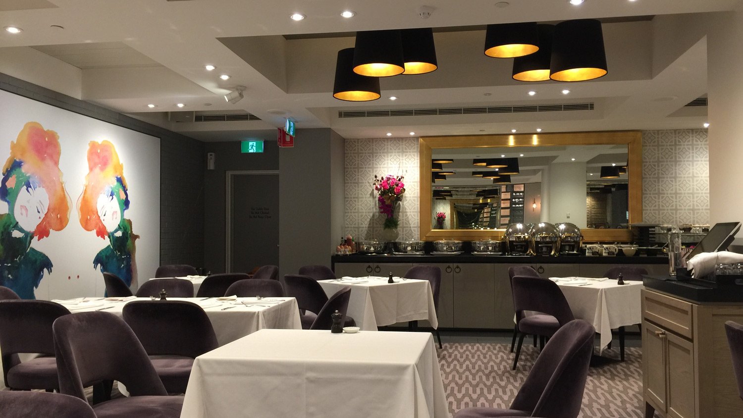
The room is used as a ‘carvery’ (how quaint!) at lunchtime, and as a restaurant at night.
The room is windowless, so this artwork does brighten it up.
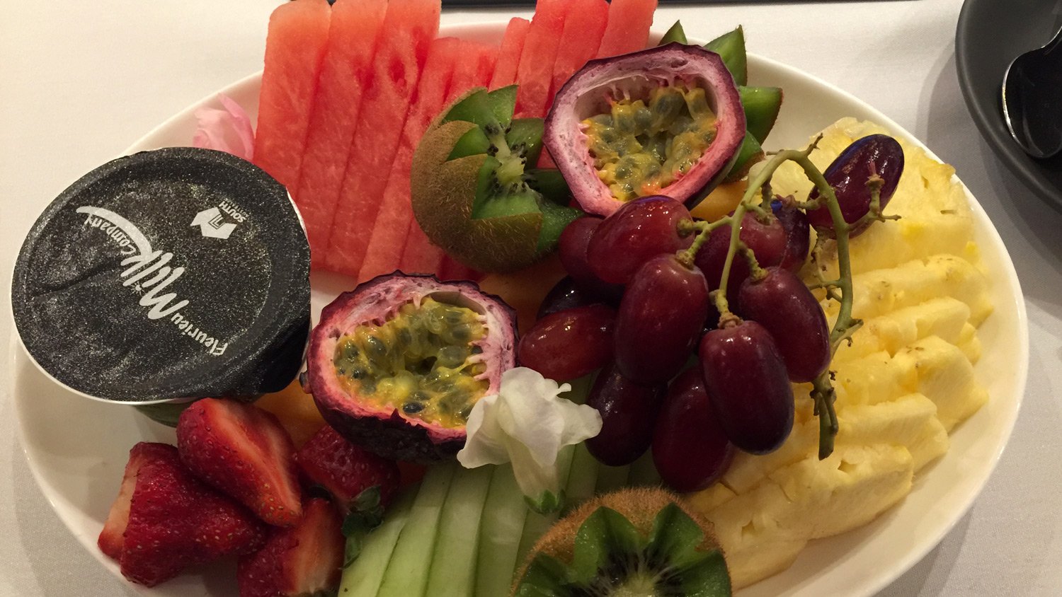
All the ‘inclusive’ breakfasts sounded just too much food at a cost of AU$39. Staff were lovely – made it feel like eating in someone’s home actually. I had a look at the a la carte menu and opted for a fruit salad plate and a coffee, which came in at under AU$25. As you can see the fruit salad was vast, and I couldn’t finish it, but it was delicious.
What I didn’t see
I didn’t make it to the gym – even for a few photos – nor did I make it to Hennesey’s Rooftop Bar at the top of the hotel. It’s named after the original architects, and guests have priority access.
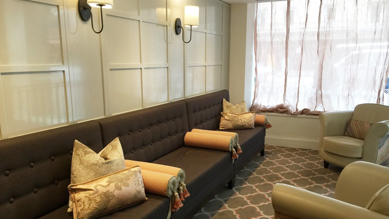
One of two seating areas running either side of the entrance
The verdict
This is a good hotel, that could be great. It is not cheap and sits at the high end of room rates in the city. It’s rooms are well designed visually, but have lots of rookie errors in terms of utility – from flooding showers, through to wardrobes that can’t be opened unless you move furniture.
Can’t fault the staff, or the food and beverage, and I especially like the complimentary minibar.
This is my equal first preference when staying in Adelaide. Equal to the Intercontinental Adelaide
Review
85%
Summary This is a good, beautifully designed hotel, that could be great. It has some rookie usability design faults. It's not cheap - sitting at the high end of room rates in this city. My equal first preference when staying in Adelaide.














What did you say?