
HOTEL REVIEW: Stamford Plaza, Adelaide, South Australia. Three square metres makes all the difference.
Content of this Post:
Introduction
Regular readers would know that I travel monthly between Sydney and Adelaide. I grew up in Adelaide, and my close family and a few friends are still there. I also have some work connections, so I tend to combine a visit to see my family with a bit of work.
Although a creature of habit, I am also a whore for a deal, so although I usually stay at the Intercontinental Adelaide (formerly the Hyatt), I won’t pay their ‘surge’ pricing when hotel rooms in Adelaide are scarce. I’ve seen a basic room rise from the lowest rate I have paid (AU$129) to the ridiculous AU$620, which I won’t pay.
Basically, I am prepared to pay around AU$150 a night – at a stretch AU$200, but my pecuniary nerve gets very annoyed if I go much over that (thanks, Dad – who tried to teach me the value of a penny).
The Intercontinental was booked out for the first night of our stay, so it was either stay elsewhere or book the first night elsewhere. Despite its slightly outdated look (I’m talking the pink marble in the bathrooms), the Intercontinental (IHG) is still one of my favourite hotels in Adelaide, and I get a bunch of benefits through my Ambassador membership.
Adelaide Full
Although we could get two nights at the IHG (at a reasonable rate), there was no room at the inn(tercontinental) on our first (Thursday) night.
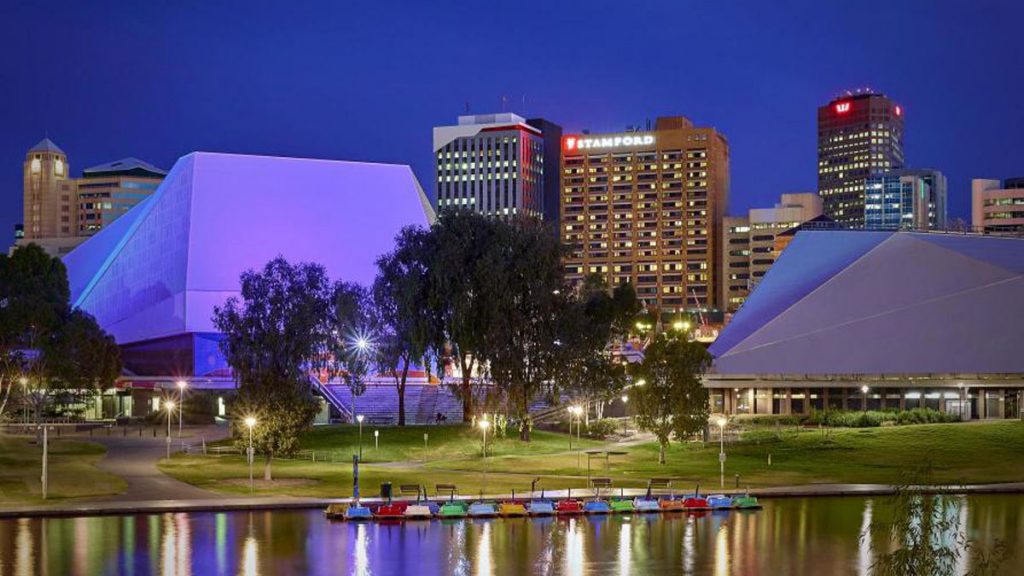
No problem, I thought, we will stay over the road at the 4.5 stars Stamford Plaza for the first night – and anyway, it will allow me to review another Adelaide hotel.
I booked through Qantas Hotels – they had a rate equivalent to other booking sites, and at least I would get some Qantas points. I booked this before I became a total convert to Hotels.com and their one-night-‘free’-after-every-10-nights program.
The rate was high and outside my comfort zone, but as I said previously, all rates were high in Adelaide for that date as it was the Adelaide festival season.
Hotel Information
Stay: 8 March 2018
Stars: 5
Room: Superior City King
Size: 32 sqm (344 sqf)
Bed: King
Per Night: AU$271
Address: 150 North Terrace, Adelaide, South Australia, 5000
Phone: +61-8 8461 1111
Email: reservations@spa.stamford.com.au
Web: www.stamford.com.au/spa
History
The site has a chequered history. It used to be Adelaide’s premier hotel – The South Australian, with past guests ranging from H. G Wells through to Pavlova, Dietrich and even the Beatles.
Like many old grand hotels, it was demolished to make way for a multi-storey hotel. The purchaser was Ansett Transport Industries – also the owner of Ansett Airlines at the time. The new hotel was named the Ansett Gateway Hotel, and then The Gateway, later The Terrace, and currently the Stamford Plaza.
Arrival
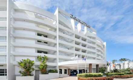
The front of the hotel was undergoing some renovation at the time of our arrival. I don’t have any shots for you. The hotel foyer is fairly small and simple compared to the cavernous grandeur of the Intercontinental. Its closer to the Peppers Waymouth Street.
We didn’t need to queue for long to be welcomed to the hotel and asked if this was our first stay (it was). Hotel facilities were briefly described, and we were on our way to the lefts on the opposite side of the foyer.
Our Stay
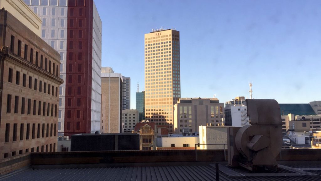
. . . was unremarkable – a little like the view from the room’s window. We only stayed a night, and left the following morning early for an appointment, returning briefly to collect our bags and move over to the Intercontinental for the next few nights.
Didn’t even get time to explore any other facilities of the hotel.
The Room
Our room was at the back of the hotel, no river view for an entry-level room. Exiting the lift, we turned right to exit and followed the corridor around to the penultimate door.
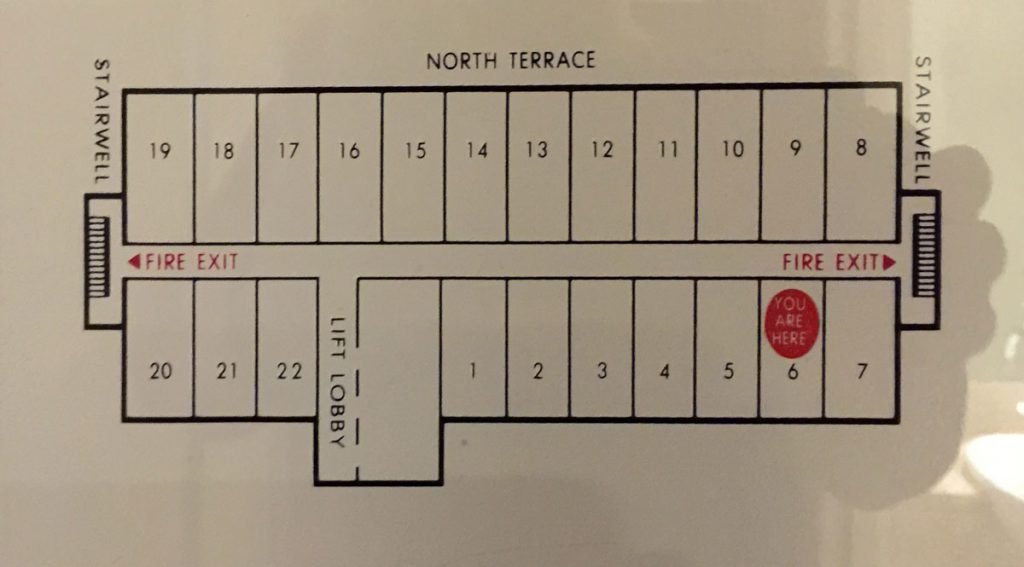
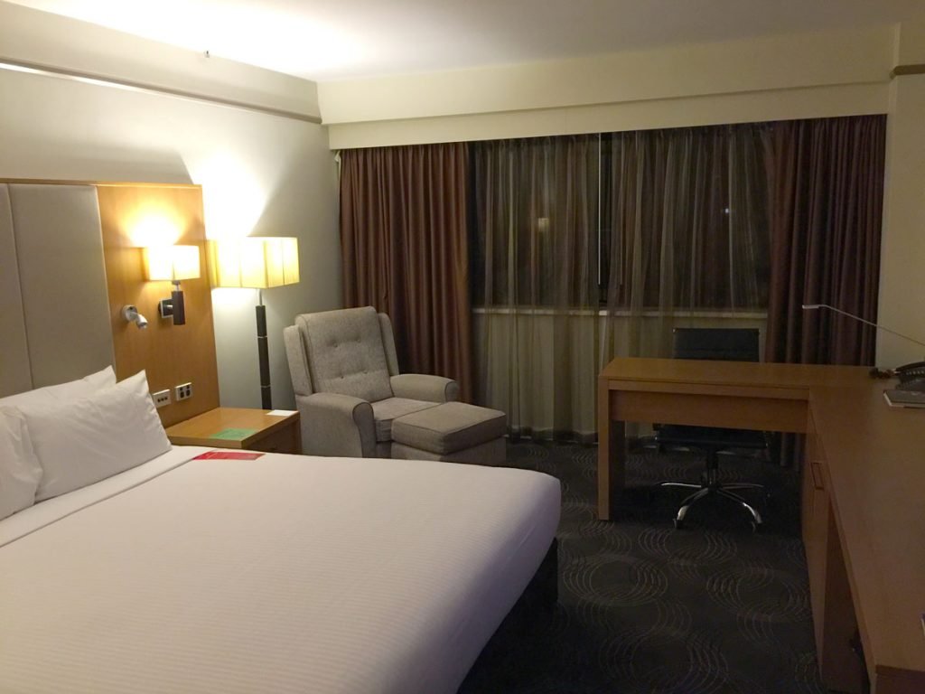
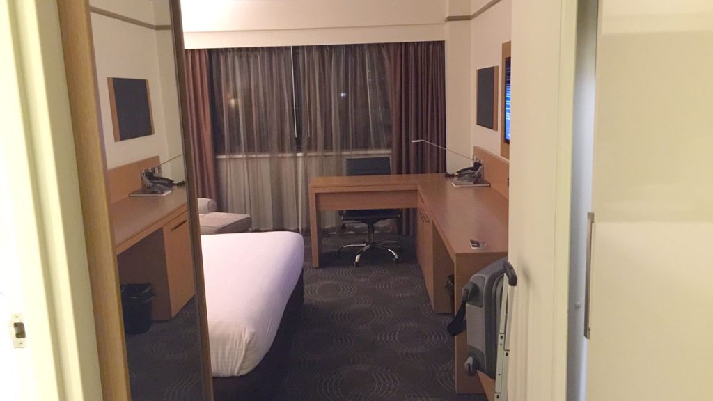
Although the room is sized at 32 square metres, it seemed smaller – or maybe an extra 3 square metres that would take it to 35, makes all the difference? It seemed slightly poky, with a small bathroom. Maybe the size of the desk and minibar cabinetry didn’t help?
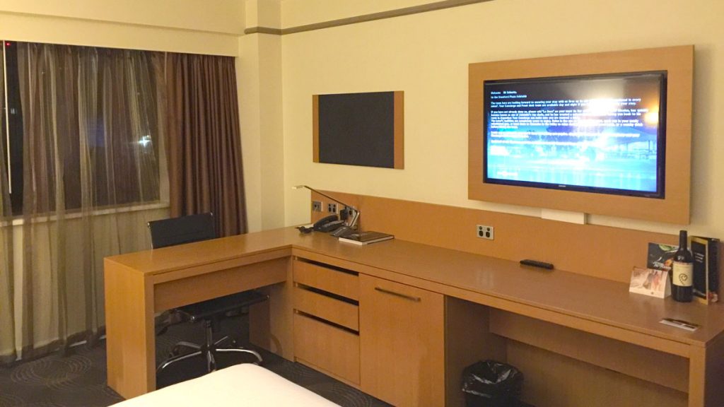
The Desk
The desk looked solid and workable on first inspection, despite it being a little bulky. However, this positioning of the desk with its back to the window meant that the whole set-up took up a lot of space, without actually being very serviceable. The desk did have more than adequate power-points at a serviceable height.
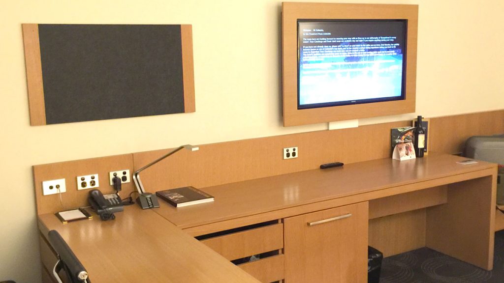
See that dark glass on the wall? What is it, you ask? I don’t know.
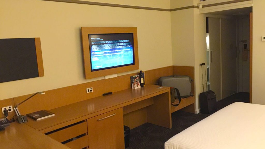
The desk, bar-fridge area, and luggage shelf, just felt like they wrapped around the bed with a minimal area to get around. It was actually a little more spacious than it looks in the image above – but the image is correct in the slightly claustrophobic feel this cabinetry gives to the room.
Mini-Bar
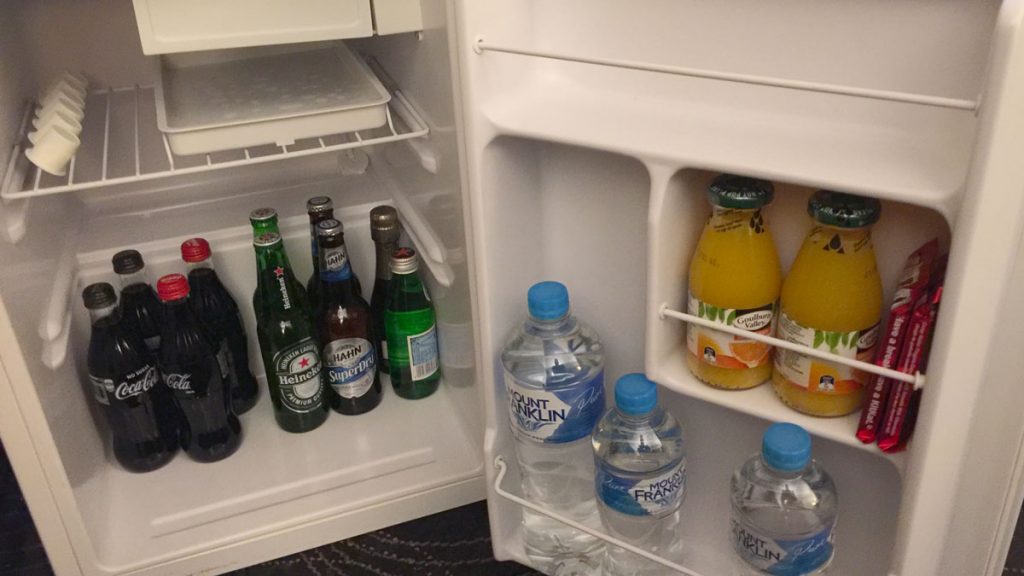
The minibar was adequately stocked with the usual juices, soft drinks beer, sparkling wine and water. Note those annoyingly small UHT milk containers – you know the ones you have to use at least two of to get a barely adequate amount of milk in your coffee.
Wardrobe
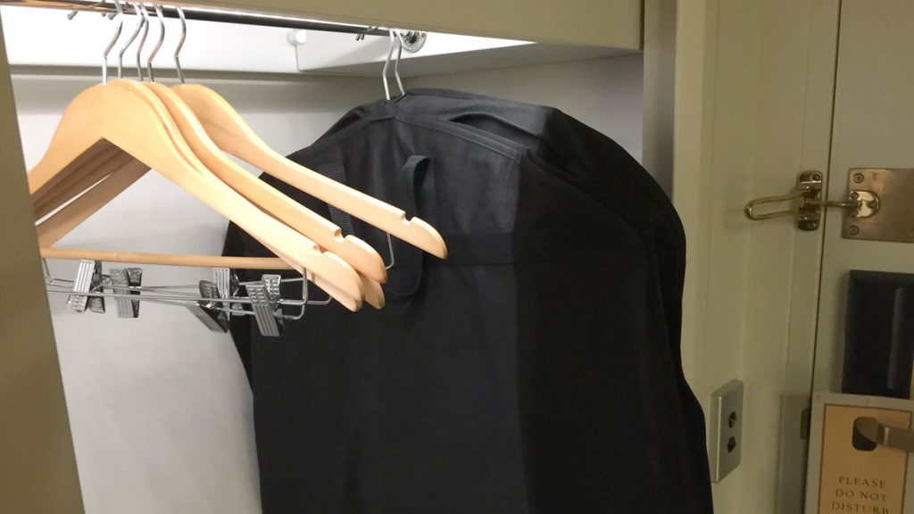
This was located at the entrance with slightly cheap doors. At least it had propper coathangers and not the loathed ‘non-steal’ ones like at the Peppers Waymouth. Opposite the wardrobe was a full-length mirror mounted on the wall.
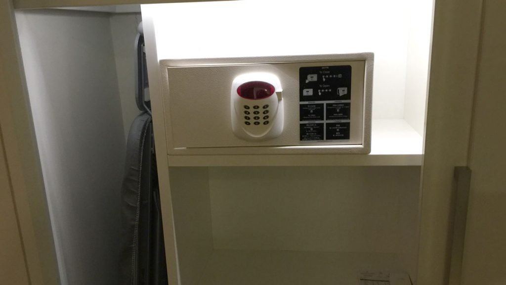
The wardrobe had adequate shelves (no drawers), safe, iron and ironing board. You can see that the depth of the wardrobe was quite shallow – you couldn’t fit a suit bag in without placing it at an angle or crushing it when you closed the door. For a business hotel, that’s not really acceptable.
Bedroom
As I said earlier, despite its actual size, the bedroom felt cramped, largely due to that wrap around desk, minibar and luggage rack cabinetry. Other than that the room had everything that is required.
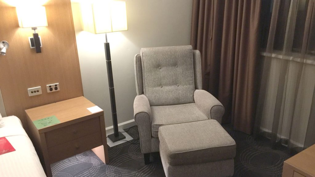
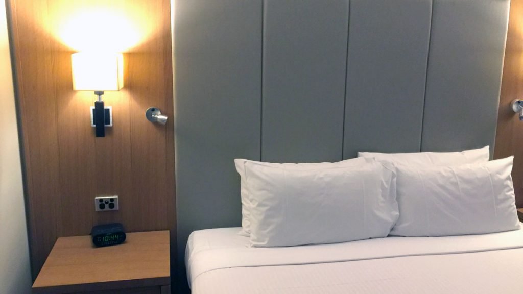
Bedside tables and reading lamps, and night lights – although, these were rather bright. Either side of the bed were two bedside powerpoints for device recharging and an alarm clock on one side completed the picture. Oddly, no bedside phone.
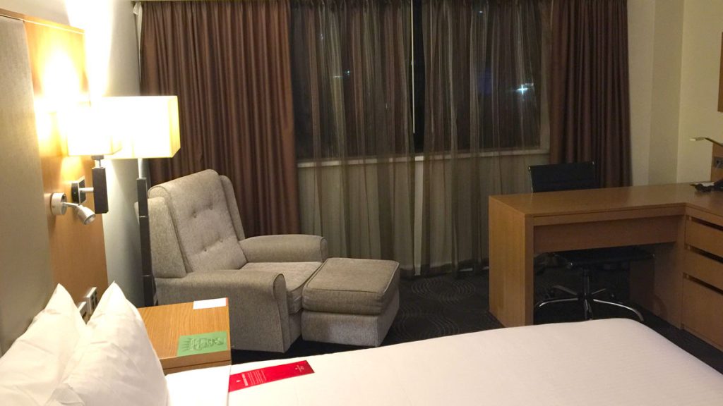
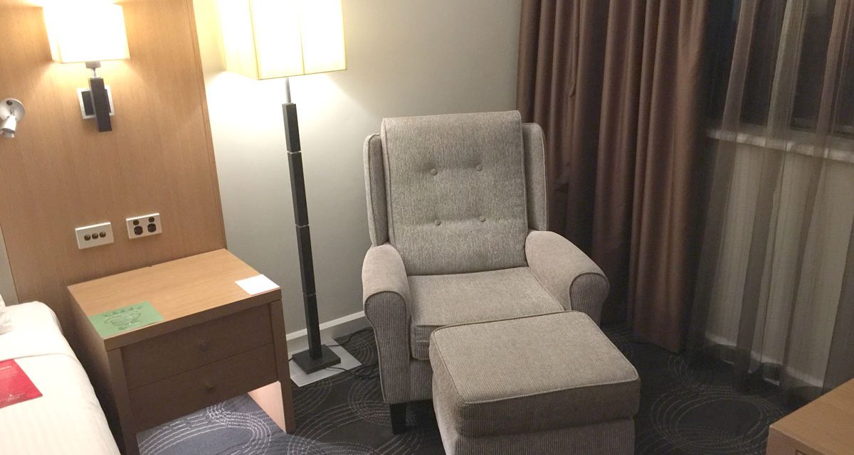
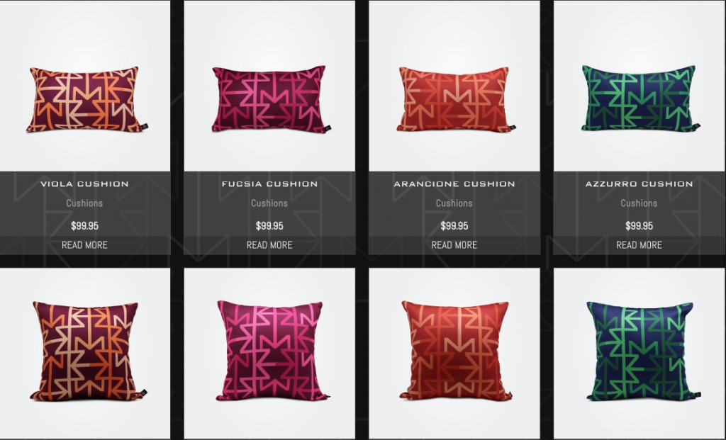
The decor is very neutral, in greys and light wood, with a dark grey patterned carpet. Inoffensive, without being endearing or memorable. No cushions, neither on the chair nor decorative ones for the bed.
The cushion thing is not a complaint, but it does make me realise that it is those decorative elements that make a room memorable, and in part, visually comfortable.
Bathroom
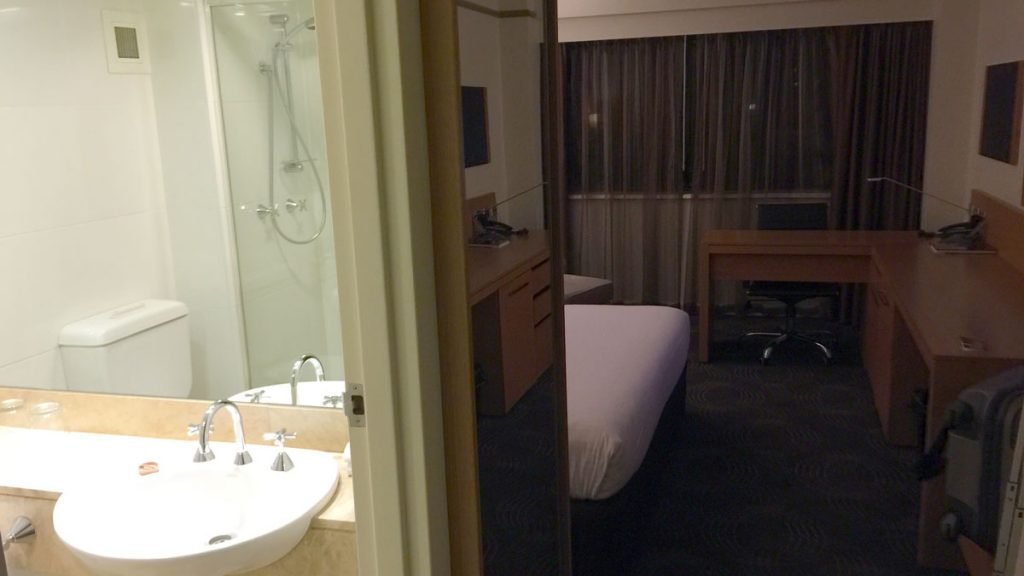
This is to the left of the entrance, opposite the wardrobe.
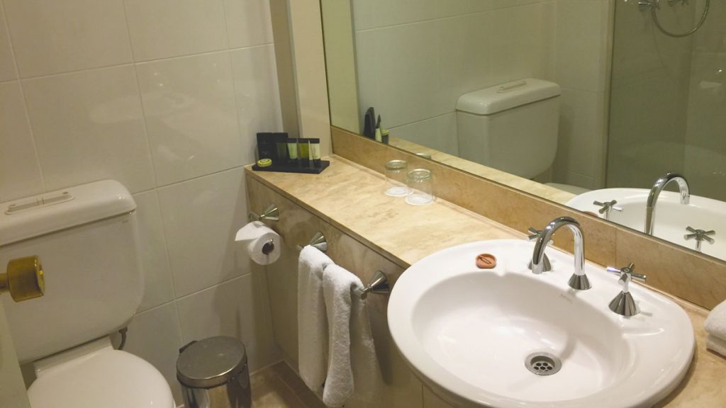
The bathroom has a sink and bench to the right of the entrance. A toilet directly in front of the entrance door, and a long shower cubicle to the left.
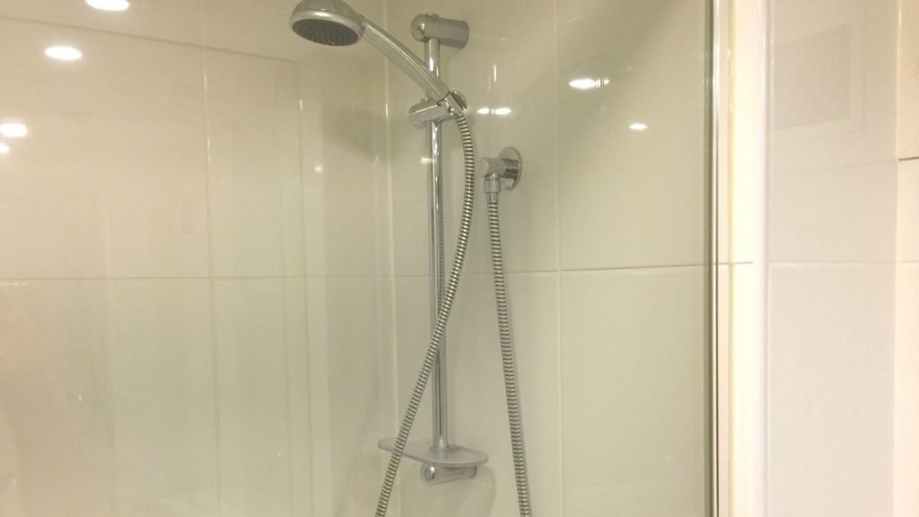
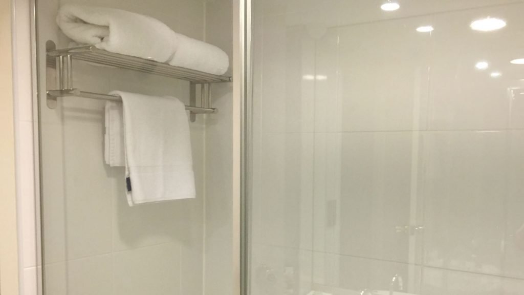
There is no overhead shower, only a wall-mounted handheld showerhead. There is no bath. Towels are located on a rack within the shower cubicle, which places them in potential shower soaking jeopardy. Not an ideal location, although handy when you are in the shower.
Although adequate, the bathroom lacked any sense of luxury and felt a little cheap. It was too compact for my liking. On the plus side, the mirror extended wall to wall so was more than adequate.
Amenities
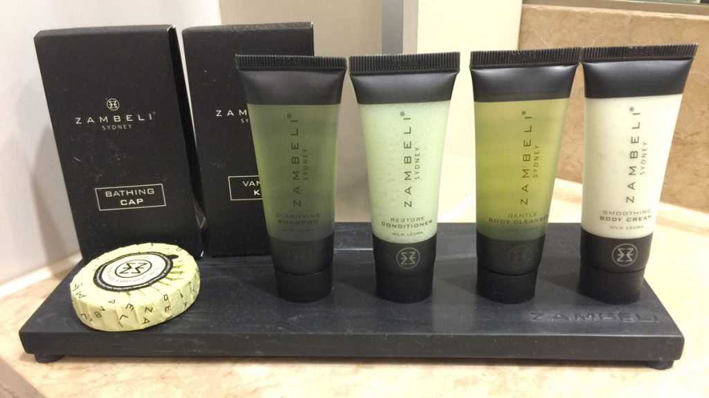
Bathroom amenities were by Zambeli, featuring the Australian scents of wild laura and wattle. The company produces a range of soft furnishings as well as these hotel amenities – pity the hotel room didn’t feature some of them, as that would have lifted the room decor a lot.
2PAXfly Takeout
Although this is a perfectly adequate hotel room for its class, I didn’t like it and would prefer not to stay there again.
That was my feeling directly after our stay.
Now, reviewing the photographs, I can see that the room is perfectly acceptible, and I question my reluctance in returning to the hotel. On the other hand, photographs don’t always tell the whole story, so maybe I should trust my instincts, about not returning.
Review
65%
Summary This has all that is necessary for a 5-star hotel room, but without anything else, no style, nothing memorable and it feels cramped.
















What did you say?